1

It seems that most web designers choose scalable units (rem, based on font size) for pretty much everything, instead of fixed units (px).

But when it comes to spacing and sizing, that doesn't make sense to me, for a few reasons:

  1. Most users use phones, tablets or laptops with limited screen space. The bigger the spacing, the fewer content elements can be displayed on the screen.

  2. If users increase the browser font size, they most likely want bigger text, not bigger everything.

  3. Most if not all browsers support the page zoom feature, which pretty much enlarges everything. So why have another setting for the exact same thing, instead of using font size only for the text?

I really don't understand why, in these circumstances, the design industry still continues to use scalable units for spacing and sizing, when fixed units would be more beneficial overall.


Edit (24 Aug):

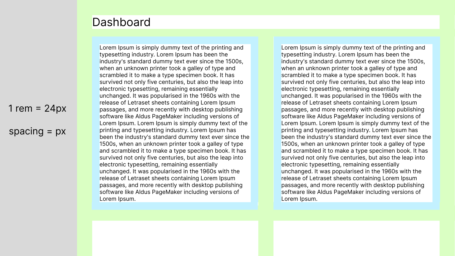
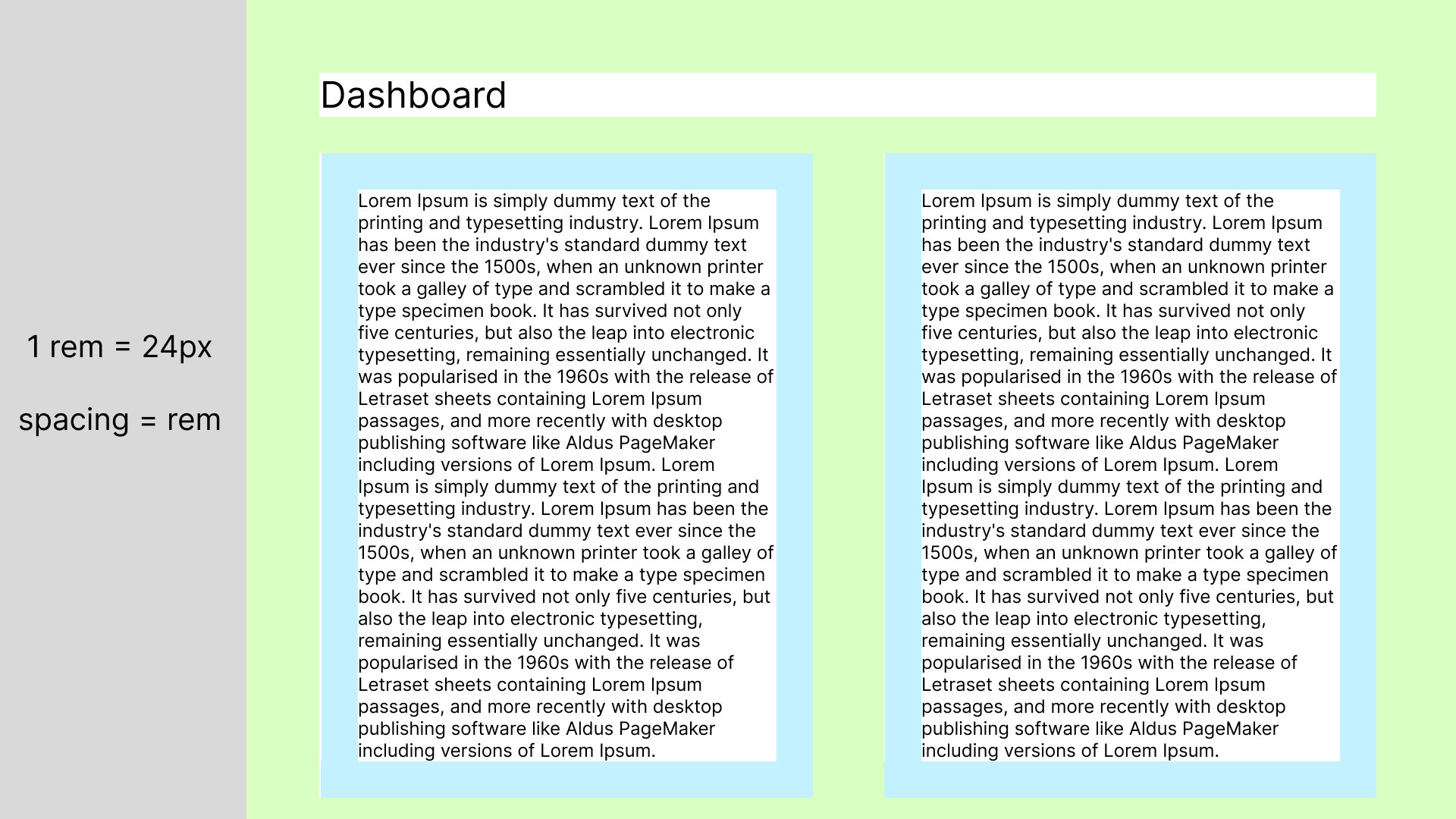
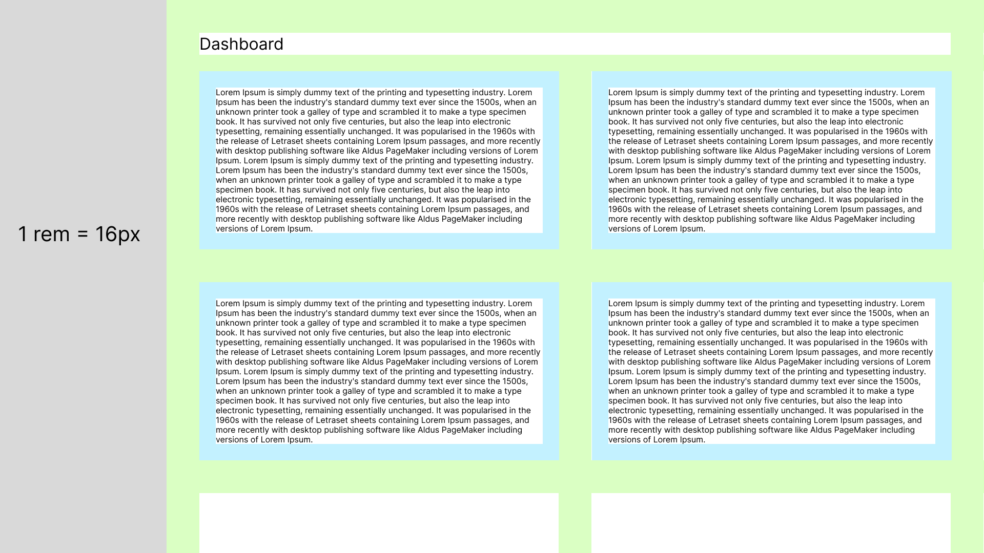
Here is a basic example of scaling text vs spacing (a dashboard with cards).

Default view allows 4 full cards and 2 cropped cards: Default font size 16px

Spacing (px) view allows 2 full cards and 2 cropped cards: Scaling font size 24px, spacing as px

Spacing (rem) view allows only 2 full cards: Scaling font size 24px, spacing as rem

6
  • 1
    If you use larger text, you need larger margins, larger clickable areas, etc. And also balance (do not put too much things!). For other uses you may use px. I think your question lack of context: do you have well known site where you think rem is abused? Commented Aug 20 at 13:46
  • It's a general question. I would like to see situations where increasing the layout together with the text does make sense. In my opinion, it doesn't.
    – Morco
    Commented Aug 20 at 14:30
  • As you saw, it makes sense for most of people (and not clueless people). So it is your turn to give an example (well designed) that use rem, and explain why do you think it make no sense. I cannot understand why it makes no sense to you. Visual balance is important. We always designed with proportions. Commented Aug 20 at 14:53
  • I already mentioned 3 reasons why it doesn't make sense to me. The fact that most designers copy the same old practice doesn't make it good.
    – Morco
    Commented Aug 20 at 17:01
  • 1
    And we answer you. You should really be more open minded and try to understand the arguments (forgetting your) first, and than check. 1- bloat is bad (you never find billboard full of materials, in fact they may be cleaner then other adv); 2- the visual balance, 3- browsers have different behaviour on zoom, and it requires user interaction. em: designers choose (and again: when it is not appropriate, designers use px). Commented Aug 21 at 7:09

4 Answers 4

2

Only your 3rd point makes sense. Keep in mind that, the larger the content, the more space is needed around it to keep the visual proportions the same, otherwise the intention of the spacing loses its function.

  1. If users increase the browser font size, they most likely want bigger text, not bigger everything.

This is not necessarily correct. Spacing is used to make content better readable, easier noticeable, it can be used to group or separate content etc. When only the content is zoomed in, the effect of the surrounding space will diminish at the cost of readability and usability, not something most people will prefer.

  1. Most users use phones, tablets or laptops with limited screen space. The bigger the spacing, the fewer content elements can be displayed on the screen.

Same as above: spacing is functional. Without enough spacing, the content becomes less readable/usable.

  1. Most if not all browsers support the page zoom feature, which pretty much enlarges everything. So why have another setting for the exact same thing, instead of using font size only for the text?

There are indeed not many people that use text scaling (source), and using relative units for everything is debatable (source). One reason to choose rem over px is that there are so many screen resolutions with different pixel densities that designing/developing with pixels as basis is really not that relevant anymore. That a browser zooms any type of unit and it still turns out fine is not the right motivation to still use px as unit. And to account for those few people that still use text scaling, using a relative unit is a safer choice. I work with mostly rem as unit and never had problems with it. And it doesn't require me to think about scaling.

A note in general about zooming but something to keep in mind; Zooming must not cause scrolling in two directions. Scrolling in one direction (vertical) is a requirement of WCAG2.2.

EDIT:
Based on the examples, I can confirm two things from my answer:

  1. Scaling is functional. As Devin mentioned in the comment: preserving spaces while users want to zoom in works against their intention. Dashboards can be difficult to make responsive, I must give you that, but it certainly isn't impossible.
  2. If rems are not suitable, you are still allowed to use px.

But there is also something to add:

  1. There is the css max property. For example the paddings can be scaled half the text size but only from a minimum value: max(16px, .5rem).
  2. If complex scaling is most definitely wanted, javascript can be used to observe text size and adjust spacing accordingly. I would never go this route, but it is possible.
  3. Don't overcomplicate it, scaling works as most people expect when using standard available techniques.
7
  • Well, I don't debate that spacing is important for readability, but I don't see that as a direct reason for scaling the spacing together with the text. The answer could be improved imo.
    – Morco
    Commented Aug 21 at 11:45
  • And indeed, it seems to be a very low number of people actually changing the font size, therefore very few designers actually bother with this issue.
    – Morco
    Commented Aug 21 at 11:46
  • 1
    I don't understand. Can you give a reason why or in what situation it isn't wanted to scale the spacing along with the text? Do you suggest that it is worth using different proportions for text and the surrounding space? That would make design/development work unnecessarily hard. Or do you have a different experience, can you tell something about it?
    – jazZRo
    Commented Aug 22 at 16:00
  • Well, I kinda came to the conclusion that both rem and px are too rigid solutions for what is actually needed. They are both linear solutions. What is needed is a curve for scaling the spacing based on text. I don't think the current technologies support this natively, so designers choose whichever option they can.
    – Morco
    Commented Aug 22 at 19:32
  • Has this answered your question about px vs rem? You can always post another question and ask about this particular scaling problem. But I’m curious what that problem is. Why are you looking for a different way of scaling? Do you have examples that show the benefit of it or the problem it would solve?
    – jazZRo
    Commented Aug 23 at 5:52
1

I think rem are have many advantages over px's for sure and you will find tons of articles around this.

The nature of rem itself is responsiveness and like you mentioned today we most of the mass have access at the fingertips with various screen sizes/devices. It always takes into account the root font size that is used for development in basic html.

Some points that I can recall from what I have learnt working closely with dev team:

  1. I remember during UI audits with different screen sizes, I encountered inconsistencies in the spacing and sizing due to px usage. It was frustrating for the dev to make changes at each and every place to fix it. Consistency is real player when rem is used.
  2. With using px things like lets say margins and paddings get fixed that cannot be handled with responsive behavior due to increasing demand of responsive sites/apps.
  3. Ultimately, for maintenance of the app is crucial too. It is a lot more easier to maintain the site when developed in rems rather than px. Time is money. Lesser the maintenance time faster is the deployment of service. This is most common due to changes that comes through again and again.

Better to build the site/app for future warranties with rem rather than px.

Accessibility is a one concern that should be part of any web app/website. Check this blog in A11y that talks more about this topic. This has more technical advantages explained related to how media can be better handled with rem.

https://www.a11y-collective.com/blog/what-is-rem-in-css/

1
  • I think you misunderstood my question. Both ca be written as design tokens. But why rem and not px when it comes to spacing and sizing?
    – Morco
    Commented Aug 19 at 12:55
0

I think that this has become a common problem for designers since the tech world has increase the integration between Dev & Design. In the past developers were not pushed by designers to cover all the design's aspects for space, font-size and responsive elements in a website. Now that there are lots of sizes for screens, pixel ratios and multiple devices to cover one way to solve all those issues with one design is to use rem. As Ashumk mentioned it is important to reduce the time used to maintain a website and release a product swiftly. So, when you hand-off your designs to Devs in pixels, it is going to fit well just in one screen size and for the rest it might feel odd. So, if you use 16px as your baseline for spacing that is going to be your root size and the browser will calculate the different sizes to make your website feel "proportionate".

Let's think of it like the first approaches from Devs to use percentages in a website to make it responsive. Now with the use of multiple devices we need to make them proportionate and have a sense of aesthetic.

This post could help you understand the Dev POV why use em or rem. https://www.freecodecamp.org/news/why-use-rem-to-set-font-size-in-css/

Regards 🖖

1
  • It still doesn't answer my question. Or at least it doesn't cover any of my 3 bullet points.
    – Morco
    Commented Aug 20 at 17:05
0
  1. Most users use phones, tablets or laptops with limited screen space. The bigger the spacing, the fewer content elements can be displayed on the screen.

Some people require very large text indeed. We're talking zoom factors of 700 - 800 percent or higher, which leaves very few words on the screen at any time. Browser zoom ends at about 500%. (I'm in Firefox right now, it could be a bit different in other browsers).

Fixing the typographic parameters you mention, can result in overlapping text, making it unreadable. Also, see point 3.

  1. If users increase the browser font size, they most likely want bigger text, not bigger everything.

This is a false assumption. People with dyslexia may in fact require "bigger everything", though not the size of an elephant as above :-)

They have tools to override and adapt text settings to fit their needs, and if you block the use of those tools, you can prevent people from accessing your content. Setting fixed values can do so.

  1. Most if not all browsers support the page zoom feature, which pretty much enlarges everything. So why have another setting for the exact same thing, instead of using font size only for the text?

There's a difference between the simple zoom feature of a browser and a USD $900 tool like ZoomText.

If you plan on fiddling with typography settings, you should learn about reading disabilities first.

Your Answer

By clicking “Post Your Answer”, you agree to our terms of service and acknowledge you have read our privacy policy.

Not the answer you're looking for? Browse other questions tagged or ask your own question.