2

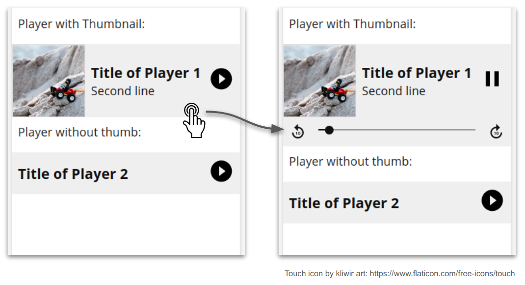
For our app (media guide app for museums), we are implementing an "inline audio player", which should look like this:

Concept of the Player UI

When the user clicks or touches the gray field, the control bar below with the controls (scrub bar and rewind/forward buttons) appears. Play/pause is triggered on the complete upper part of the player.

If the player ends, the part with the controls should automatically disappear again.

And this is what I do not like at all. I have a strong opinion on that, I think that this can't be the right way to do it, mainly because of two reasons:

  • Users are supposed to be in a museum when using this app; this means that they are not looking at the display when listening to the audio. After the audio ends, they will look at the display again, probably to play the next audio. But as the controls are automatically closed, they do not have any visual indicator to know which audio they just played—they have to remember the title.
  • I personally believe that showing or hiding UI elements without user interaction is far from expected. But in regard to this, there are some other opinions. Even more in this case, as this hiding animation will most probably take place without the user noticing it.

Am I wrong with my opinion? Does it make any sense to auto-hide the controls after the player has finished playing? If yes, why?

Or am I right? And if yes, are there any more reasons, theory or other sources to support my point?

2 Answers 2

1

I would say that this situation falls under "Zen Mode" - it tries to focus onto the content by hiding the control bar. Hiding control bar might make users feel like they don't have full control of the application, which I would consider to be bad UX.

While zen mode is a well-intended UI feature, in practice, it can ultimately increase cognitive strain. To understand why, let’s step outside the world of UX for a minute and consider a painter. While the task of painting requires extreme focus, the artist must, occasionally, dip her brush into a palette (or maybe into a cup of water, for watercolor). The artist could not possibly work without the paint, and the awareness of the paint’s location is essential to the artist’s success. If the palette suddenly went missing, or was hidden behind the easel, the painter would have to regain control of the palette (search for, grasp, and then utilize the palette), which would take away from her attention on the painting itself.

Article's source here.

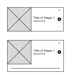
Other options: if you decided to keep the UI as it is, please consider adding some kind of an indicator, for example a chevron down icon to indicate users that the thumbnail could collapse. Visual example is shown below.

example

2
  • 1
    Thank you! Makes sense. Although in this case, it is not really Zen-Mode, as the there is nothing related to focus while playing the audio, and the rest of the page will still be there. The subject the user will be focused on will probably be not the app, the things in the museum. The app is the "palette", not the painting. Commented Nov 28, 2023 at 10:40
  • That was the closest definition that I could've found and from my perspective it looks logical: when user looks down at the app, it only sees the thumbnail, title and the stop/play button and user isn't bothered by rewind, forward buttons and a line, which makes this situation kind of "zen modish" if I could say. But don't get me wrong, I agree with you as I believe that user should be able to see all available actions just as it was said in the mentioned article. :)
    – fakermaker
    Commented Nov 28, 2023 at 10:54
1

The way it's designed today has a big problem - you're letting the user fast forward the scrubber with their finger (a hard gesture to use with precision), or they can tap the "fast forward 10 seconds" button (how many people can accurately gauge whether there's a full 10 seconds left?). It would seem that the user could easily, unintentionally leap too far forward, and then not be able to correct the location in the audio, because the controls are hidden!

What your users want is a really elegant, streamlined bicycle... but this design is a unicycle. Designs need to be forgiving to work well.

Your Answer

By clicking “Post Your Answer”, you agree to our terms of service and acknowledge you have read our privacy policy.

Not the answer you're looking for? Browse other questions tagged or ask your own question.