3

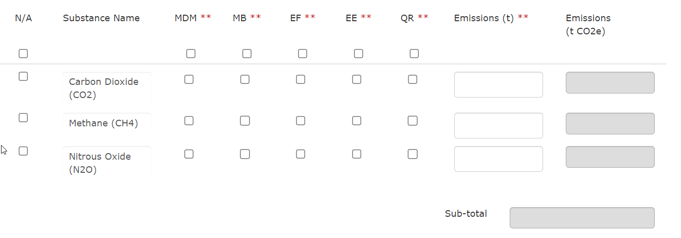
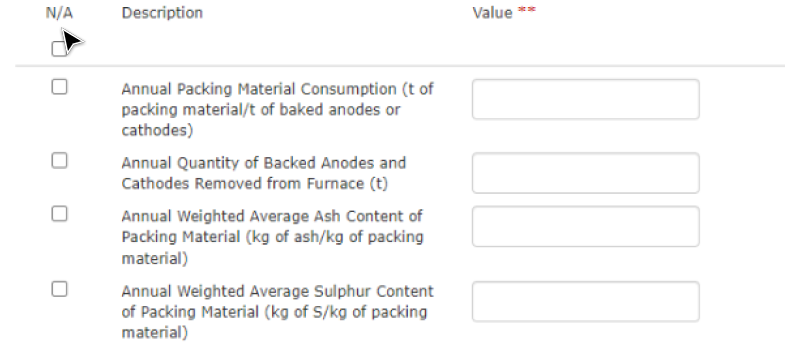
I am redesigning an old greenhouse gas emissions regulatory application that has a common design pattern where data tables include "Not Applicable" marked as N/A as the first column. When the user marks a row as N/A they are essentially saying that the particular emission does not apply and the system will not use the information in that row to perform different calculations and it also is useful for data extraction purposes. This approach does not seem intuitive and I've been trying to think of alternatives.

The obvious solution that comes to mind is to make it an opt-in approach vs an opt-out (what it is currently). So remove the N/A and only if the user deems it applicable, they will click on the checkbox marking that it applies. This approach might not be the best because we want the use to consciously read through each emission and mark it as N/A. It's an extra layer of validation. If we don't force the user to do this, they might not make the effort to mark relevant emission as applicable.

Another option we have thought about is to make the user enter a zero instead of an N/A checkbox, but zero and N/A serve different purposes. Zero would mean it is still applicable but the emission is zero.

Screenshots attached.

Is the N/A approach they way to go or is there a better solution?

enter image description here enter image description here enter image description here

6
  • 2
    Interesting. First question: how many possible options/rows/items are there that the user can select from (or designate as N/A)? Second question - what are the steps just before and just after this, for some context?
    – Mattynabib
    Commented Nov 17, 2023 at 18:17
  • Would it be an option to let users remove the non-applicable rows, with the option to add them again from a dropdown menu?
    – jazZRo
    Commented Nov 20, 2023 at 9:14
  • #1 It depends. Some tables have 3...some can have 20. #2 no "steps" before these pages. There is a main dashboard page, and then you click into a page that can have multiple data tables like these.
    – user170002
    Commented Nov 20, 2023 at 15:22
  • I think we could but some of these tables are large. Not sure if that would make dropdowns really long.
    – user170002
    Commented Nov 20, 2023 at 15:30
  • Do users always make changes to all applicable substances? Can making no changes mean the substance is N/A?
    – moot
    Commented Nov 20, 2023 at 16:21

3 Answers 3

0

My suggestion is to somehow gamify the process of declaring emissions:

  1. Reverse the N/A into applicable by default, with all items selected.

  2. Encapsulate each row into a card and place the applicable checkbox as a partial overlap with the card (either center-left or top-left of the card). Make it look like a fancy checkbox (rounded, big, colorful etc.)

  3. When deselecting the checkbox, disable all inputs inside the card and make the whole card grayed out.

  4. When refreshing the page, place the unselected cards at the bottom of the list.

  5. Maybe you can even drop the table layout and display the cards in a grid.

  6. Add a title above each list of cards and also add in brackets how many cards are selected, like this: "Toxic emissions (4 selected)". By default they should all be selected to encourage the user to think about them.

  7. You can move the sub-total next to the title and make it bigger, to draw attention to the overall impact and encourage users to reduce that number.

  8. Use various colors, backgrounds, badges, icons, illustrations for each card based on the provided user input (big emissions = red, small emissions = orange, 0 emissions = green, etc.). When refreshing the page, place the large emissions first, to draw attention to them.

  9. Add a progress bar based on how many cards are selected vs how many are considered "safe" emissions. Place the progress bar on top of the list and make it obvious.

  10. If all selected cards are emissions at toxic levels, add a dummy emission that is safe, so that you can always have a small progress in the progress bar. This will nudge users to fix the other emissions.

0

Example

You can follow the opt-in or opt-out that could help you make your flow more intuitive. I thought that you could group the elements that are marked as N/A so that in the universe of elements, it is easy to understand which elements are making the sum of all the emissions. Maybe graying out those as N/A might help understand that they are in the form but do not add to the whole sum.

-1

It sounds like you’re facing a key usability challenge. Here are a few quick suggestions:

Use a Checkbox for Applicability: Instead of defaulting to N/A, use a checkbox or switch to mark emissions as applicable. This helps users clearly indicate which emissions they are working with.

Dynamic Fields: Adjust the form fields based on user input. If an emission is marked N/A, related fields could be hidden or disabled.

Guided Workflow: Implement a step-by-step process or prompts to guide users through marking emissions accurately and understanding the importance of their choices.

Maintain Zero vs. N/A: Keep zero for “no emission” and N/A for “not applicable,” as they represent different states.

These ideas might help make the process more intuitive and ensure users provide accurate data. Good luck with the redesign!

Your Answer

By clicking “Post Your Answer”, you agree to our terms of service and acknowledge you have read our privacy policy.

Not the answer you're looking for? Browse other questions tagged or ask your own question.