0

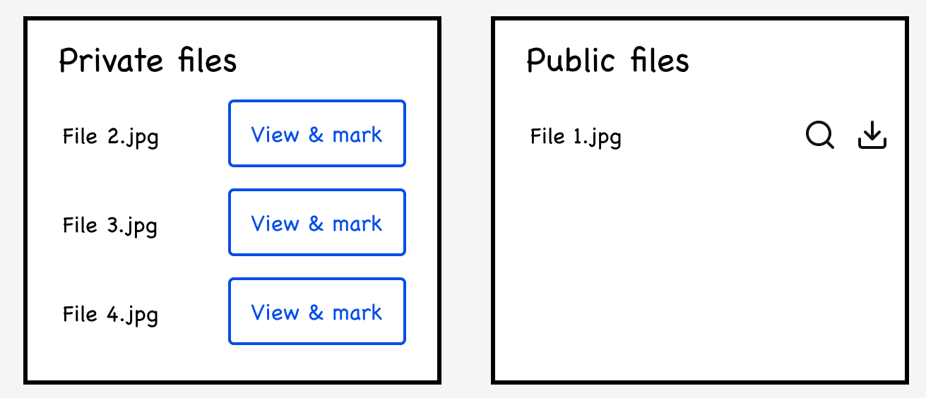
We're working on a platform that has these 2 sections:

  1. Private files - participants in the call have their own private files section
  2. Public files - Files shared here become accessible (to preview and/or download) by everyone

To move a file from private to public, the user has to Mark them. This action is what makes the file publicly accessible.

In the original design, we had two separate buttons for Mark and Preview. However, based on user interviews, users were adamant about wanting to preview the file first before marking it. They were concerned that if previewing were optional, they might inadvertently share the incorrect file.

Note that these are legal files, so certainty in sharing the correct file is a must.

So as solution, we're making previewing mandatory before marking or making it public.

With all that said, what would be the appropriate button label here? Some ideas I thought about:

  • View & mark
  • Preview & mark (This works too, but working with limited real estate here)
  • View to mark
  • Preview to mark (Again, working with limited real estate here)

Any other ideas?

enter image description here

0

2 Answers 2

0

In terms of labels, what you have is correct. However, what happens if the file name is too long?

Additionally, having users click each time can be tedious and result in a poor user experience.

Therefore, I would suggest an alternative approach: provide a small paragraph explaining what users should expect when performing certain actions.

For example, you can instruct users to mark files for public availability using checkboxes next to each file, and then provide a single button at the bottom of the files list with a label such as "Preview and Mark" (which accurately reflects the action).

This approach allows you to accommodate longer file names and saves space. Furthermore, users won't need to navigate back and forth; instead, you can implement a screen where users can browse the selected files, similar to the file preview feature in Google Drive.

3
  • The plan was to just have the filenames wrap if they were long. If they were still too long, will probably truncate with an ellipsis. The user typically shares one file at a time, (for more context, this is a legal proceeding, so the user sharing more than one file at a time is highly unlikely) so not sure if it's appropriate to use checkboxes.
    – M Bo
    Commented May 20, 2023 at 16:52
  • Ah, okay. I based my answer on our experience working with legal firms that often share files in bulk. Then, as I mentioned at the beginning of my response, I believe your current labels are appropriate.
    – Devin
    Commented May 20, 2023 at 17:25
  • What action does your CTA 'View & mark' is going to perform? Let the user view and mark at the same time, because that's what it looks like from the button. But, obviously, that overrides the whole purpose of having the user preview files first before Marking. Also, how does this preview thing work? Does it open the file or a snapshot of that file?
    – Fasih
    Commented Jun 19, 2023 at 18:14
0

If the preview is mandatory anyway - why do you note that in the button text and not just call the button "Mark"? As I understood from above, the users are not afraid to click the button, but to not preview it first. When the button is clicked, the preview opens up and you could present a "Confirm" button to the users.

1
  • But then people will be afraid to click in case the labeled action is immediate. Commented Feb 14 at 13:53

Your Answer

By clicking “Post Your Answer”, you agree to our terms of service and acknowledge you have read our privacy policy.

Not the answer you're looking for? Browse other questions tagged or ask your own question.