5

We are developing a webapplication and some of us has gotten into a small argument of how the main tabs and their corresponding sub tabs should be displayed.

It's mainly a question of weather the main tabs and the sub tabs should have the same colour coding or if they should differ.

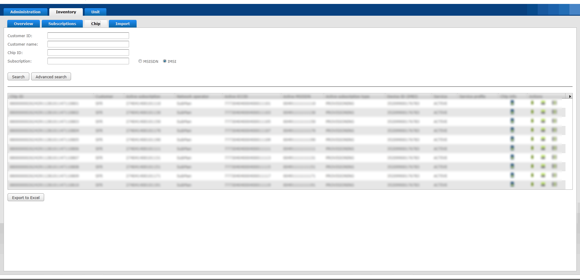
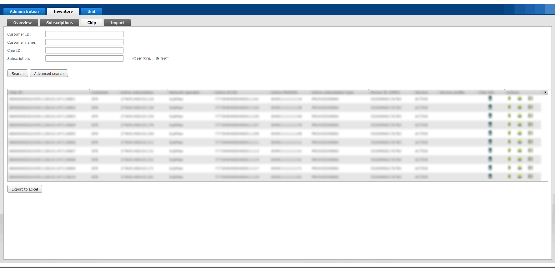
Let me present two screen shots displaying the two variants (please click "show image" if they're hard to see):
enter image description here

enter image description here

These images show the two variations of tab colour coding.

  • Main tab being blue when inactive and white/grey when active. And sub tabs also having the same colour coding
  • Main tab being blue when inactive and white/grey when active. Sub tabs being greyish black when inactive and white/grey when active.

There are drawbacks and gains with both variations. The first have a cleaner look with a more narrow range of colour coding, the second one because of the different colour coding more directly distinguish it from the main tab bar. Then again the pure layout and mapping of the sub tab bar is maybe enough to distinguish it from the main tab bar..?

I would like to hear from you guys your own opinion in this matter and if you have theories or best practices to reference that would be great too!

3 Answers 3

4

My opinion on this (for what its worth!) is that it would be better to distinguish the tabs by style rather than by colour. You could have the lower tab as a button bar or maybe something simple like a pipe "|" delimited menu instead.

Its important to distinguish between the two menus, as it at a glance it looks like it could be a version of the dreaded microsoft tabs.

enter image description here

2
  • ohhh, I know... I've thought of that myself, and it's not a pretty comparison.. those tab bars are one of the worst examples of terrible user interaction components. So yea, that's a great point. Distinguishing them by style is something I'll look more into, see if I can mock-up a design that could eradicate this problem. Commented Dec 6, 2011 at 15:11
  • Of course I mean *best examples... =) Commented Dec 6, 2011 at 15:46
3

My direct feeling on this is that you shouldn't have two sets of tabs. This make the top of your application confusing and you lose lot of space.

There are lots of other way to optimize space in this context and to offer a more appropriate navigation. For instance, you could go for vertical tabs on the left to avoid the user to move the mouse cursor up when he would like just to stay at the same level of navigation. This will make your header clearer with one obvious navigation.

1
  • I see what you're saying. And we did consider using faceted navigation, which I assume is what you're referring to. However, the table in this view contains a quite large amount of columns where users will gain from being able to have as many columns as possible displayed at the same time for quick analysis. Compromising the width of the view with a tab/menu -bar is therefore not optimal. I definitely see it as a more suitable option in other contexts but in this it just wont do... Commented Dec 6, 2011 at 14:50
3

I see three primary communication objectives here: hierarchy, current position within the hierarchy, and relevance to current task. I don't think it's wise to try to use color alone to communicate all these things at once.

I might explore using contrast in multiple characteristics--like size, position, text treatment or even a different UI element--to differentiate one of the two levels of of the hierarchy in your example. I think the most visual weight should probably be placed on the choices that are most relevant to the workflow of the immediate task.

You should also consider whether, at any given stage of the user's workflow, it is more important to quickly visualize where they are at in the hierarchy, or what other options are available. I suspect that the blue "hot" color of the non-active tabs may be more eye-catching than the light grey of the current tab, so be sure that is where you want to draw the user's eye at that moment.

1
  • Thanks for your answer! I see what you're getting at. The subject has been discussed amongst parties and it has been concluded that the differentiator will be by using a different colour code. I would agree that using colour alone to differentiate between items in a hierarchy wouldn't be enough. However there still is a difference in mapping in the sample above. The outer main tab bar is framing its content with the additional inner sub tab bar. This, even though not most effective, will trigger the hierarchical interpretation of the GUI navigation system. Commented Dec 8, 2011 at 8:27

Your Answer

By clicking “Post Your Answer”, you agree to our terms of service and acknowledge you have read our privacy policy.

Not the answer you're looking for? Browse other questions tagged or ask your own question.