11

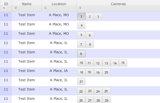
I have a panel where a user selects a camera to view from a location so they can load images from that camera. They can only load images from one camera and one location. Because of this I used radio buttons; only one valid entry per location. But the individual groups of radio buttons are also mutually exclusive.

An example is below. Camera 1 from the first location is selected. If I selected Camera 2 from the first location, the camera 1 button pops out. It also pops out if I chose a camera from another location.
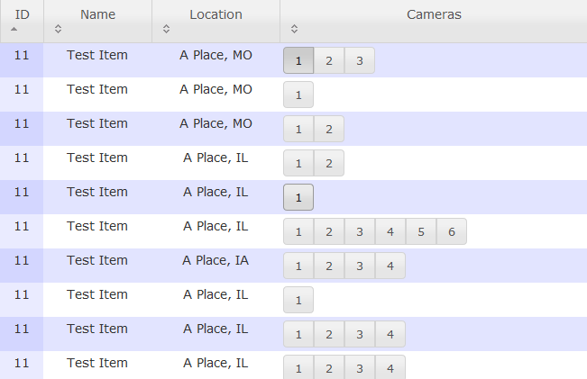
enter image description here

I physically grouped the buttons to suggest connectivity, but I don't know how I would or if I should indicate the separate groups are also mutually exclusive. It's quite apparent from using the interface though, as the buttons will visually pop out if you chose another option.

8
  • As a technical note, the whole thing is actually a single group of radio buttons, they're just visually split across rows and connected visually for affordance.
    – Zelda
    Commented Dec 2, 2011 at 16:29
  • I am a little lost based on your description. Is the intended interaction that in line one if I click #3 it becomes selected (and #1 unselected) . If I then click in row 6 #3 does that radio button get selected and row 1 is left alone, or that row 1's #3 is deselected. I believe it is the former not the latter. In which case I think your screen shot above is enough to convey that Buttons 1,2,3 in row one are entirely unrelated to those in row 2 or 3 or 4. Commented Dec 3, 2011 at 2:37
  • Another followup question, Does a location start off with a default camera selected, or is it not appropriate for a default to be selected. It seems like on line 1, since it is the only option, #1 should be selected automatically. Additionally it would seem nice (based on my assumption of what the use case might be, which is probably wrong) that the first camera should always be selected by default at each location. This fact would instantly, to me, indicate that I can select one camera for each location and each set is independent. If not, you are missing a off or no camera button. Commented Dec 3, 2011 at 2:45
  • Which would be selected by default, and create the same effect. If it is appropriate to never have a camera selected, as is indicated by the current mock-up, then you are missing away to select no camera. Commented Dec 3, 2011 at 2:46
  • They are completely related, that's why I said mutually exclusive; you can only pick one single camera out of the whole grid of possible cameras. There's no default since I can only pick one camera out of all cameras at all plants, and I can't assume which plant will be relevant.
    – Zelda
    Commented Dec 5, 2011 at 14:28

8 Answers 8

6

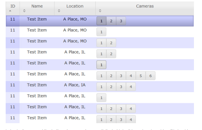
What about changing the color of the row to show that it is selected? Like this:

enter image description here

Then whenever they change a camera that is in a different listing, they will see the whole row change as well.

2
  • I had considered this at the start and I forget why I hadn't done it. I like the gradient making the row look "pressed" in, I think that might work to suggest the same affordance as the radio buttons. I'll give this a try.
    – Zelda
    Commented Dec 5, 2011 at 14:35
  • I am not sure i will see the change if i am at the bottom of the list (if the list is scrollable that is)? Commented Dec 5, 2011 at 15:52
6

I think you are doing a good job so far. But I would make one strong suggestion: do not restart the numbering. That indicates a separation of namespace, which also implies a separation of selection.

enter image description here

If you use the same list and layout, but number the cameras sequentially across the entire list it will help reinforce the notion that you are picking one camera from the list, not one camera from each list.

4
  • 2
    I like the thought but this issue with this suggestion in is if I sort by a different column the numbers need to reorder, making them meaningless or worst confusing that camera #1 is now camera #12. Or they become all mixed up which will also be potentially confusing. Additionally depending on the use case. If the cameras are actually refered to by 1 - X at each location, then the above labels would confuse the user as they are expecting camera 1 at location 5 to be labeled #1 not #9 Commented Dec 3, 2011 at 2:40
  • What about removing numbers altogether? As it is, the button numbering is a strong indicator against the correct usage. No numbers at all would be an improvement in usability. Are the camera numbers important to know before the user selects, or can it be a piece of information they receive after? Commented Dec 3, 2011 at 20:31
  • This is an interesting idea, however the cameras are assigned numbers by the plant; Each plant has a Camera 1, some have a camera 2 ect. We know where Camera 1 is at a particular plant and will be looking at camera 1 to find a particular image/angle.
    – Zelda
    Commented Dec 5, 2011 at 14:30
  • How about naming the buttons 1A, 1B, 1C, etc. for camera 1, then 2A, 2B, 2C, etc. for camera 2, etc?
    – supercat
    Commented Jul 16, 2014 at 22:44
3

Here's my wireframed idea: Complex Radio Buttons

You can include as much or as little information for each camera as you like (I left out ID in this sketch), but group like information together so that each button essentially tells the story of that particular camera: what it's called, what it's doing, and where it is.

By arranging all the buttons with equal weight, and using location to frame them, you 1) make the mutual exclusiveness a little more intuitive, and 2) preserve their relationships without compromising point 1.

If would use multiple lines of buttons arranged like this, and don't be afraid to break a location across multiple lines.

5
  • Really? A down vote? Does this not answer the question?
    – Taj Moore
    Commented Dec 2, 2011 at 20:47
  • I think the down vote is more related to concerns on the solution. Adding a sketch is great and commendable, but I have my own concerns on the omission of data that makes this not solve the entire issue, that the information is not as readable at a glance, and specifically the comment "don't be afraid to break a location across multiple lines." as I can just imagine how difficult, I personally (and that is only an opinion of one), would find that to use and correlate one button that is on one side of the screen to one that is in a different row AND on the opposite side of the screen. Commented Dec 3, 2011 at 1:54
  • @ChrisJanssen I see your point. I was optimizing for what I interpreted the user was after, which is not complete information, but enough information to complete their task. Breaking lines, I think would be okay, if it's really about the camera location, and not the completeness of presenting locations together. I guess it isn't clear from the question what the user regards as most important. And I don't mind down votes now that there are a few upvotes, but a -1 just felt like an unnecessary slap (to my fragile ego, lol).
    – Taj Moore
    Commented Dec 3, 2011 at 17:58
  • This would be nice if there were few cameras, but we have quite a few and I think this spreads out the information too much, and the physical grouping still seems to have the original problem of not suggesting that a single item out of all groups can be selected.
    – Zelda
    Commented Dec 5, 2011 at 14:32
  • Would a map with pins work better? …select a camera from the flyout on the pin?
    – Taj Moore
    Commented Dec 5, 2011 at 18:10
1

You could add a column that shows an icon indicating that the associated camera is 'now showing', like maybe an eye icon. All other rows in that column would be blank but as the icon jumps from selected row to selected row, the association between the live camera and the icon should become clear.

1

To simplify the design you can hide the camera button options for camera buttons which are not from the active location.

Inactive locations could have a single button labelled "show this location" and on hover the button can be transformed in a label "view camera:" plus one button per camera (only in case of more than one camera).

1
  • Interesting solution, however I don't want to hide any controls or add any additional interactions unless necessary.
    – Zelda
    Commented Dec 5, 2011 at 14:34
1

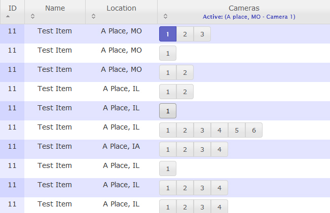
Ben, it seems that the problem lies in the moment that you change the camera. At that moment user should be certain that the old one is not working anymore, so maybe a solution for that would be having somewhere on the layout (preferably on top) area to clearly call out active camera like: "A place MO, camera: 3". That way if you change the camera you will see on top (no matter where you are in the list of cameras) that it has been changed.

btw, i am aware that THIS is not the best solution the way i've put it, but maybe having something similar to this might help.

(in addition you can connect button for selected camera with text for "active" by color)

enter image description here

0

Keep the interface the same, but change the labels on the cameras to incorporate some reference to the location. So '1' becomes 'A place - 1'.

0

Thinking with my 508 hat on, why not use radio buttons that have the label associated with the answers? by showing a radio button, you tell the user that they have to pick a single item.

Your Answer

By clicking “Post Your Answer”, you agree to our terms of service and acknowledge you have read our privacy policy.

Not the answer you're looking for? Browse other questions tagged or ask your own question.