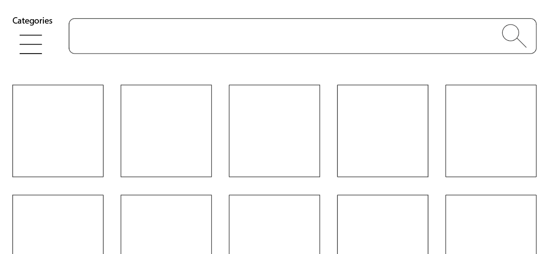
I have worked for several online stores, according to my experience there is a very defined functionality for each product search element depending on the type of user. Mainly:
Categories: the subdivision of products into categories is essential for the seller to organize their products, but not for the customer. While the seller is very clear about where to place each item, for the user it is something totally new and implies a waste of time. In fact, you yourself confirm it in your comment: if the client is looking for something for babies, he/she will not find it in "kids" where will probably start looking.
Search engine: it's essential for the user and secondary for the seller. Going back to the example, if the client is looking for something for babies, simply placing it in the search field avoids any type of category navigation, saving time.
In my opinion, the best mass merchandisers work best with a maximized quick search field and the category navigation alternative secondarily. This favors not only the immediate search but also the best optimization of screen space for articles, information, and offers.
If I had to start a big eCommerce website project I wouldn't hesitate: a wide top horizontal search field as a starting point and a category access button. Given this layout, the best option for the categories layout is a left vertical sidebar with drop-down options.

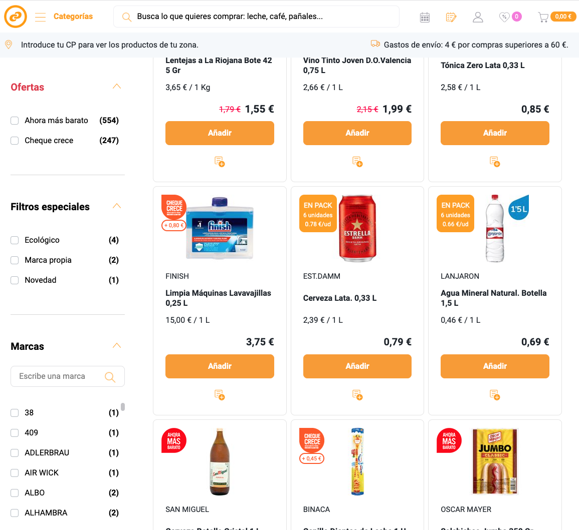
This other example consum.com, in addition to the upper search field and the category access button, leaves the left sidebar for filters:


