0

I'm working on an online banking website and its design system.

UI designers tend to want all form input elements to be the same size so that everything is perfectly aligned. I've explained that the size of a field should match the expected data.

We've agreed that we're going to settle on 3 or 4 different column sizes as they work with a grid.

However I don't know what to do about labels that are wider than the text input. Imagine that you want a 2-digit input field. The label should be "Day of the month". It's going to be longer than the field. Is it a problem?

As a UX designer I think not, but UI designers will really struggle with that.

enter image description here

At the moment the field for "day of the week" is 3 times this size. I'm also not a fan of large datepickers.

I have seen a thread with a similar question but it's quite dated and I wasn't convinced by the answers.

2
  • Is this the only case where this happens? Why can't the system derive the "day of the week" from the date entered?
    – Nicolas
    Commented Sep 8, 2022 at 17:42
  • this is a fake example but imagine that you are setting a recurring money transfer, you would choose the 5th of each month, or the 12th, until a specific date Commented Sep 9, 2022 at 15:18

2 Answers 2

2

Although the rule we learn is to make the input field length approximate the expected input length, in reality, we see a lot of examples where aesthetic considerations take more importance.

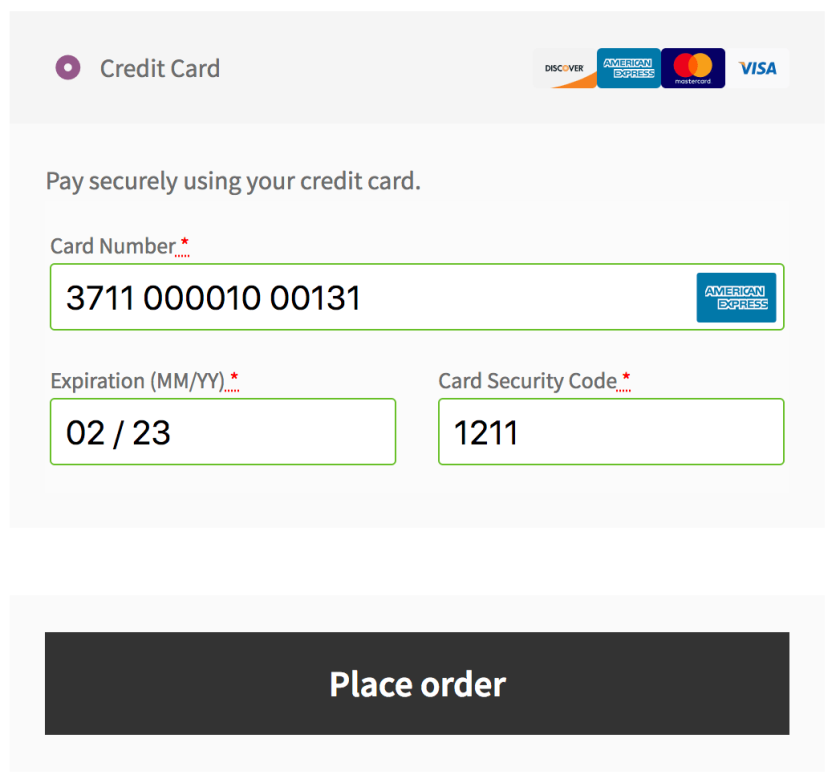
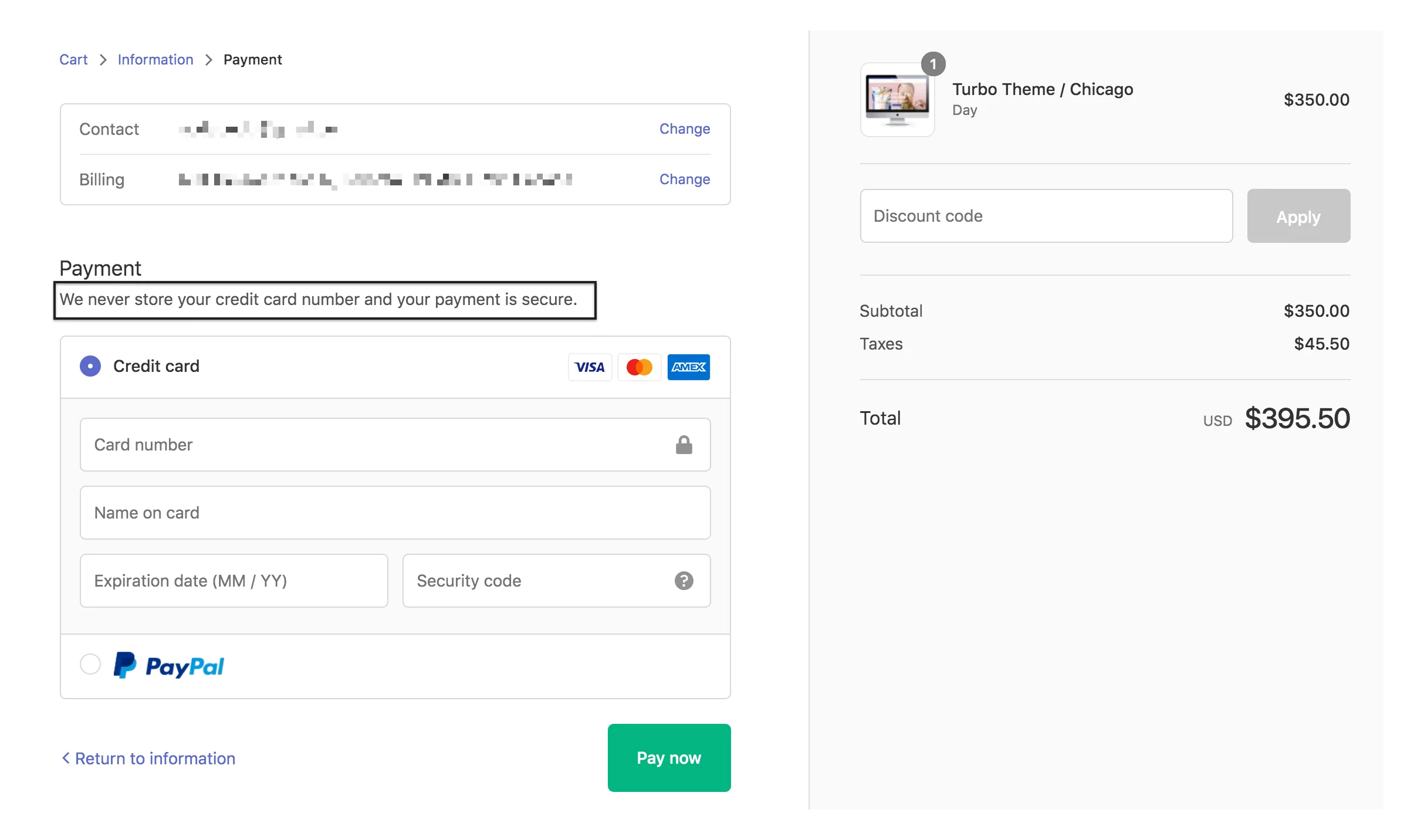
A good example is a credit card security code or CVV. While they're usually 3 or 4 digits, many payment gateways will have the field accommodate the length of the label or fill the form width. And that's okay, because the longer "security code" field doesn't imply to the user that they need to enter more digits. When users know the expected length of a field implicitly, it's less important for the system to visually guide them. So I think you'll be okay with lengthening your "day of the week" field, as long as it's not weirdly exaggerated.

Credit card form with long security code field

Another example of a long security code field

3
  • 1
    I think the length of the field does imply the user needs to enter more numbers. It's a general good practice to use the length as an affordance for how much data should be entered: smashingmagazine.com/2018/08/…
    – Nicolas
    Commented Sep 8, 2022 at 17:44
  • I agree fundamentally, though as users become used to webform interfaces, it's becoming an accepted practice to have some fields like DOB, phone number and zip code display longer than necessary. It seems correlated with mobile-first design, and gives the user a larger tap target.
    – Izquierdo
    Commented Sep 8, 2022 at 18:25
  • I agree with you in this case, however in a form with less obvious data, well, it's less obvious Commented Sep 9, 2022 at 15:22
1

Personally, I have a constant fight with DEVs and their habit of setting exaggerated margins in all the elements. In fact, when I receive a finished project, I open it in the browser and assign margin: 0!important and padding:0!important to each component to start the layout from scratch.

In the example, there is enough space to define a two-line label. What it occupies vertically is recovered horizontally by achieving highly exaggerated gaps. I would not hesitate for a single moment to think not only in the x direction but also in the y direction.

enter image description here

2
  • So you think it's more important to adjust the width of the input to the expected data than to have something visually pleasing by not wrapping text? It is a debate Commented Sep 9, 2022 at 15:21
  • What I think is I would do my best not to have such pronounced visual mismatches anywhere in the entire design
    – Danielillo
    Commented Sep 9, 2022 at 15:26

Your Answer

By clicking “Post Your Answer”, you agree to our terms of service and acknowledge you have read our privacy policy.

Not the answer you're looking for? Browse other questions tagged or ask your own question.