I've seen some similar questions on this subject and I want to ask anyways. In my case, a web platform I'm designing for desktop has a data table that has both vertical and horizontal scroll, and yes, all columns are necessary. Our fear is that the user will have to scroll down the table to see that horizontal scrolling is supported. How can I improve this experience? We want users to immediately understand that they can scroll horizontally.
2 Answers
There are a few things you can try.
The classic pattern for more information available offscreen is to deliberately show something that looks "incomplete". Break the rightmost column in a place where the user will want to scroll to see it.
If data density allows, you can show a limited number of rows (5-10) by default and expose the horizontal scrollbar. This could become a burden for users who need to regularly see a large number of rows and don't want to keep adjusting the view to show more, so you might want to only show the limited view the first time.
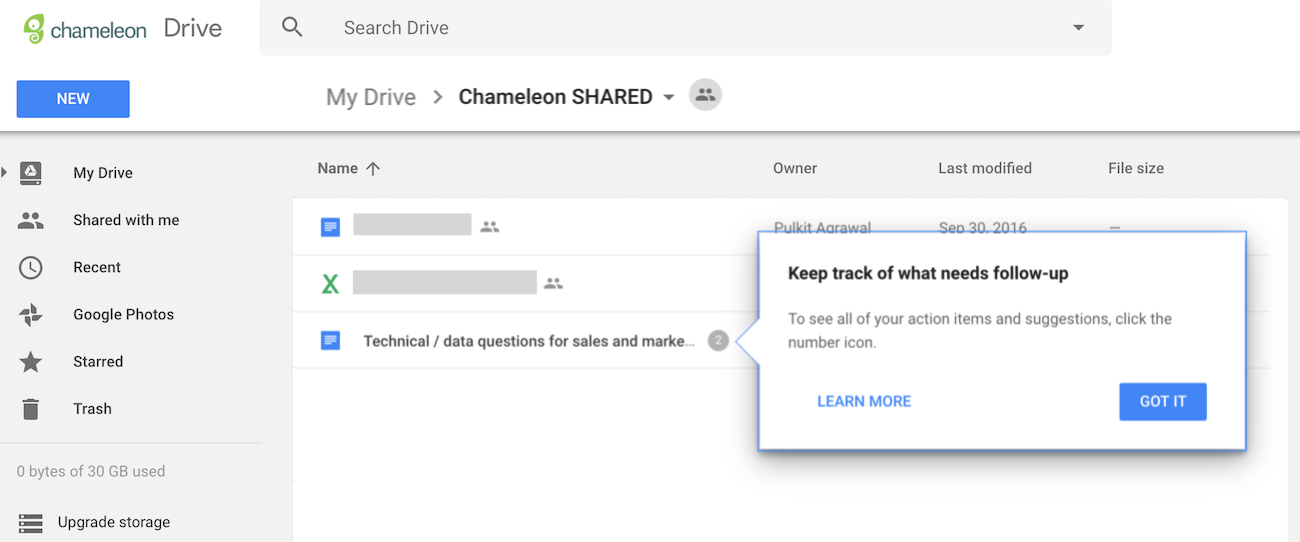
You could add a "product tour" feature that points out that more information exists. Users often dismiss these before reading them, so they might be better used in conjunction with other patterns.
Different tactics can be used:
- Use an arrow icon or horizontal scrollbar to show viewers that the table may be scrolled horizontally.
- Too many columns might make horizontal scrolling complicated and challenging. Use responsive design to change the table to the screen size or freeze columns to keep them visible.
- Freeze the table's first row or use a sticky header.
... and finally test, test and test with real users.


