1

I tried to look up this topic and found something here as a side comment but nothing more.

Context

  • I need to print a value in the Real numbers [-1,+1] interval.
  • The Value has a semantic meaning: The closer to -1, the worse, closer to 1 is better.

Problem

  • When the value is negative, I must print the - sign before it e.g., "-0.8"
  • When the value is positive, I feel I should print the + sign before the number, but it feels like an increment to the user eyes (tested)

Constraint

I cannot use semantic color-coding on the printed because:

  • The value is printed in a comparison grid(comparing columns), and having all cells colored will make the grid look like "carnival time" (UI issue)
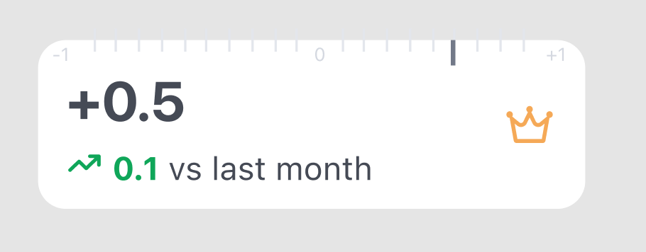
  • the semantic color coding is already "taken" by the increment delta (see example picture)

Remark: I'd also rather not bypass the +/- problem by tweaking the function (e.g., with normalization in the positive real numbers interval [0,1])

Visual concept

  • Each card/cell is stacked horizontally for comparison
  • the Value Number needs to be the focal point of the UI
  • I know Right flush is not proper for numbers in a table. It works well in this grid UI (tested)

stacked cards

Extra challenge (UI)

  • I would like (if not possible, I'll drop this) to show a reference that tells the users that the value is in the interval -1 to +1. But hosting this info as well makes the UI jammed with info. I've tried a few concepts, but when displayed in a grid, they undermine the readability and clarity of the comparison enter image description here.

I'm trying a different approach (don't mind the crown icon):

enter image description here

But the more I try, the more I feel I want to drop this extra info.

Let me know what you think about it. Thank you so much for your attention and participation.

Mike

1
  • Is anything on the card interactive? Why do your users think they can change these numbers? Commented Jan 9, 2022 at 17:22

2 Answers 2

1

If the symbols used in a graph provide perceptual meanings that can be misleading, there is no possible solution except to eliminate them or find graphical alternatives. Two solutions:

1 - Reduce the level of relevance in visual perception of the symbol by contrasting size and / or color so that it loses its meaning in reference to the number and becomes its own entity:

reducing

If the design of the symbols is systematized, perceptually they can be interpreted as part of the same graphic group, separating them even more from their meaning in direct relation to the number (Gestalt law of similarity).

enter image description here

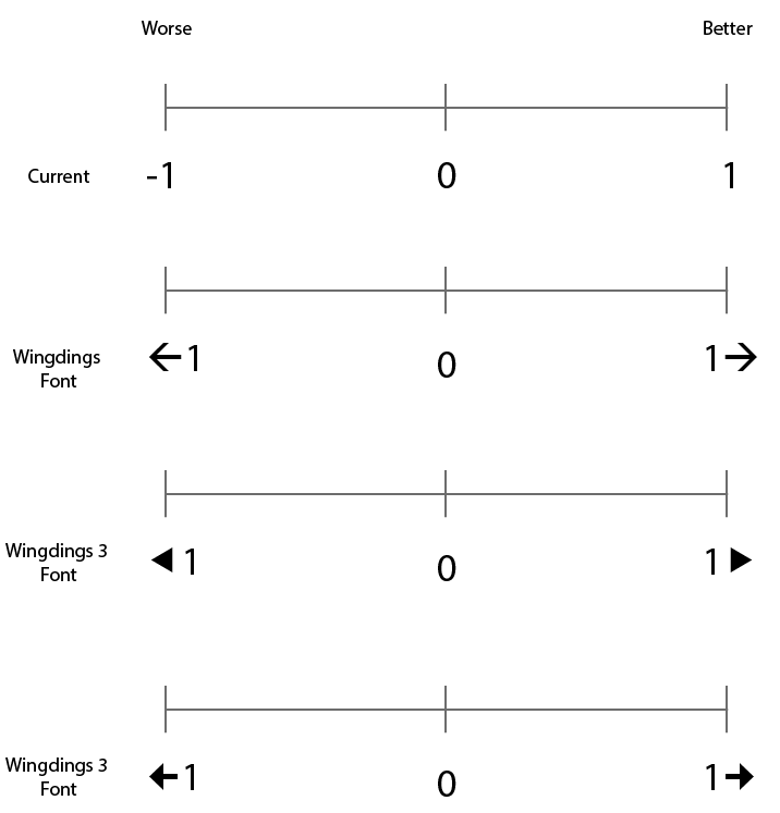
2 - Redefine the graph's metric symbology using other types of symbols to represent worst / best.

Example with alternative font:

enter image description here


Example with html arrows:

←1 –––––––– 0 –––––––– 1→


Example with html symbols:

◄ 1 –––––––– 0 –––––––– 1 ►

enter image description here

2
  • Thanks! I like the superscript take you gave. I'll bring this back to the team for testing. Commented Dec 11, 2021 at 21:56
  • 1
    Superscript seems best to me too. The boxed ones actually feel even more like buttons. Commented Jan 9, 2022 at 17:22
0

I think showing the visual refrence at the interval is a bit of on overkill as it crowds the UI and has exactly the same information as the number. The only way I'd vote for doing that if it would be really in the background, not taking my cognitive abilities in looking at that when I don't want it. You could have a separate more graphical view (kind of reports) where you could then show some visualization within two-dimesnional space (x = time, y = [-1; 1]).

I would not change the "-" for any arrows or something else as those will confuse most people while everybody is familiar with the concept of a minus sign.

Your Answer

By clicking “Post Your Answer”, you agree to our terms of service and acknowledge you have read our privacy policy.

Not the answer you're looking for? Browse other questions tagged or ask your own question.