3

I have an app where from the home page the user enter in a page built like:

  1. List of all registered documents from which the user can choose one of them and send it to the server with a bottom app bar from which by pressing + the user can create a new document.
  2. New document it's a page FORM like where the user has to compile the data about the document
  3. Body it's the part where the user has to insert all items which belong to that document

For now i show all it in a TAB menu the issue is that there are lot of scrollable elements and a TAB layout it's not appropriate as the user can swipe between views mistakely.

Here is a preview of how it looks like:

enter image description here

2
  • Tabs are for views... are these steps that the user has to take to process a document?
    – Izquierdo
    Commented May 11, 2021 at 22:32
  • @Izquierdo it's an inventory app where the user have to scan the items which then will be sent to the server, all items belong to a "document" where before adding the items it's needed to add some other info about that document, then each document can be modified again by adding other items to it or the sent items can be reviewed in the list shown in the first tab Commented May 12, 2021 at 6:29

2 Answers 2

3

I've changed the whole layout in to a single page now it looks like only the list screen, by pressing + a bottom sheet will compare where the user will fullfill the form (same bottomsheet like in GMAIL when writing a new mail on iPhone) then once the user confirm it i collapse the BottomSheet and load in the view the page where he have to add products, by backpressing the user will return to the list screen and then to the home screen.

Here is how it looks like now:

enter image description here

Any improvement and comments are welcome

1
  • Hi Igor, the answers section is for answers - could you please modify your original post with the updated design information? Thanks.
    – Izquierdo
    Commented May 11, 2021 at 22:05
2

I can think on 2 options:

  • Swipe progress flow: As per what I see instead of having the tabs you could benefit from using a slider with dots. This will show the user how many steps are remaining in your workflow providing a sense of progression and give it the flexibility to still move across them without using a tab for this particular task

Slider Carousel

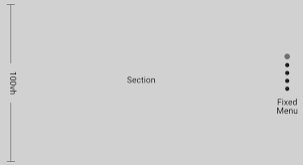
  • Vertical flow: Another option would be to use vertical flow with blank spaces to separate step, if you want to provide some order you can put anchors in a similar way to indicate the user where it is at the overall flow:

Vertical Slider

On both cases the idea would be to use swipes as the way to transition between states

1
  • I've tried to do something like that but it was still too confusional to use so i simplified the layout to single page, i've just added an answer with how it looks like now Commented May 11, 2021 at 16:32

Your Answer

By clicking “Post Your Answer”, you agree to our terms of service and acknowledge you have read our privacy policy.

Not the answer you're looking for? Browse other questions tagged or ask your own question.