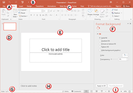
Center-area concept:
For a desktop application, we commonly find a similar structure for the GUI:
- Top menu / Ribbon
- Dockables left and right to explore the content and show properties.
- Center-area with the main content or view. Internal frames are deprecated in favour of file tabs.
I am not sure about the name of this "center-area", my apologies if there is a more appropriate name. For the purpose of this question, I will keep calling it "center-area"
As an example (E is the center-area):
Multiple center-areas concept:
Let now suppose a use-case where several views of the same "file" or "project" are useful with an equivalent importance: to illustrate this principle, I will take the example of a "3D printer" slicer.
- The 3D view is required to be big, so details and possible issues are well visible. (It makes sense to have it in the center-area).
- The user spend 90% of it time on settings and configurations, which would ideally be in the center-area. Note that applying those settings (slicing) take time (usually many seconds), so there is no point in showing the 3D view and settings at the same time.
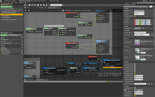
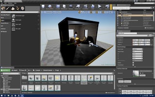
An other example is a 3D engine editor:
- The designer spend lot of time editing the 3D view, by placing new models in it (it makes sense to have it in the center-area).
- The designer spend lot of time configuring shaders managing huge graphs. (it makes sense to have the graph view in the center-area).
Note: I want to highlight the difference between having multiple content in the same center-area GUI (e.g. multi-files in your browser), versus having multiple GUIs filling the center-area, for the same project or file.
The question (s):
Is having two(or more) GUI filling the center-area a good practice?
Otherwise, what are the alternatives?
Finally, is there a name for this multi-central-area GUI?


