18

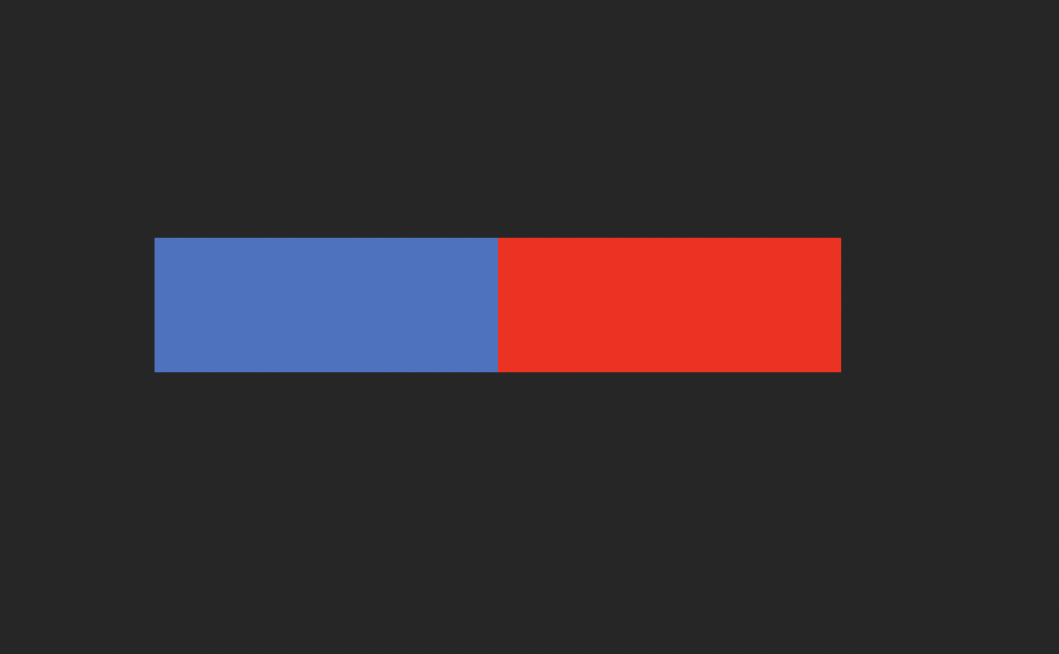
For me (wearing glasses) the red box below appears to be slightly above or below the blue one, depending the angle I'm viewing it. Some of my colleagues don't see it and some do. Not all wear glasses. Does anyone know this effect and the cause?

The use case is that we are designing our web app using a dark theme from clarity. When using a button group and placing a primary (blue) and danger(red) button next to each other, the red button appears to be slightly above or below the blue one.

enter image description here

6
  • 9
    Unrelated to the question, but having a "danger" button literally touch a primary button doesn't seem like good UX. Also don't forget to consider accessibility when choosing red to indicate the type of button: ux.stackexchange.com/a/125674/8407
    – mowwwalker
    Commented Jan 22, 2021 at 20:38
  • 6
    Chromatic aberration in eyeglass lenses makes blues and reds bend differently. This can present the illusion of blues and reds splitting when you are looking anywhere except through the ideal center of the eyeglass lens. Take your glasses off and it will go away. The effect is more pronounced for those who have stronger prescriptions - especially for myopia. You can see similar effects at a strong black/white boundary, except in that case you will see yellows and reds bleeding off one direction and blues and magentas bleeding in the opposite direction.
    – J...
    Commented Jan 22, 2021 at 21:54
  • 1
    Chromatic aberration
    – J...
    Commented Jan 22, 2021 at 21:59
  • 1
    It's definitely the glasses. I never used to see this until I changed prescription, and now I see it way too much. Commented Jan 23, 2021 at 15:13
  • 3
    @Dithermaster It can be the lens material you choose also - if you went from thicker low-index plastic to a thinner high-index plastic then one of the tradeoffs for the thinner, lighter lens is a higher dispersion in the high-index plastic which causes stronger chromatic aberration. If you really don't like it, one way to reduce it is to opt for the cheaper low-index lens material next time you buy glasses. You end up with thicker and heavier lenses, but colour fringing would be reduced. You'd be looking for a lens with the highest Abbe number
    – J...
    Commented Jan 23, 2021 at 19:28

4 Answers 4

22

At first I thought this was going to be a 'contrast ratio' or 'colour difference' effect from the 1 pixel darker borders (or maybe it's just aliasing) around each button. But the coloured border effect is a constant colour all the way round, and the red button looks lower at the top and the bottom when compared to the blue.

So I suggest this is an effect called Chromostereopsis. It is usually observed using a target with red and blue bars and an achromatic background - exactly as you have here. You can perceive a positive or negative chromostereopsis when the red bars are perceived in front of the blue or vice versa, explaining why some people might see the red button higher or lower than the blue.

The visual effect may be a result of chromatic aberration resulting from "the differential refraction of light depending on its wavelength, causing some light rays to converge before others in the eye". But you can read plenty more about it below, rather than me pasting chunks of the internet! :)

Ref: https://en.wikipedia.org/wiki/Chromostereopsis

5
  • 2
    Thanks! Finally something tangle to present to my team!!
    – Han Che
    Commented Jan 22, 2021 at 9:38
  • 3
    It's definitely because your glasses refract red and blue light oppositely. When I take my glasses off the effect completely disappears, with my glasses on the effect is very pronounced, and I have noticed this for a long time; for example when tilting my head while wearing glasses and looking at some "white" lights they get split into red and blue blobs, both moving to opposite sides of the light source.
    – user67467
    Commented Jan 22, 2021 at 17:32
  • 1
    I am not wearing glasses and this effect happening to me @theonlygusti
    – Junelilly
    Commented Jan 22, 2021 at 17:35
  • 1
    @theonlygusti It can be a result of glasses, but it is not always. I see it clearer in this case without my glasses because my astigmatism (which is almost completely corrected by my glasses) accentuates the effect rather significantly (unless I turn my head on it’s side relative to the image, which makes the effect almost completely disappear). Commented Jan 22, 2021 at 17:57
  • Without glasses the join between the colours is 'uncomfortable' for my vision, but at the same level. It looks like a visual illusion.
    – PhillipW
    Commented Jan 22, 2021 at 22:32
6

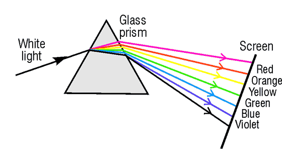
It's exactly because lights of different wavelengths are refracted differently through a prism, or any other optic instruments with two non-parallel opposite surfaces.

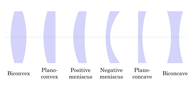
Your glass works exactly like the prism above - in a different direction. Typical glasses for the short-sighted looks like the 4th one below - the negative meniscus one.

The lens in your eyes behind your corneas also more or less contribute to the effect you're seeing. That's why the vertical displacement effect perceived by some people is more noticeable than by others.

3

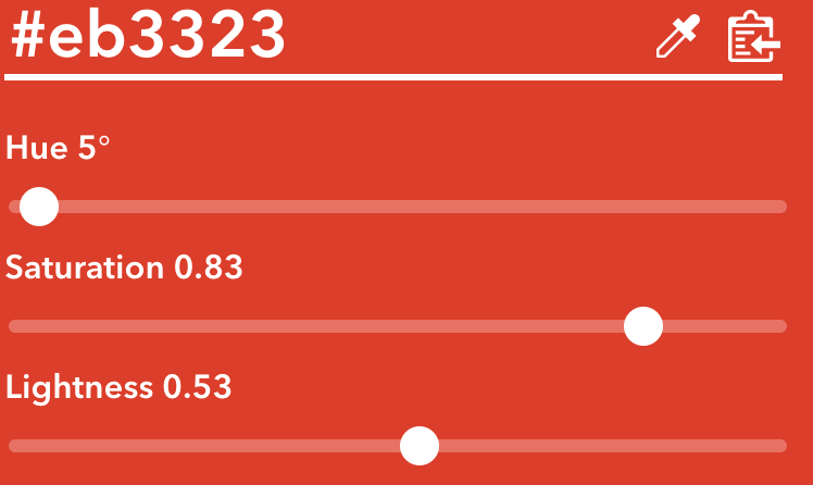
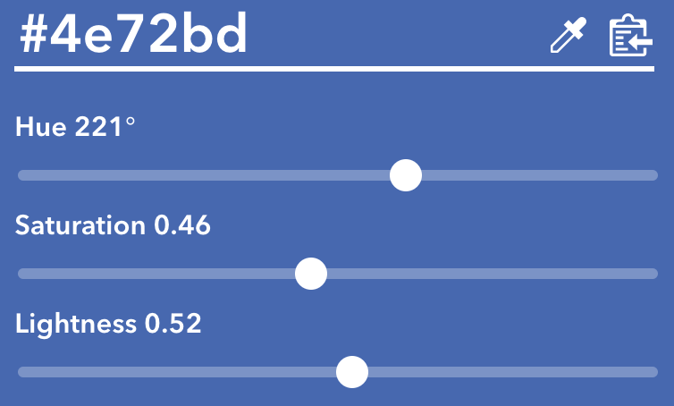
The fact that the red is more saturated (0.83) than the blue (0.46) might also make it pop-out more

enter image description hereenter image description here

0

While other answers correct, additional straightforward factor that affects perception can be pretty technical — red LEDs on the surface of display are slightly shifted in vertical or horizontal direction (depending on the type of the matrix), compared to blue or green LEDs, so edges of color plates are perceived shifted, especially at non-Retina displays.

Your Answer

By clicking “Post Your Answer”, you agree to our terms of service and acknowledge you have read our privacy policy.

Not the answer you're looking for? Browse other questions tagged or ask your own question.