I know the Ribbon was intended to replace the conventional menu, but are there any examples of desktop applications which attempted to use both? If so, how was the end result? Was it a nightmare? Did it actually create an interesting and maybe efficient interface tailored to that specific application? Keen to hear your thoughts!
-
I am pretty sure that the Microsoft suite of products continues to use both types of strategies to allow users to access features. Are you talking specifically about applications outside of Microsoft products? I think it would be interesting to see some examples in the answers :)– Michael Lai ♦Commented Jan 21, 2021 at 4:50
Add a comment
|
1 Answer
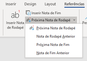
Word merge the two styles, but the dropdown is a additional menu.
When the selected option has few options, they use a dropdown, when has a lot they open a modal with the options.
I think this type of design tries to reduce the learning curve for users. Using both menus can offer many paths to the user and become confusing.
But if you want, you can perform usability tests and asking yours users about how they feel.

