1

What would be a good design on an app for a time picker, incremented by 30 min with some blacklisted times? So for ex. 9:00am, 9:30am, 10:30am 12pm, 12:30pm etc.

checked all over for inspiration, but couldn't find a good answer...

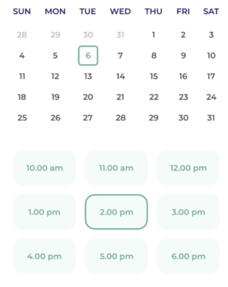
I was thinking to do something like this:

enter image description here

but I think that will only work if there aren't that many options. Since I will be having a lot of times (from 8am - 8pm), It's just too much for the user and they will have a hard time finding the time they are looking for

3 Answers 3

1

You're on the right track! If there are too many time slots available, you can arrange all of them vertically either on the right of the calendar (if on desktop or tablet) or under the calendar (if on mobile) and the user will be able to scroll through the available times.

1

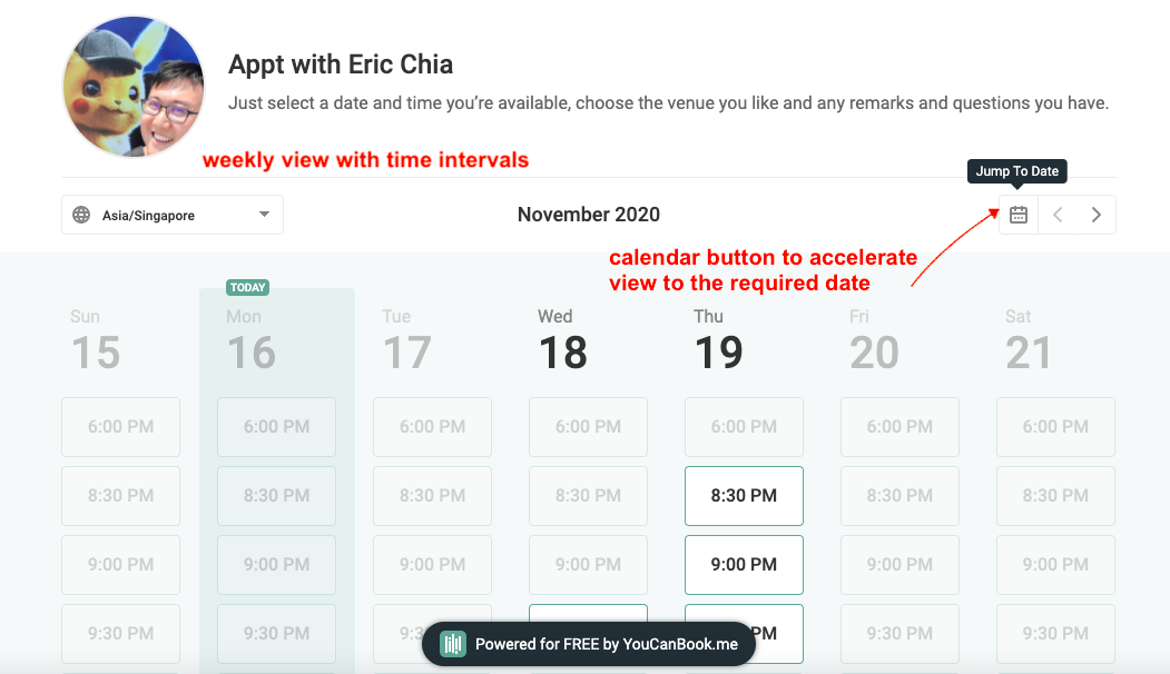
I thought you may like to draw some inspiration from this web app: youcanbook.me

They did a nice interface for time picker with blacklisted time, I share a screenshot on how it looks like for users selecting a time. The app is done in a way that users can set up the interval length and day of the week to start.

screenshot of user interface on youcanbook.me showing how users can easily pick a time slot on a calendar

1

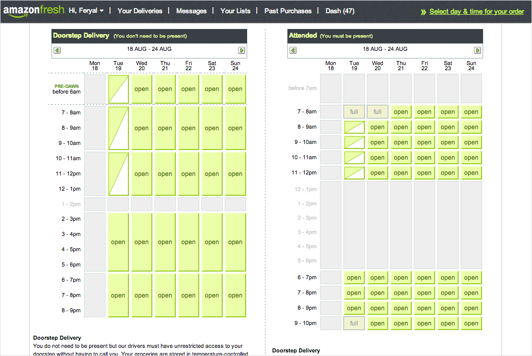
Amazon Fresh did something similar, they display all options and what blocks are available, which ones are full and the benefit of also being able to display which ones are mid-full

Amazon Fresh

Your Answer

By clicking “Post Your Answer”, you agree to our terms of service and acknowledge you have read our privacy policy.

Not the answer you're looking for? Browse other questions tagged or ask your own question.