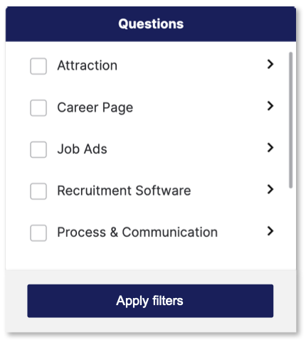
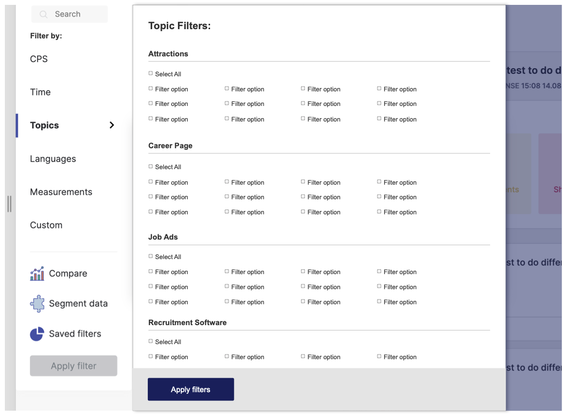
currently, I'm redesigning a data-driven platform with a side filter bar. Every filter opens a pop-up window with filtering choices. To apply filter user has to click the "apply filter" button - implemented on the bottom of the side filter bar(we might change it in the future but for now as I discussed with developers we aren't able to implement dynamic filtering which would not require "apply filter" button due to the fact that database is too huge to implement it dynamically). My question is - when the user chooses to filter options on the pop-up window he can't close the window(unless he clicks outside the window) or he doesn't have any component which would confirm his changes before he clicks the apply filter button. Do you have any suggestions on how I would be able to improve this user flow? I think it seems not user-friendly that when the user chooses few options the window doesn't close - the user clicks outside of pop up to close it and I just wonder how to improve it. What is important to remember the user still has to click the apply filter button at the end to apply filters...Any suggestions on how to improve it?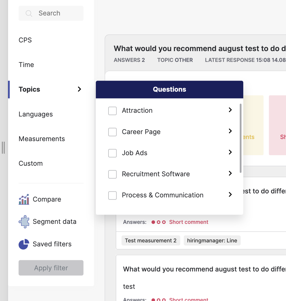
2 Answers
Given the system constrains and the user flow, the "Apply Filter" button could be within each pop-up filter window. So the user applies each category of filters before moving to the next.
Furthermore, it seems the popup has more levels of filters to it with a checkbox option to select all child filters under each. The levels and number of options might be too overwhelming for such a small popup. One alternative is using the real estate of the screen to showcase all options at once.
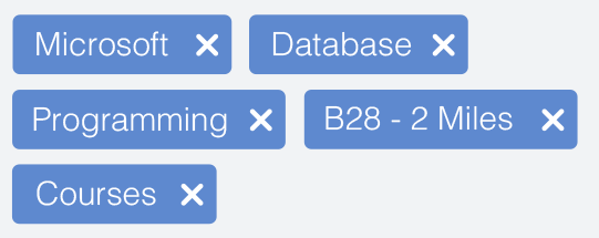
Lastly, this amount of filters needs some way of tracking and managing for the user. Consider something like filter tags.
-
Dear Nicolas, thank you for your valuable insights. Regarding suggestion number 1 and adding the button for each category - would then data filter after clicking on each button for each category? would you delete the main button? or I would ask the user to confirm the selection and click the button on the bottom too? I ask cause as I discussed with developers the current solution allow us to filter data in the end otherwise it's just overwhelming for current capacities. Commented Oct 15, 2020 at 8:30
-
Regarding suggestion number 2 - I considered this solution too. Indeed on the demonstrated example, the filter has more levels and the next levels consist of the question for each topic. My only concern was that not all filters are as complicated. Ie. "Languages" filter consists (at least for now) 2 main options....maybe in the future, it will be more. it also depends on the company (customers and in which country they use the platform). Time and CPS are also more "simple" pop up modals without levels. Would it be still appropriate to add different view for topics? Commented Oct 15, 2020 at 8:34
-
Regarding suggestion number 3 - indeed I've already added filter tags - they appear after clicking the "apply filter" button. Moreover, every filter tag has its color assigned to right category. Next to category user is able to see the notification with the same color and the amount of chosen filters to decrease overload of information and simply recognize which filter tags are assigned to which filter. Commented Oct 15, 2020 at 8:37
-
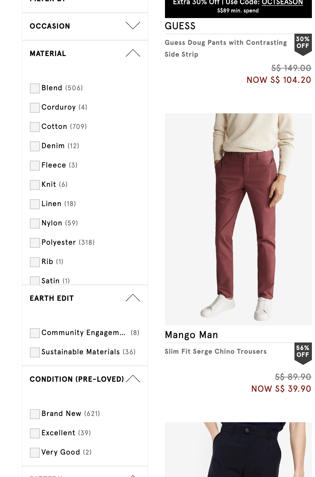
1Hi Lorelei, #1 would have the button for each category without the main button. The issue with the main button is that it's a bit disjointed taskflow-wise. The user is focused on the "popup" while the confirmation button is outside of it. If the interface is changed to a more traditional accordion style (categories expand within the sidebar), then the sidebar button would make sense (the user is interacting with the sidebar only while the confirmation button is within that sidebar).– NicolasCommented Oct 15, 2020 at 10:44
-
1As for number of requests for #1, requesting by category is still much less than a dynamic solution. Worst case would be 6 requests. Ultimately this will still depend on the developer's opinion.– NicolasCommented Oct 15, 2020 at 10:46
-
thank you, Ameen. It was the primary idea but due to the fact that some of the content are the questions up to 125 letters I had to resign from it :( so for instance is 6 rows with questions up to 125 words...it wouldn't be readable. Furthermore, it would be too much scrolling Commented Oct 16, 2020 at 9:21

