2

Currently, I'm working on a data-driven platform. I designed a side filter bar that allows users to filter data dependable on their needs.

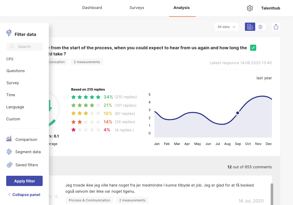
The problem appears on smaller screens. After a discussion with my team, we decided that the side filter will be always open by default on smaller screens and will overly the content and the user will be able to close it. The solution is indicated below.

I'm concerned about this approach (the filter bar overlays content - I believe it's not the best user-friendly thing to do) and wanted to hear your insights maybe exists a better user-friendly solution?

Do you think this approach is ok?

What do you think about the filter bar (it connects 3 different filtering options - regular filter data, comparison view, and advanced segmentation) Due to many filtering options which are equally important I decided to go with a side filter.

enter image description here

3
  • Hi, Could you please give more info about the 3 filtering options you have given and how? Along with that, what does saved filters open ? a modal pop up? I am seeing that there are no sub filters in main filters shown. Could you tell this info too ?
    – Ashumk
    Commented Oct 8, 2020 at 2:28
  • When filter is active the chevron-right appears next to filter and typography of active filter is bolder. Each filter opens a side filter - modal pop-up. This solution was implemented due to lack of space of a side nav filter bar and big amount of options too choose from while filtering (it's based on survey so ie. you are able to choose questions) The other filter is "comparison view" and "advanced segmentation" they are rarely used by users. for now hence the filters are wrapped. Saved filters - that's filtering options saved by clients - so they don't have to choose same set-up again. Commented Oct 8, 2020 at 4:42
  • 1
    People will be looking for a way to get rid of the panel since it is blocking their view. They have to scan the whole thing and read the link below to understand that it is what they are looking for. A "x" button in the upper corner is a better idea as it is the first spot that people will scan and the "x" is easily recognized as a close button.
    – jazZRo
    Commented Oct 8, 2020 at 7:35

3 Answers 3

1

It seems the image provided would not really qualify as a "small screen". There is plenty of room to rearrange the body content and fit the filter sidebar to show at all times.

Filter overlays that hide the body is more suitable for small screens such as mobile, where screen real estate is very limited.

Covering the body with the filter options is not an issue, after all, the user cannot find what they are looking for in the body and therefore want to make a filter selection. Meaning the goal is to filter and the screen should show filter options only. When the goal is selecting a filter option, irrelevant body content is a distraction.

If overlaying is still a concern, another approach is pushing over the screen. The filter menu pushes over the entire body (hiding some of it to the right) enough to fit the filter menu in the viewable area.

1
  • Dear Nicolas, the indicated screen is 1000 px width. Indeed in the example above it would be possible to shrink the content within question card - but what's important to nitice is a fact that the platform has many question type cards and the content differs - to more complicated one like - multiple choice questions etc. Thank you for your advice Commented Oct 14, 2020 at 7:55
1

Not sure if you have explored turning the side filter into a permanent frame and use responsive design to visualise the data on the main frame.

I’m suggesting this because your team has decided that the side filter is important to keep open when the user goes in, and it seems your filter is complex it may be good to keep it open so that users can refer to the filters applied while looking at the data.

I’ll update my answer with a sample picture when I see a similar design. Recall that I saw something like this before.

0

On mobile, depending on what your users expect, filter should be clear, but clearly signalized with button. On click you can use i.e. Bottom Sheet to show it then, with option to close it.

Your Answer

By clicking “Post Your Answer”, you agree to our terms of service and acknowledge you have read our privacy policy.

Not the answer you're looking for? Browse other questions tagged or ask your own question.