0

I'm designing a UI where sections will become editable, and there are also quite a few help icons for users to get further information about each section.

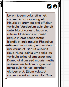
Originally, I put the Help icon in the top right of each panel / section with the edit button immediately to its left. Then if they go into edit mode, the edit button changes to a Tick, representing 'save'.

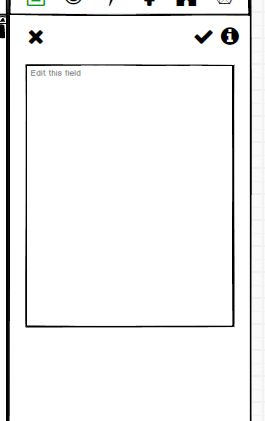
But I was wondering what I should do about a Cancel button, which I'm guessing would be represented by an X.

My options are:

  • Don't include a cancel button as its clutter outweighs its usefulness

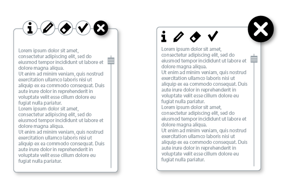
  • Put the Cancel button in the top left of each panel (but this feels wrong as X type buttons are usually top right

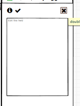
  • Put the Cancel button in the top right and move the info and tick over to the left, or somewhere else (which also feels wrong)

I don't really want to put the save and cancel buttons next to each other as it seems too high a risk of misclicking with very frustrating results.

I'd love to know if there is established best practice / research on user behaviour with regards to this, or failing that, people's informed opinions.

Thanks!

Here's some images to help show what I mean:

enter image description here

enter image description here enter image description here

1
  • There is already a good answer, but to add to that, the biggest pain point you may have is user's diferentiating between cancel and delete. I like to use an X for cancel, and a trash can for delete, to help users tell the difference.
    – Kelderic
    Commented Sep 23, 2020 at 14:00

1 Answer 1

2

Instead of thinking about where to put the buttons, what can be useful is to think about the global functionality of each elements by group.

As explained in the question there are three main groups:

  1. Edit window
  2. Toolbar for editing
  3. Cancel the edition

Differentiating these three elements makes the design decision easier. The base element is the edit field. The tools only affect this edition, in fact among the tools I personally miss the "clear edition" tool which can be an "x" (the eraser). While the "cancel" button affects the whole screen. Viewing all components in a basic mode in their areas of operation can help decide a future design:

enter image description here

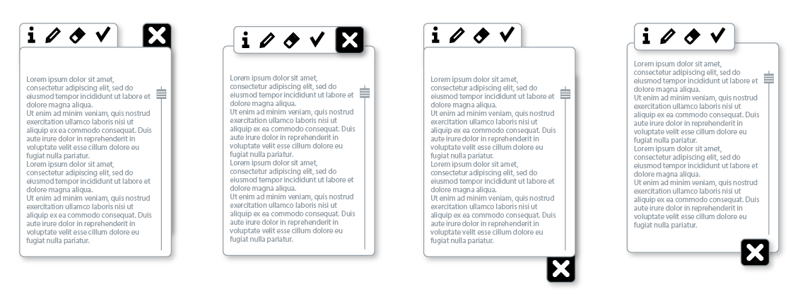
From here on, the design decision only affects to make a good visual contrast between each of the three groups. Obviously, the more exaggerated the contrast (color, position, size, style...), the greater the clarity of each group functionality:

enter image description here

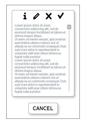
In terms of design there are several options: toolbox, tools tab, floating windows, buttons, ...

enter image description here

2
  • Thank you for your answer. I really want to keep the minimum of icons visible at any one time to avoid clutter, so I don't need the edit button visible at the same time as the tick and cross. But I'll have a think about your suggestions, and thanks again for taking the time to answer.
    – user139342
    Commented Sep 24, 2020 at 11:27
  • Contrary to what you describe in your comment, the answer is not about adding icons, but about finding graphical simplified solutions according to the functionality of each component.
    – Danielillo
    Commented Sep 24, 2020 at 12:09

Your Answer

By clicking “Post Your Answer”, you agree to our terms of service and acknowledge you have read our privacy policy.