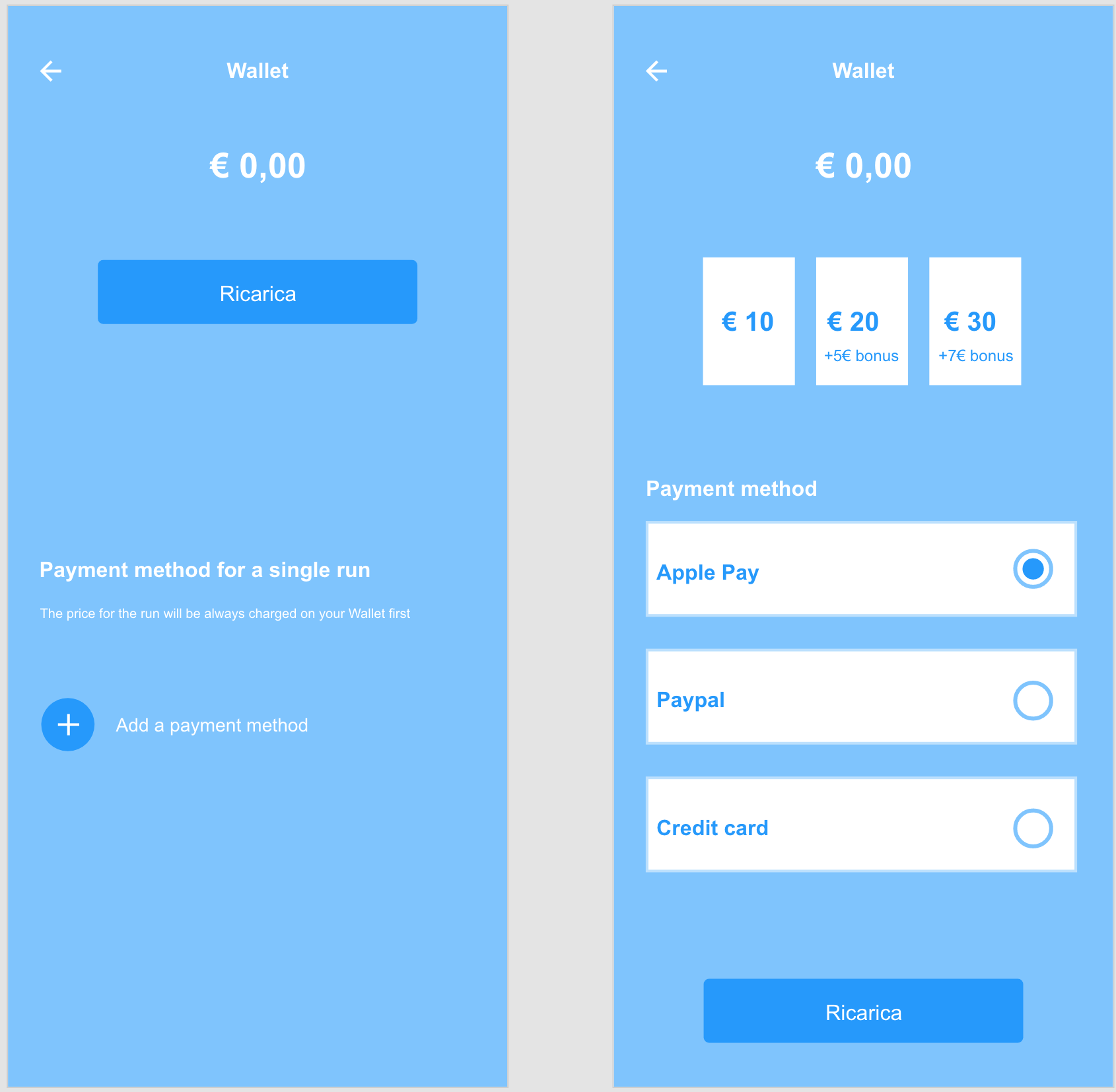
I am working on the ux of an app for e-scooters sharing.
The system has two different ways of payment systems.
- you scan the QR code, set the payment method and then once you park the scooter you get charged directly on the payment method you selected
- you has a wallet, you can recharge 10€-20€-30€, select a payment method and when you finish the money on the wallet the scooter stops.
When the user set a payment method can be tricky for him to understand what is the payment method for.
I am at this stage at the moment: 
I have two main problems here:
- is it clear enough that there are two different ways for paying?
- In the second screen, I decided to use the Radio Botton, but I'm not sure of it. If the user select Apple Pay he can pay directly when he click on the CTA. Meanwhile if he's using a credit card/Paypal, he needs first to fill the apposite form to save it. How can I have this step in the process? If I use a "+" instead of the radio Botton the problem becomes Apple pay D:
