2

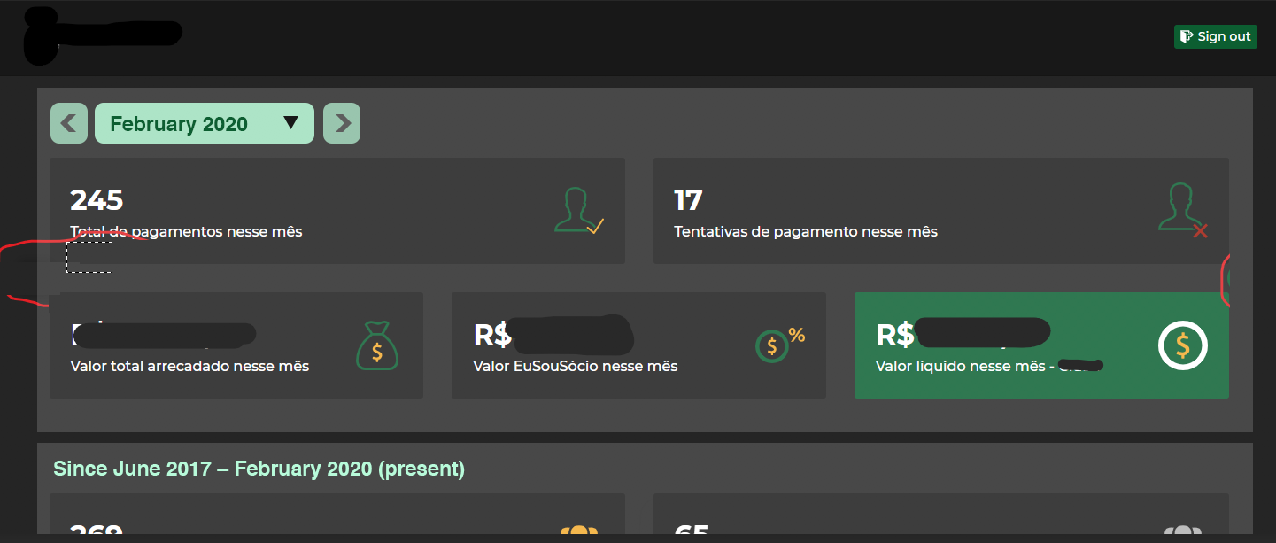
We have a Dashboard, that summarizes the earnings of an App, by month.

The entire view rendering is based on the current selected month, but some sections of its body contains an overview through the entire app life-time (from the very MVP until now).

Recently, we've added the possibility to navigate through months and years, by adding:

  1. Controls in the header, with free choices of [avaible] months and years;
  2. Controls in the "In this month" (summary of current month), with navigation back and forth between months (and years, when it eventually reachs the max/min month);

One of my colleagues pointed that 2 should be with 1, since it controls the view/navigation of the entire dashboard and belongs to the "same context".

In my opinion, I think it is alright to keep at the location where the end user will bat his eyes first, and probably will reach with his mouse or pointer within the section (triggering the effect to show that there are controls to change the view) where the most important informations are located.

Addition: Scrolling down there are two tables that are also dependent of the current month, we do inform the end user from which month he's currently viewing the that from.

Maybe I'm overthinking this and should put everything all together, but this question makes me uncomfortable 😆.

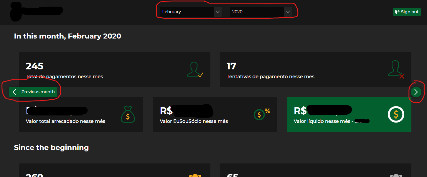
View controls example

1
  • Your question could be worded in a different way as it seems to ask: Should I trust my colleagues design advice over my own opinions? Your colleague has a good point. IMO your design is can do with some visual cleanup (back and forward buttons are not well placed, lack padding, aren't well distinguished from neighbouring widgets) and is ambiguous when considered along with the existence of browser back and forward navigation.
    – straya
    Commented Mar 11, 2020 at 7:25

1 Answer 1

2

Try grouping elements that are bounded by a similar time context. Take advantage of proximity and hierarchy so users are not confused by two different date ranges.

In your example, you have a top level time picker (which also suffers visibility), and you then change that context about 400px later down the view.

Why not take advantage of the laws of proximity, and bind each time context using grouping? You also can combine the month and year into one picker (there are libraries for this control available), and suggest monthly navigation right next to the time control.

enter image description here

Your Answer

By clicking “Post Your Answer”, you agree to our terms of service and acknowledge you have read our privacy policy.

Not the answer you're looking for? Browse other questions tagged or ask your own question.