2

I have a form for a search filter. In this search filter, however, I have two inputs for the "main bulk" of the search, and afterwards I have other filters for fine-tuning the query. My problem comes from the fact that at least one of the two "main filters" is required for the search to proceed, and both combos contain identical (or at least share some) items that can be selected.

I can have Filter A filled, or Filter B, or both, but not neither.

I have found this post about “multiple fields, at least one required” and this one about a group of fields, and while they do provide a few solutions that I have considered, I believe my situation is a bit different in that I'm not asking the user to fill a form, but to simply select items in one of two combos in order to proceed with the search.

Currently, I've left it to a message when the user tries to click the "Search" button, but I would like for something a bit more visually telling.

How can I visually communicate that at least one of two combos is required for a filter?


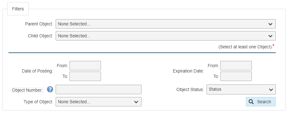
EDIT: Ended up implementing xul's answer into my form, and results are as follows:
2
  • Is providing a default selection in the filter not an option?
    – Michael Lai
    Commented Mar 2, 2020 at 23:05
  • @MichaelLai Unfortunately, I can't pre-select an item, as there's no parameter to determine which one should be selected by default. At most, I can leave the previously-selected item between sessions.
    – Hugo
    Commented Mar 3, 2020 at 11:24

3 Answers 3

1

You should separate this two fields with more margin to bottom, and optionally horizontal line. Below or above fields you can just place small text "at least one selection needed".

2

Three things:

  1. Make the required fields stand out more. There needs to be a visual priority in what fields are more important.
  2. Disable the Search button, and if a user clicks it, highlight the required fields, and optionally display a notification or text near them.
  3. Enable the Search button as soon as the user fills one of the required fields.
0
  1. Condense the options across the two selection fields into a single selection field.
  2. Add an option to add another filter (which makes a similar selection field visible).
5
  • I can't condense both options because they share some (or all) items between them. I've edited the main post to include that bit of information.
    – Hugo
    Commented Mar 4, 2020 at 12:04
  • So you expect the user to expand both selections to identify all options and carefully choose the appropriate one or two? Sounds like something most users won't want to do, resulting in most users not doing it. I think you can follow my approach, just surface all of the unique options available OR only the parent options, then allow a second set (options for which could be filtered dynamically based on whatever strange logic your system requires).
    – straya
    Commented Mar 5, 2020 at 2:48
  • Depending on which user is logged in our system, the number of items in a given selection field can vary between 1 and 800. While the vast majority of users are used to this selector (we have it across our system), we still haven't found a better way of letting them select a single object that is user-dependent and often a requirement. As an example, suppose the user had to select between a list of email senders and receivers (and suppose they couldn't just type it, just select it). They have to select at least one of the two, but could select both, in order to see a list of email exchanges.
    – Hugo
    Commented Mar 5, 2020 at 12:39
  • "suppose they couldn't just type it, just select it" why don't you allow them to type it? In a way they can type it using a vanilla select input field (keypresses scroll to that position if alphabetically ordered). Autocomplete could work well there. Having to select one option from 800 isn't a great experience in itself.
    – straya
    Commented Mar 5, 2020 at 23:25
  • they can filter results within the selection menu. And there's absolutely no way of not having up to 800 possible items to select from. Going back to the email example, imagine I can't just type any email: it has to be an address registered in our system. Autocomplete could be more of a hindrance than a helpful tool in that I wouldn't know which options there are until I started typing. I have a similar configuration in my page, so it has to be the selection menu plus filtering in it.
    – Hugo
    Commented Mar 6, 2020 at 11:41

Your Answer

By clicking “Post Your Answer”, you agree to our terms of service and acknowledge you have read our privacy policy.

Not the answer you're looking for? Browse other questions tagged or ask your own question.