1

enter image description here

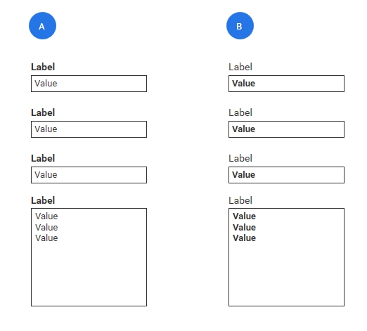
This is a wireframe of an example of a future company styleguide. The styleguide says: option B (label normal, input bold), focus on the content in the textboxes. I have never seen anything like this. What is your opinion? What advantages could option B have?

This form is part of a software for large numbers (dozen of text-inputs) in the accountancy area.

The style decision comes from one of Europe's best UX agencies. I want to understand their goal.

This is a B2B environment using desktop software.

2
  • To identify possible advantages of B, you should try and visualise the form with real information. There is no wrong or correct example. In B I can imagine that the labels have little importance and for some reason you want to give emphasis on user content. However, with textareas present in the form, this might cause user fatigue. Most people are not used to scan for information in this way. I would also like to say that it is best to discuss such design decisions when creating your mockups. Wireframes have a different purpose. Commented Feb 7, 2020 at 23:27
  • @ZoeMarmara thank you. Yes, my wireframe was only to show the problem. Thank you for your comment.
    – uxability
    Commented Feb 8, 2020 at 16:31

1 Answer 1

1

Option B would better suit experienced users (power-users) as they would be, through working with the system and/or the data the system is working with, more familiar with the data and how it is presented and managed/transformed by the system. I.e. it could increase productivity.

So, a way to leverage both Option A and B in a system in order to provide a better experience for all users is to utilise Option A until the time that a user is deemed a power-user, then utilise Option B.

Your Answer

By clicking “Post Your Answer”, you agree to our terms of service and acknowledge you have read our privacy policy.

Not the answer you're looking for? Browse other questions tagged or ask your own question.