4

As a complete UX beginner, I am having trouble differentiating pages containing 1-choice-only radio buttons and multiple-choices-possible checkboxes. I feel like there isn't enough to clearly distinguish the two to make it as easy and clear as possible for the user.

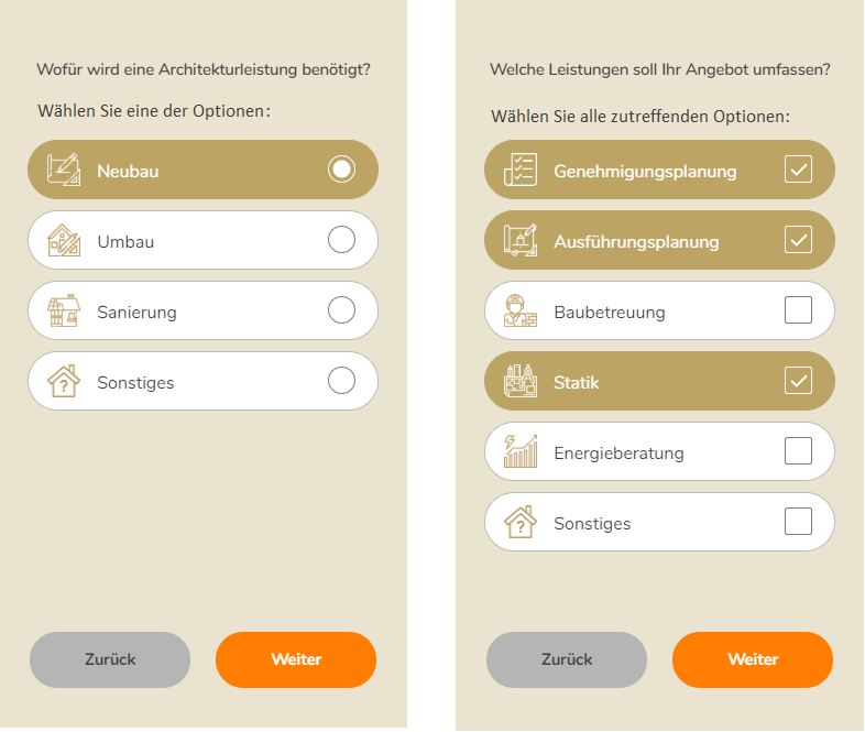
Below are two screens from our (work in progress) lead funnel, one requiring a single choice, and one allowing for multiple choices to be selected:

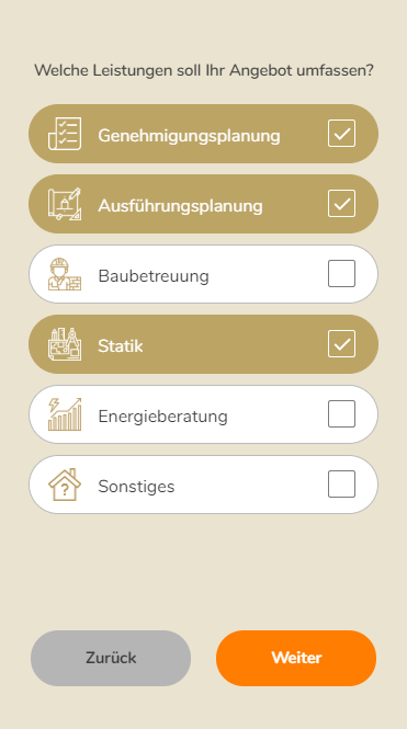
I have implemented clear radio buttons and checkboxes, but feel like it would be too much of an assumption to think that everyone will "get" this. Is this clear enough, or should I put in more measures to help the user immediately understand what is expected of them on the page?

2 Answers 2

4

I feel like sometimes just a little bit more text can be surprisingly effective.
You can simply tell people how many choices they have.

The left could say "select one of the following" while the right would be "Any of the following".

The same screenshot just with a bit more explanation text

Excuse the unfitting font and size, just quickly did this in Paint. The font size of the second line should be the same or smaller than the question itself.

1
  • 1
    You can also support this with additional cues like "1 of 10 options selected" or just preselect all options and let the user disable the ones he does not like
    – Falco
    Commented Jan 18, 2020 at 13:55
0

radio button = 1 choice

checkbox >= 1 choice


Automatically, when validate - the radio button will change, and checkbox will select - it's look clear.

4
  • You're saying it's clear enough? Maybe I'm thinking too much into it!
    – Peasey
    Commented Jan 17, 2020 at 10:36
  • It's fine - You can still think about graying the button (until the user completes the value) - or adding a message (the less is more). If in doubt, this can be improved in subsequent iterations. Button "Zuruck" - you can simply replace it with an arrow (in the right place adequately to the platform - IOS or Android differently) - unless the application is not native - then there are no standards. ux.stackexchange.com/questions/112360/…
    – Piotr Żak
    Commented Jan 17, 2020 at 10:40
  • Thank you very much for the input, Piotr. Much appreciated.
    – Peasey
    Commented Jan 17, 2020 at 10:50
  • Glad to hear ....
    – Piotr Żak
    Commented Jan 17, 2020 at 10:56

Your Answer

By clicking “Post Your Answer”, you agree to our terms of service and acknowledge you have read our privacy policy.

Not the answer you're looking for? Browse other questions tagged or ask your own question.