2

I'm trying to create a smooth way of adding users into a list on a page. The user has to add email and full name for a user. And at least 1 user should be added before being allowed to proceed.

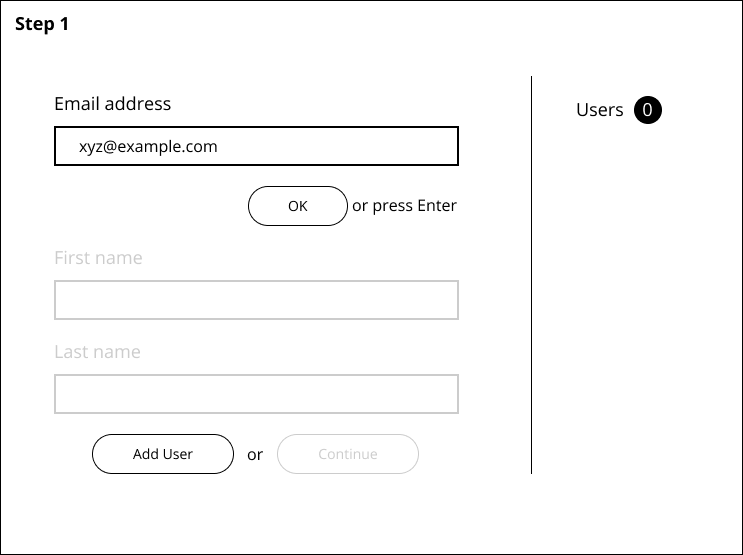
You must first enter the email address and press okay to move to next field

Step 1: You must first enter the email address and press ok to move to next field

enter image description here

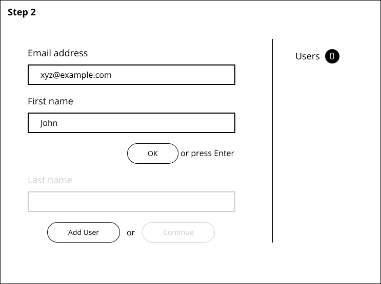
Step 2: Enter first name and press ok

enter image description here

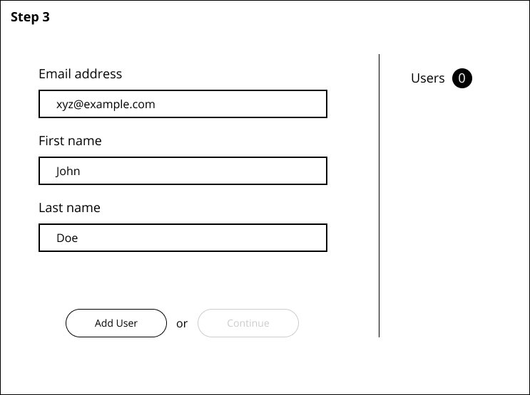
Step 3: Enter last name and press Add User. This will input this into the list on the right.

enter image description here

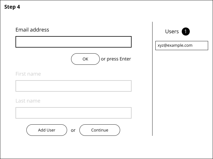
Step 4: Now that a user is entered into the list, the continue button is also accessible.

My questions are - Should the "Add User" button be disabled until the user has filled in all fields. Right now, clicking Add User without having filled in all the fields will bring up an error message on that field saying "Fill in this field". Also, if I disable the Add User button, it will get enabled when the fields are filled - but as soon as you submit - it will get disabled again (waiting for next entries fields to be entered) - So it'll be a constant disable enable of the Add User button.

Should I have the "ok or press enter" buttons to take the user through each input field? Or is this cumbersome.

I'd really appreciate some help on this.

Edit 1: Thank you guys for the help on this. The key takeaways were to remove the "Ok or press Enter" buttons, and to stack all of the input options without greying them out.

Secondly, the other takeaway was also to make Add User always available. And my bad, I didn't mean a pop up - but rather an error message bubble that tells a user what information is missing.

I do have another concern now - Where do I place the continue button? Is the "or" between Add User and Continue enough to distinguish between the two? Where would you put a continue button to essentially move on from this page.

1
  • 2
    I'd prefer seeing the "Continue" button at a place on the container that is conventionally used for same action on other similar screens. In general, this button probably belongs on the right side section of the screen, under list of users and enabled only if at least one user exists on the list. Also, it'd be cool and informational to show a "add at least 1 user to " message before the continue button and then hide the message when a user is added on the list or show it back if all users are removed from list (yes, have a remove button like Xul suggested).
    – Fr0zenFyr
    Commented Jan 13, 2020 at 18:29

3 Answers 3

1

Small noted:

  1. "Add User" and "Continue" should be on different levels because the first one relates to the action inside this form while the second will prompt the user to the next screen. Then it will also be enough space to place the note * at least one user needed to proceed
  2. You may already have it but just in case: I'd say 'Step 2' need more details like "Step 2: Create a list of attendees" (as an example). I'd also like to see the overall number of steps to get more clarity
  3. What do I do if I misspelled the name or the email? I think it's good to have the way to remove the entries from the right-hand list for such a case
  4. Another guess but just in case - most forms need a "previous step" button.
0

Scenario A: You gray out the button until it's reasonable to press it. On a PC you should display at least a tooltip on mouseover - otherwise the user will be confused why he can't press this button. Mark the non-optional fields with a * for example to further guide the user. On mobile devices, tooltips won't work. Here, Scenario B might be better. It's possible to combine both. An alternative to tooltips is an info box that may show a warning triangle and a text. However this is similar to some IDE's telling you "this variable is never used" when you just declared it - it can seem over picky and annoy the user.

Scenario B: You can press the button at any time, but an error pops up and tells you what to do / what is missing. In Addition: A popup error may not be the best option. You could shake the "Add User"-Button and/or tint it red for a second and also highlight the incomplete fields - no popup needed for most cases. If fields are just empty it's enough to highlight them. If input validation failed, tell the user how to correctly fill the field (thinking of valid email addresses etc.)

The other question: "Should I keep the 'OK or press Enter' to move from field to field"? On Desktop computers it's very common to use tab to switch focus. In MS Excel it's tab for the next horizontal cell, and return for the next vertical cell. This should all be optional, like clicking the next field instead. Your images seem like the other fields are grayed out until you accepted your input with "ok" in the first field - I would not restrict it this much.

0
  • You dont need OK / press Enter, if 3 fields are obligatory just leave them by default
  • You can turn on autofocus on first field when user land on the screen
  • You can mark your fields with * or make a small one-time notice on the very top that user is obligated to fill in all fields. That will be a bit more clearer than disabled Button...
  • Continue button, depending on where are Buttons on your other steps, should be separated from "Add user" Button. As here it appears on a place where is as functionally related to adding users, or as secondary / cancel button
  • Your user list on right hand side, should have options to delete user
  • You should signalize that at least one user needs to be added in order to go to next step

Your Answer

By clicking “Post Your Answer”, you agree to our terms of service and acknowledge you have read our privacy policy.

Not the answer you're looking for? Browse other questions tagged or ask your own question.