1

I'm in the process of designing a room booking / availability web application.

Some of the application specifics are;

  • there are 30 rooms (across three floors, in the same building)
  • rooms are of varying occupancy (1 - 20)
  • users can only book within a 24 hour time frame (i.e if I'm on the app at 3pm today, I can view / book rooms up to a maximum of 3pm tomorrow).
  • users can book in 30 minute increments or 1 hour increments
  • users should be able to filter results

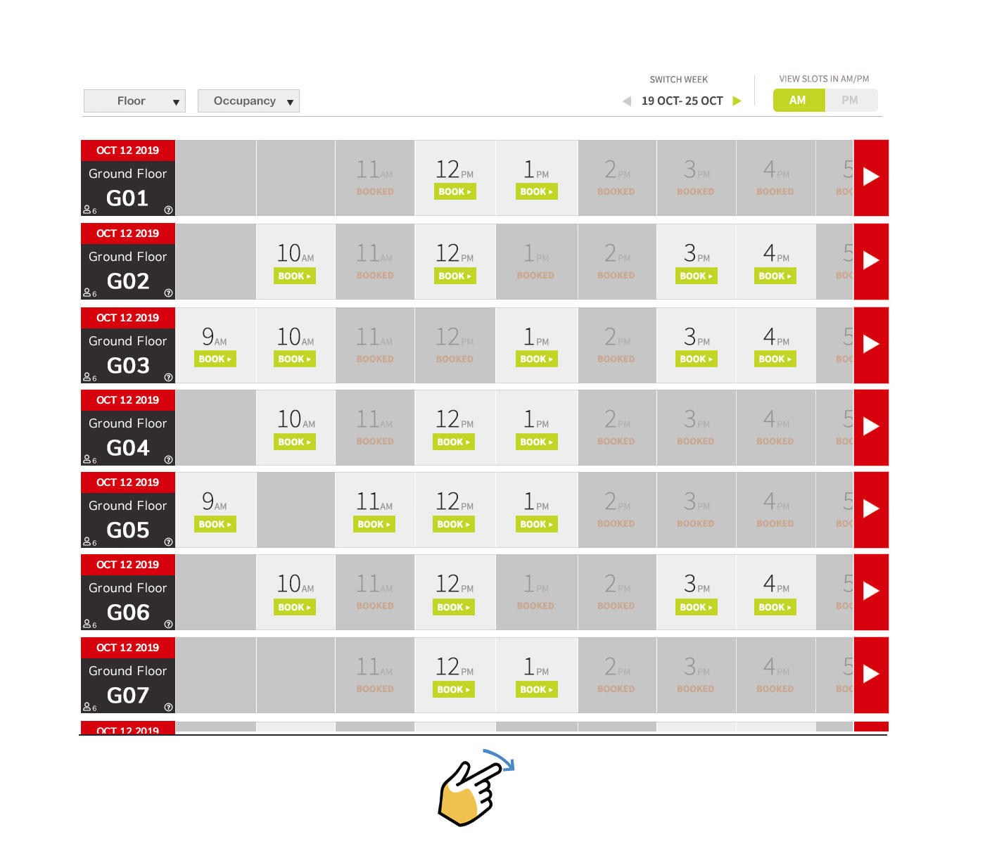
I've created a quick mock-up of a design I think could work (i've edited a design from another question on here). Room names on the left vertical, times and availability on the horizontal.

The room column contains date, floor, room number, occupancy number and info icon (when clicked will display details of room and maybe image etc.)

The time row contains time and status.

enter image description here

The idea is that users will be able to scroll horizontal and vertical but the rooms column on the left will remain in a fixed position when scrolling horizontal.

As the floor and occupancy filters are selected, then data in the table will dynamically change to show only that information.

On smaller screens I imagine that instead of displaying 8 columns, it would dynamically change to show 3, or 4 etc. and the Far left row will remain fixed.

I have a few questions;

  • can anyone see any issues with the proposed design
  • should I allow scrolling of individual rows, or scroll all the rows
  • any suggestions on how this design could be improved
  • any reason why it wouldn't work on a smaller screen

I need to incorporate the red somewhere as it's the brand colour, open to suggestions on the other stuff.

1
  • Does your application need to support only 1hr time increments or 15/30 minutes as well?
    – Mark
    Commented Dec 19, 2019 at 15:50

1 Answer 1

1

I think you have two main types of users here.

  1. People looking for a specific room and time is flexible
  2. People looking for a specific time and room is flexible.

I’m going to follow my gut and say the second use case is probably the one that occurs most frequently. Therefore I think the orientation with time on the horizontal and room on the vertical support easily browsing/scrolling through rooms.

With that said, I think your mockup could benefit from removing some repetition, leveraging more calendar type layout/behavior and making some perhaps commonly used feature easier to adjust frequently.

Consider the following adjustments to your mockup:

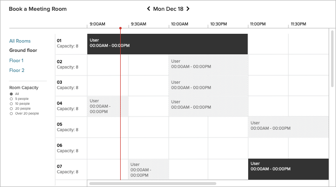
enter image description here

  • Clearly indicate the users task (though you didn't specify I'm assuming this room your booking is for a meeting)
  • If showing one 24hr time frame clearly present to scope and make it navigable Display the linear time scale at the top. Reduces the repetition from your proposed UI
  • The swim lane scrolling you had in the original mockup could be problematic and confusing as user scroll individual lanes. Each lane would then show a different time in context. Consider simplifying to just a single horizontal and vertical scroll
  • Instead of booking with a button consider clicking and empty meeting time and dragging to the appropriate time frame. Showing only booked times reduces the complexity of the UI. Consider show a difference between the current user booked times and other users bookings. Also If you need to exclude time for reasons other than booking (example: after business hours) you could come up with some hashed background on the time space.
  • Exposes filters, vs hiding behind a dropdown, for easier filtering
  • Provides indicator to display the current time in context to the scale
1
  • thanks for your suggestions, I'll definitely consider some of your points. The single horizontal scroll is a good suggestion, I never though about the confusion individual scrolling could cause. To be honest though, I find yuor mockup a bit confusing. My immediate thoughts are why are some blocks dark? What is the light grey about? Does white mean available? How would this look on a small screen device? I like the filters on the left, and it's very minimal which I like.
    – jonboy
    Commented Dec 20, 2019 at 9:59

Your Answer

By clicking “Post Your Answer”, you agree to our terms of service and acknowledge you have read our privacy policy.

Not the answer you're looking for? Browse other questions tagged or ask your own question.