56

Some of our form fields have character limits. We're debating whether we should reflect the current size of data entry, or to simply hard-limit and inhibit data entry beyond that size.

In HTML, simple <input> elements can have a maxlength attribute that inhibits further entry, but <textarea> has no built in option. Character limits in <textarea> can easily be imposed via javascript.

Twitter shows the remaining available characters, and will let you type more than that in but shows it as an error (and disables the action button).

twitter limit remaining twitter limit exceeded

We're looking at proactively showing the number of allowed characters for a limited field, and showing the number of characters remaining. If the user exceeds the limit then an inline form invalidation message appears.

limit shown, characters remaining field limit exceeded

A counter argument is that users don't even notice the little numbers updating, and that the user might well end up expending a great deal of effort typing something which they then need to trim.

What are some of the pros and cons of using these character counters?

4
  • 10
    Personally, I do notice the twitching wriggling little numbers as I'm typing. And I also find it frustrating if I attempt to copy/paste something into a field and have it either disallow it completely, or silently truncates at the character limit.
    – Erics
    Commented Oct 21, 2011 at 6:32
  • Edited to add red border to invalid field, as that is our house style.
    – Erics
    Commented Oct 21, 2011 at 11:55
  • As long as the numbers constantly update it clearly draws attention to the eyes. I recently had a user request this feature on a form field with an (incorrect) character limit, so even non-technical users seem familiar with this concept.
    – Zelda
    Commented Oct 21, 2011 at 14:19
  • 13
    I'm surprised no one has mentioned the subtly color changing "characters left" text on SE sites, I like it a lot. Starts grey and barely noticeable, turns orange to let you notice it, then finally red for the subtle "OMG WTF ARE YOU DOING" moment when you cross into too many characters.
    – Zelda
    Commented Oct 21, 2011 at 14:29

4 Answers 4

41
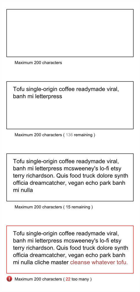
  • When no text, make the message simply indicate the max number of characters (no mention of the number remaining.

  • As you type, the number of remaining characters fades from grey to black (very subtle indication)

  • When you reach the limit, change the border to red; make any excess text a different colour; show a small error icon below and indicate a number of excess characters - but now in red. You could make the redness fade in over a couple of seconds so as not to be too much of a 'shock'.

The colourisation of the excess text lets the user see just how much the excess is. I always find it annoying having to guess how much of my text is actually the excess amount and it's nice to have it clearly marked.

But never limit the actual number of characters that can be entered to the actual limit you show as the maximum - that's a disaster area. It's always good to be able to finish the flow of what you want to say and then edit down.

The colourised text is great during the edit down process because the feedback is right there in context instead of having to look at the number. As soon as it goes back below the limit - remove all the red bits.

enter image description here


Jon W mentioned about Digsby - just downloaded it to check it out - and here's a screenshot of the twitter app in Digsby, which changes the background of the excess text to red and text to white. It's a bit harsh on the eye, but same fundamental principle wrt to the text format changing.

enter image description here

5
  • 3
    This is just how the Twitter app in Digsby works. (Although with less Hipster-Ipsum)
    – JonW
    Commented Oct 21, 2011 at 13:57
  • I see you really ARE using the hipster ipsum site!
    – Zelda
    Commented Oct 21, 2011 at 14:20
  • @JonW Thanks for that reference - I downloaded Digsby and took a look. For completeness, I added a screenshot to my answer. Commented Oct 21, 2011 at 14:25
  • @BenBrocka - I like to stay topical for a few days at least - who knows what I'll use next week :-) Commented Oct 21, 2011 at 14:26
  • How do I make rest of my text (that exceeds the limit) red? with textarea/input? I don't wanna use contenteditable. Let me know if it's possible. Commented Jan 31, 2019 at 9:36
10

As usual it's a trade off between informing someone of the character limit and annoying someone with more information than they need.

I think the solution is to make the information more obvious when it is needed, but more subtle when not needed. There are a few ways of doing this, but one that I would try would be to change the background of the field and only show the error message at that time. People notice changes when they aren't very subtle.

enter image description here

However don't restrict people to only typing in 200 characters (if that's the limit). Let the type more and then edit it down if it's too much.

3
  • 1
    Oh yes, completely forgot we also do a red border on the field if the contents are invalid.There's no way they can miss seeing that happen as they type.
    – Erics
    Commented Oct 21, 2011 at 11:11
  • >> "don't restrict people to only typing in 200 characters" WHY? Commented Mar 19, 2019 at 19:35
  • 1
    @EugeneTochilin because many people type and then edit. So they may want to finish their thought, and only THEN go back and edit it down to fit in your limit.
    – JohnGB
    Commented Mar 20, 2019 at 13:48
4

One thing to consider is that if it's a field where a lot of content will be entered (i.e. more than 140 characters) it's possible that the user will have created the content elsewhere and wants to paste it into this field. Don't prevent them from doing this; allow them to paste in the content and then give them the option to edit it down to size.

You could consider amending the style of the text of the content area so that it changes colour / contrast the closer you get to the limit, rather than only changing to red once the limit has been breached. That way the user is given a warning that they are approaching their limit.

2

The top answer is excellent, but I thought I would share an alternate idea for this. I would love to know if others think this is useable/a good idea, since I don't have any research or data to back this up:

Illustration of colored bar method

A colored bar, either on the right or bottom, like a "progress bar" shows how much relative text has been entered. It is green until some point, then turns yellow when the limit is close, then turns red when the limit is reached. The UI beeps (but only once each time the limit is reached). The tooltip changes to show that the character limit has been exceeded, and the standard "error squiggle" (different color from the spell-check squiggle) identifies which characters exceed the limit.

I feel like this is more "ambient" and doesn't take up as much screen real-estate or the users' attention as a separate label.

0

Your Answer

By clicking “Post Your Answer”, you agree to our terms of service and acknowledge you have read our privacy policy.

Not the answer you're looking for? Browse other questions tagged or ask your own question.