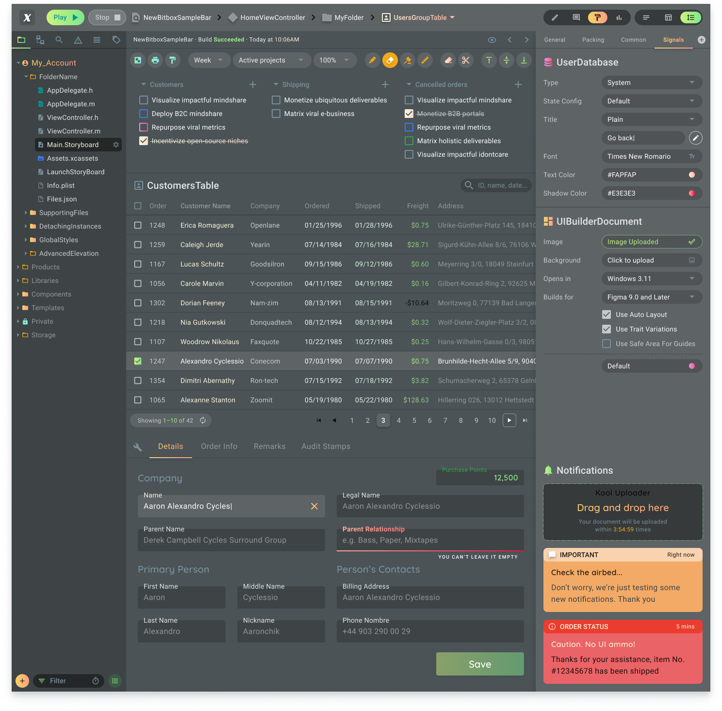
I'd take such rigid "guidelines" with a grain of salt, because they don't take any usage context into account. Some applications simply won't be usable in a meaningful way when shown within a tiny 800 x 600 viewport, and Microsoft actually agrees, as, e.g., Microsoft Visual Studio 2017 requires a screen setup that is quite a bit larger than 800 x 600:
"Video card that supports a minimum display resolution of 720p (1280 by 720); Visual Studio will work best at a resolution of WXGA (1366 by 768) or higher."
So, I'd suggest researching what screen sizes your actual users work with, and select a decent minmium resolution to design for.
As an example, our analytics showed that ~97%+ of users of our SaaS platform's admin console access that web app with a horizontal screen resolution of 1,280 px or higher.
Based on that insight, we decided to design for a minimum width of 1,024px, just in case. Below that width, the entire page starts scrolling horizontally.
We also make some concessions for resolutions below those "measured" 1,280px, such as always displaying the main navigation sidebar in a minimized state (with auto-expand on hover), whereas it's always expanded at 1,280px and wider.
Maybe this isn't quite the answer you expected, but I feel that trying to cram a feature-rich UI as shown in your screenshot, into a 800 x 600 viewport is just not worth the effort, especially if none of your actual, paying customers would ever use it at that screen size.

