1

We are re-developing a B2B application to make it more user-friendly, but keep it robust.

One of the features has popup wizard with 3 steps.

On Step 2, we'll need to have a grid of items to be checkboxed/selected to progress onto Step 3.

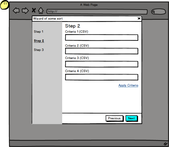
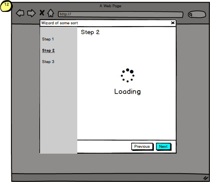
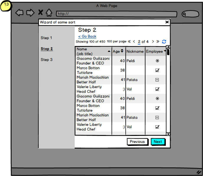
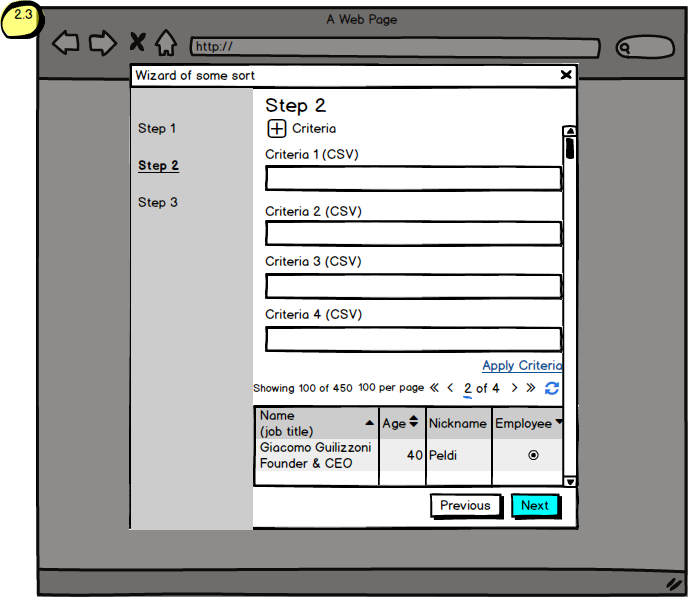
The catch is that for the grid to appear a user will need to search for certain CSV criteria (we have 4 criteria by which users can search). When the criteria is populated and is applied, the step would clear/load (see below steps 1.2 and 2.2) and the grid of results with those criteria would appear.

This is where the opinions are divided:

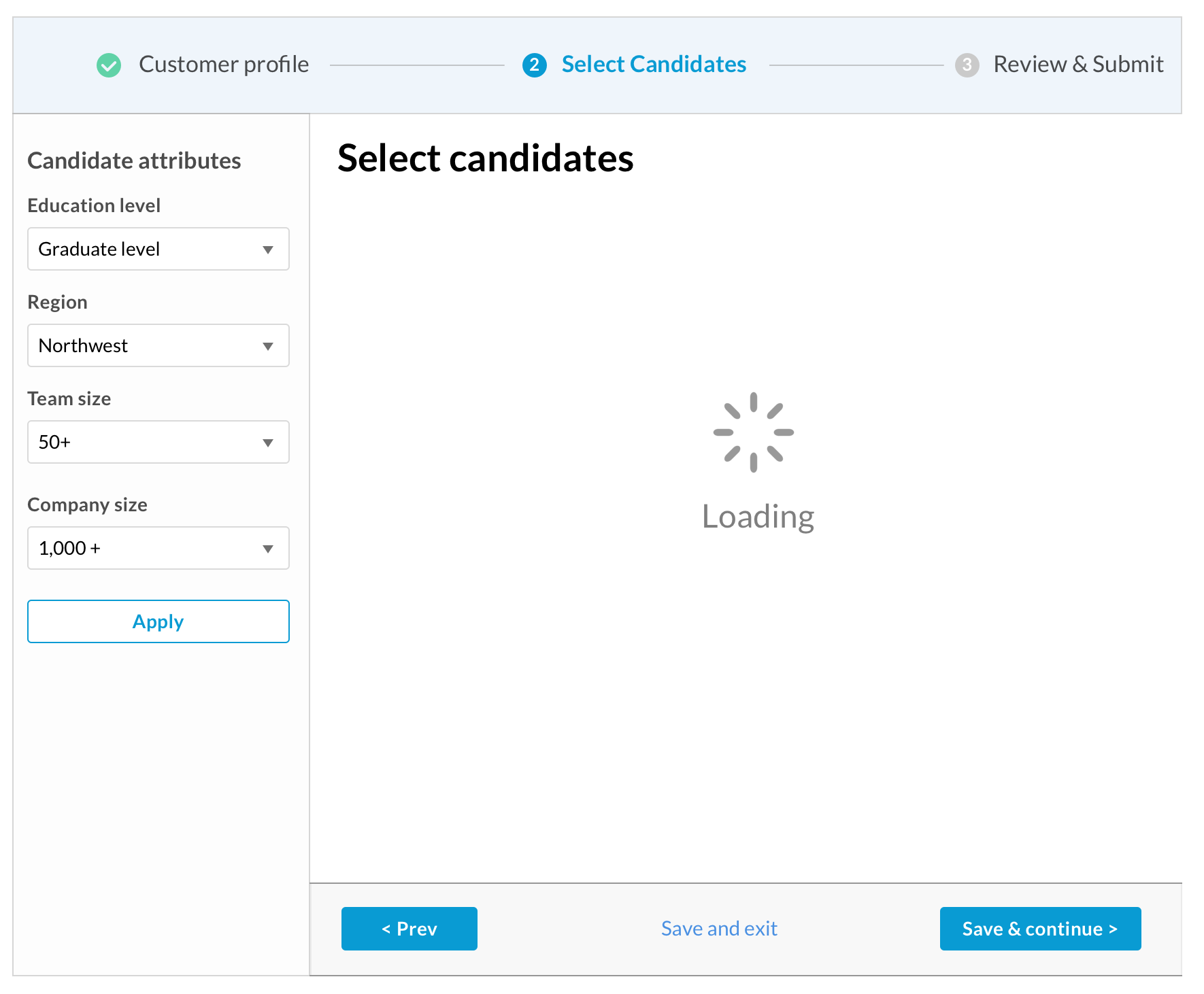
  • have a 'split step' approach (see 1.x screens attached): have a screen of 4 input boxes + apply criteria button;

enter image description here enter image description here enter image description here

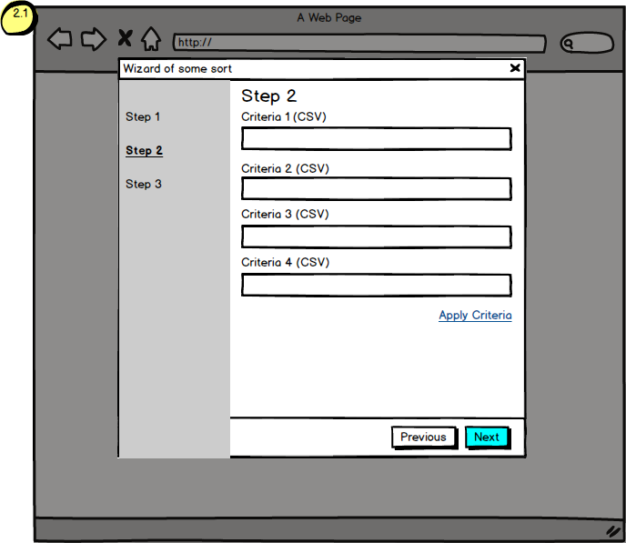
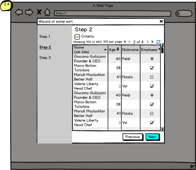
  • OR have a full step approach (see 2.x screens attached): put everything in one screen and use a collapser for criteria.

enter image description here enter image description here enter image description here enter image description here

Here are our thoughts:

  • split step provides a cleaner UI, and less waste of real estate when our users are looking at the grid and can always go back and reapply different criteria. (if they want to change the criteria, click back? will the users panic about anything?)

  • full step provides users with the all-in-one screen and the criteria can be collapsed (initially or afterwards? but then won't the user panic with 'where did my criteria panel go?' we aren't sure)

  • the grid can be huge... and fitting everything into one big step... might be blow up a browser or cause a lot of scrolling - just as bad as going back and forth.

  • Both approaches are as crazy with 'clicks' (one has on and off collapsing big chunk or scrolling, the other has going back but not seeing the grid), but B2B apps aren't the prettiest from what we have seen.

  • Both approaches will have the issue of 'apply criteria' and reload the entire grid.

PS: some of you might notice our pagination is crazy. It's because it is. I hear you.

Thanks for any help guys :)

4
  • Do you search for a criteria at a time? so I enter my search in Criteria 1 (CSV), then the grid displays to choose from? then do the same for other three criterias one by one then click apply or how?
    – Moath
    Commented Apr 2, 2019 at 17:06
  • Can a user search for up to 4 criteria or do they need to search with 4 criteria at a time?
    – Kevin M.
    Commented Apr 3, 2019 at 11:07
  • @KevinM. - up to 4 criteria at a time. They don't have to search for all four at the same time.
    – aly.i.ux
    Commented Apr 4, 2019 at 10:46
  • @Mo'ath - they could do that if they're patient:) But no, they can search for all 4 criteria at the same time
    – aly.i.ux
    Commented Apr 4, 2019 at 10:46

3 Answers 3

2
+100

Try putting the stepper navigation up top. Allow them to see the criteria values, and refresh as needed.

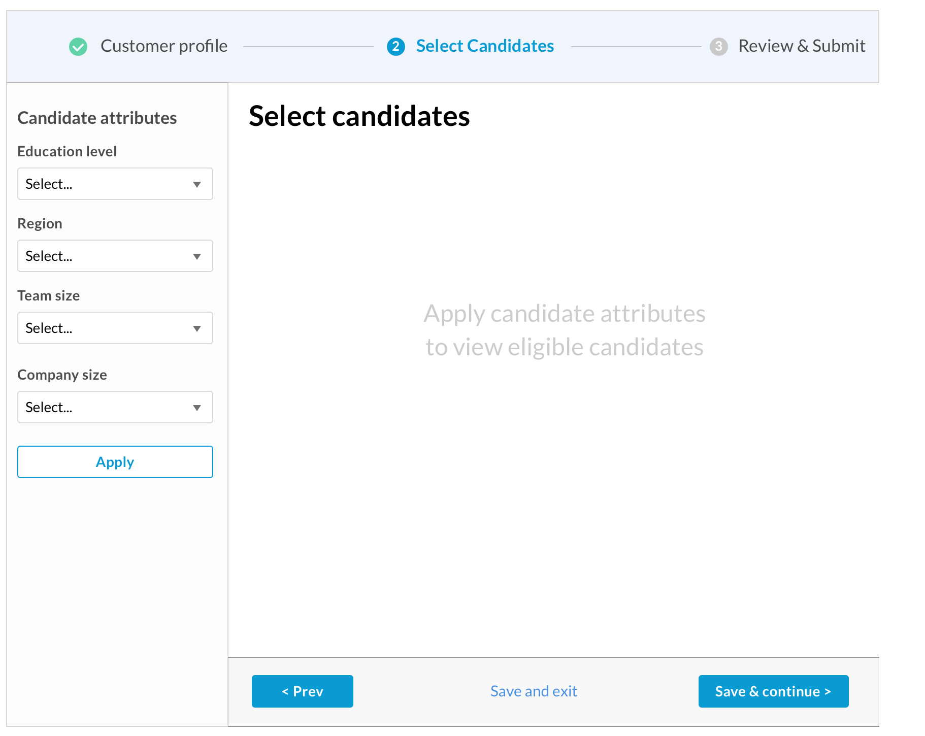
Since the quality of the list is dependent on the criteria, you could attempt a persistent sidebar, similar to filtering in ecommerce.

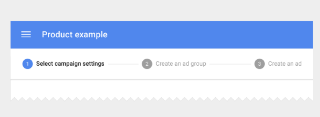
Material design has some simple patterns for steppers. This will get you some horizontal space to work with.

enter image description here

Can you go full screen? Maximize real estate.

Assuming this is a desktop, if you are going to use a dialog, can you expand it to full screen? This will give you more real estate, and allow you to place always visible filters to the left.

If you can, show results and filters together.

From Edward Tufte, a key principle of information design:

Allow important visual analysis to be done adjacent in space, not stacked in time.

If you can delineate the sections of the page, you can take advantage of the common pattern of filters to the left, results to the right.

Don't make them memorize the filters they applied to get the results.

By seeing both together, you avoid a memory tax on the user, and they don't have to open and close filters that would live either on a previous step, or above the table of results.

This is where adjacent in space comes into play.

enter image description here

enter image description here

UPDATE: You could separate the criteria (BIG STEP), but not punish them for wanting to view / edit in context if need be.

Flexibility can help those either uncertain of their choices, or need to see and filter the data in context.

While I find v1 Big Step very useful to help concentrate on a single task, could you build flexibility for those who need to be reminded or edit their choices in context?

If you allow for another way to edit, you won't punish those users who need to view (and maybe edit) the criteria.

Worst case scenario is that they don't see the criteria view / edit option, and go back a step.

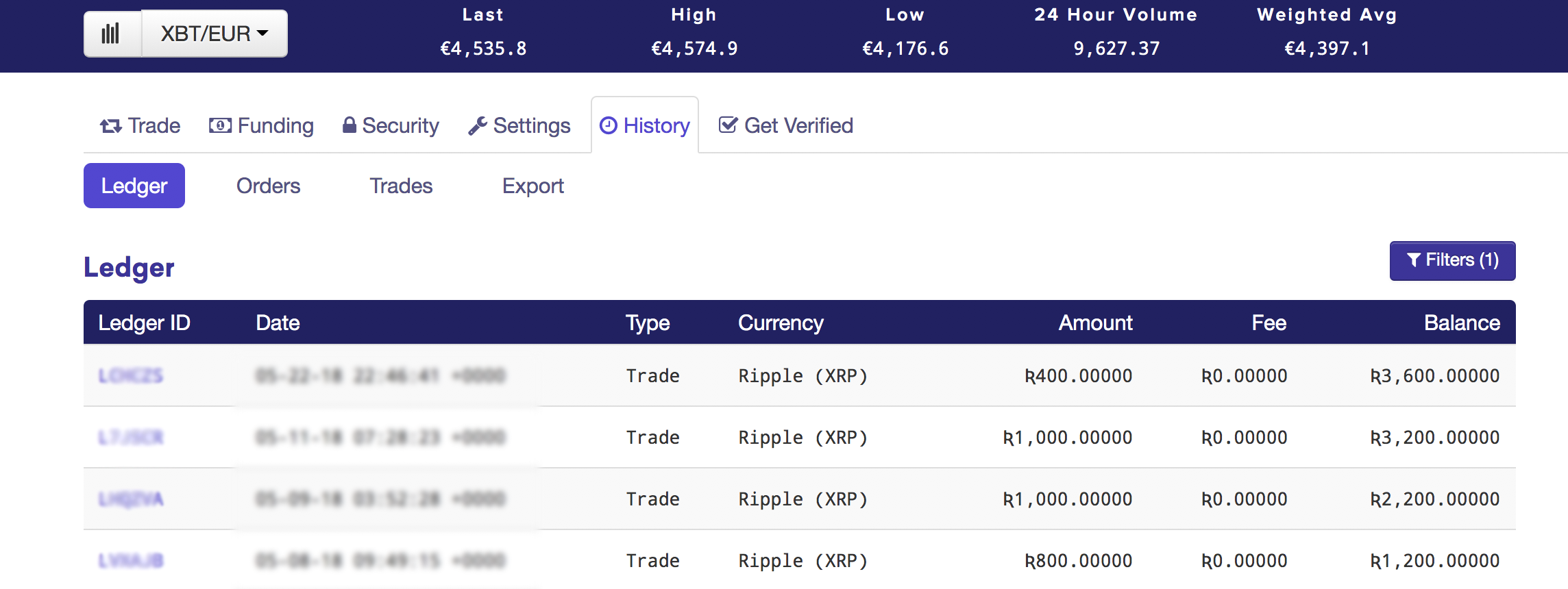
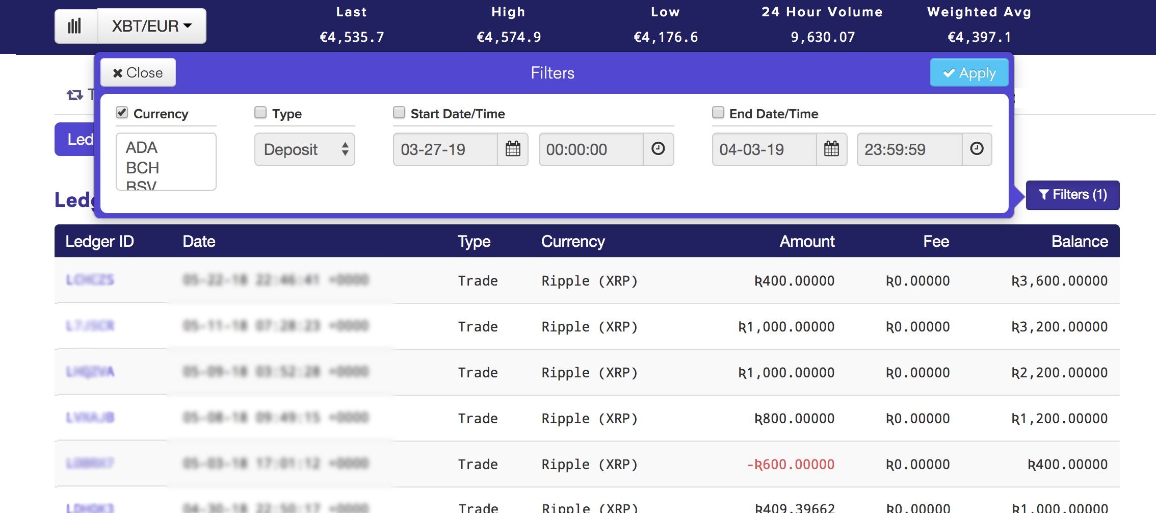
I've come across this pattern from the trading platform Kraken, where you have a table, and can view and edit the filters as a popover above the table:

the upper right shows that filters are engaged:

enter image description here

with a popover, I can see the table values: enter image description here

While I find some of the graphic design choices a little distracting (the thick dark purple), I found it helpful to filter the data.

In your case, you can place an 'View / edit criteria' button or link, prominent enough to be noticeable yet not distracting.

7
  • Thanks for help, Mike. However, we cannot change how our company-wide wizards work (steppers on side), nor can we go full screen here.
    – aly.i.ux
    Commented Mar 31, 2019 at 20:55
  • @aly.i.ux thanks for clarifying. Are there only 4 criteria? or is this expected to grow? and how big are these fields? long strings?
    – Mike M
    Commented Mar 31, 2019 at 21:03
  • No worries:) Yup, only 4 criteria. At them moment judging by the requirements, it won't grow any time soon. The fields are simple input fields (strips). Although, because they're supposed to be CSV... I am wondering if they should be bigger. But for now we're sticking with the legacy version - strip-inputs. Hope this helps :)
    – aly.i.ux
    Commented Mar 31, 2019 at 21:12
  • @aly.i.ux I've updated my answer after running across both a wizard in the last day that kept me single focused, and a list view in another application that allowed me to quickly see filtering choices without losing vertical space. Hope this helps...
    – Mike M
    Commented Apr 3, 2019 at 17:14
  • Thank you very much Mike!:) we'll analyse all the answers today!:)
    – aly.i.ux
    Commented Apr 4, 2019 at 10:49
1

I came across a similar requirement where we had to onboard Enterprise social media accounts that had more than 40 Facebook pages. We were ad-tech company and our USP was we consolidate your various social media channels into 1 platform. We used to have a dedicated employee that handled onboarding with these clients as they were big whales.


Here are my 2 cents

  • split step provides a cleaner UI, and less waste of real estate when our users are looking at the grid and can always go back and reapply different criteria. (if they want to change the criteria, click back? will the users panic about anything?)
  • Both approaches are as crazy with 'clicks' (one has on and off collapsing big chunk or scrolling, the other has going back but not seeing the grid), but B2B apps aren't the prettiest from what we have seen

I feel the users here are trained personnel with industry knowledge where they know what CSV criteria they are looking for. So we can call these Power users. As a result, I will definitely focus on the efficiency of the user while maintaining the effectiveness. My priority on how clean UI looks is secondary.

From the relevant information above, my money will go to 2.x options. Here are the reasons why:

  1. All information is glanceable at the same place to make effective judgments.
  2. Since they don't have to go back and forth, it makes the process more efficient.

  • the grid can be huge... and fitting everything into one big step... might be blow up a browser or cause a lot of scrolling - just as bad as going back and forth.

I feel display of dense data can be handled more graciously. If you want any inspiration, look around these data tables 👉👉 https://ant.design/components/table/

1
  • Thank you for the answer:) we're analysing the answers today:)
    – aly.i.ux
    Commented Apr 4, 2019 at 15:43
1

I work a lot on .GOV projects over here in the UK. We advise splitting tasks into small components because we find it focuses users attention on a specific thing. Ergo, the step wise approach is always the way to go.

It looks like with more complex interactions you are trying to do too much on one screen. This will make it harder to learn.

And another thing you need to consider: how often will this tool be used? Daily? Monthly? Once? That effects the type of interaction too. If it's rarely used, it's even more likely you need a progressive step-wise approach.

Summary

Step wise is good because it breaks down the task

It focuses user attention

It's easier to learn

But may not be as fast for expert, frequent users

The trick is, of course, to test your work with users.

1
  • Thank for the answer:) PS: hey fellow brit:)
    – aly.i.ux
    Commented Apr 4, 2019 at 10:49

Your Answer

By clicking “Post Your Answer”, you agree to our terms of service and acknowledge you have read our privacy policy.

Not the answer you're looking for? Browse other questions tagged or ask your own question.