My web app has a settings page.
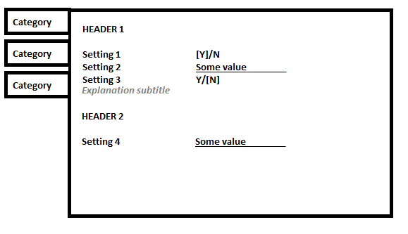
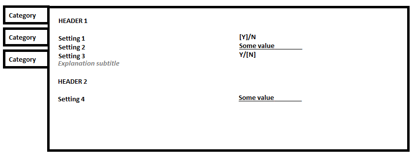
It's pretty normal: some broad categories on the left, then pairs of option-name - option-value settings on the main right-hand section. Works OK.

However, on a full-size PC desktop screen like 1920x1080 or 2560x1440, there's a lot of empty space in the right-hand section.

Are there any ways to somehow make better use of the horizontal real estate?
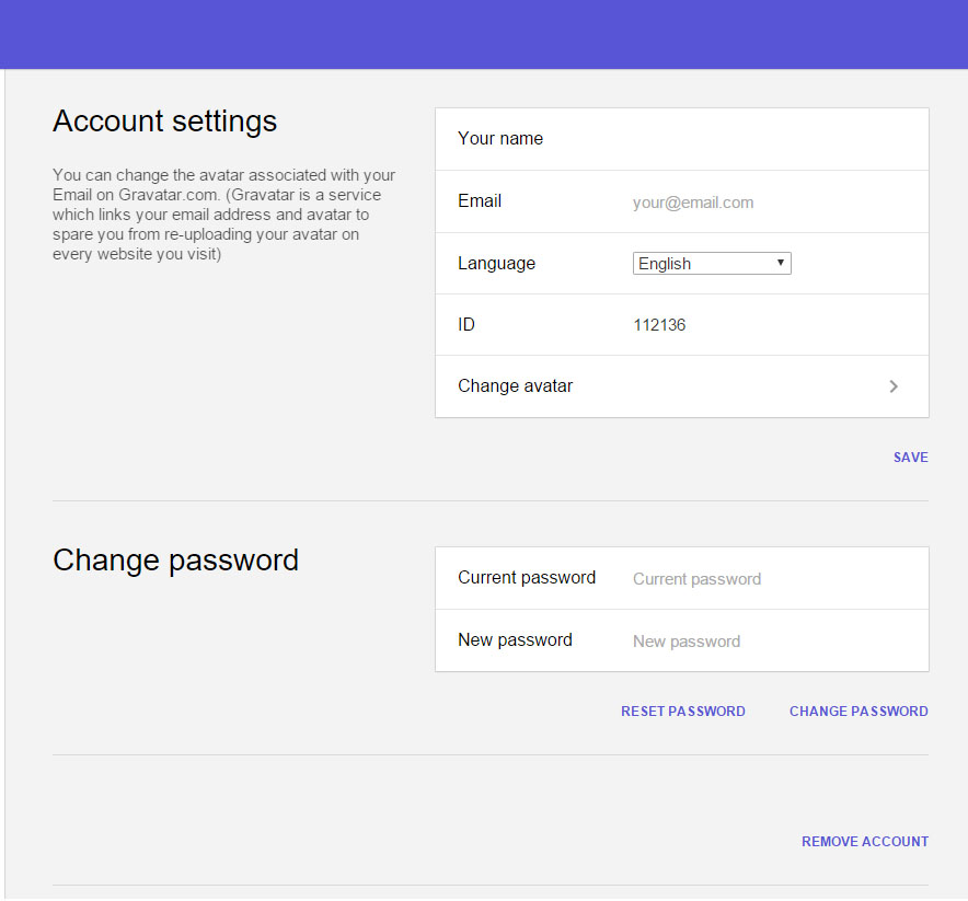
Are there any examples of apps that have different designs for the settings-screen that work better in wide layouts?
We tried having the settings in two columns, moving the "HEADER 2" section to the right of the "HEADER 1" section. It works okay but i think not great for visually scanning to find things.

