29

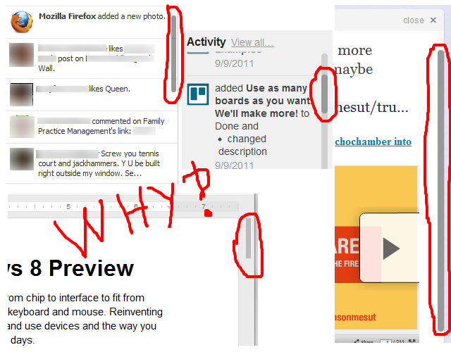
I've noticed that a lot of webapps have started using custom scroll bars. A few examples include Facebook, Trello, Google Docs, and Twitter. I'm sure you can think of some more:

why custom scroll bars?

How do these types of custom scrollbars affect usability? I often find them harder to click on, and they have a habit of disappearing when I'm not scrolling. Having a smaller area to grab and a disappearing target makes it harder for me to use the web app, but I might be a minority. Is there anything indicating a benefit to the user experience when using these, or is it just done to make things look more fancy and "Web 2.0"?

9
  • +1 This is why I default to using the scroll wheel or the PgUp/PgDn keys... Commented Sep 28, 2011 at 23:24
  • 2
    In OS X Lion the default scrollbars look very similar to the scrollbars in your screenshots. Commented Sep 29, 2011 at 2:22
  • Methinks you are thinking they're custom by the website, but they're actually the browser's or OS's ones. Commented Sep 29, 2011 at 11:13
  • 1
    @ChrisMorgan These are certainly custom by the websites in question, at least for the Facebook and Google Docs scrollbars I have seen before.
    – Zelda
    Commented Sep 29, 2011 at 14:02
  • 4
    Excellent usage of the interrobang, there. Commented Sep 29, 2011 at 15:08

6 Answers 6

23
  1. Aesthetics help usability. Many things "just" look nice, but when it comes to such key elements as scroll bars, their visual appeal can make them more usable.
  2. It's important that they look different from a standard scroll bar, because in most web apps at least one of the scroll bars is the rightmost element on the page, so it's adjacent to the standard scroll bar of the browser. If they looked the same, it would both look terrible, confuse people as to which belongs to what container, and be very inconvenient to use.
  3. Up until fairly recently there had been a guideline that a screen or a page shouldn't have many small boxes with internal scrolling. This convention stemmed from the fact that most containers used the standard scroll bar, which is pretty large, is always visible, and gets unusable when placed in a small box. When you'd see a page full of scrollable boxes, it invariably looked like crap. You'd often see it on old Sharepoint websites, for example. Today, this convention is pretty much gone - because custom scroll bars solve these problems, their most helpful feature being context-dependency. The fact that they appear only on demand lets us use many scrollable elements on a single page without harming its appearance.
  4. The standard scroll bar was made first and foremost for scrolling using its handle (the scroll box) - hence its width. This was before mouse wheels were commonplace. Today, the absolute majority of mice have wheels, and even people who aren't very computer-savvy know how to use them, or learn it relatively fast. So the "functional" role of the scroll bar is diminishing, and its "feedback/indicator" role becomes relatively more important - we often display them just to let the user know that this area is scrollable, at which point the user has the wheel or the keyboard to let them scroll - we don't design the scrollbars to be used as the primary means of scrolling. So they don't need to be as wide as they used to.
6
  • Re: #2 - If there is a custom scroll bar next to the browser scroll bar, I would argue that it shouldn't even be there. Use the tools provided for you - just use the scroll bar that is part of the browser and get rid of your custom one entirely. Commented Sep 29, 2011 at 20:55
  • @Charles Right, but that only refers to cases where the custom scroll bar spans the entire screen, not to smaller elements. Commented Sep 30, 2011 at 11:43
  • @xmjx In addition to the link that's already there, you get plenty of articles if you just google aesthetics help usability. Commented Oct 3, 2011 at 14:18
  • @VitalyMijiritsky First I thought, oh, wow. Sorry. You provided a reference. But after glancing over it, I feel I should have made myself clearer: Do you have any reference to a scientific paper that provides empirical evidence that aesthetics helps usability? Funnily, the lemon squeezer on the book cover shown at the right of the page you linked to is a striking example of an aesthetically pleasing piece of art that is absolutely horrible to use and, thus, provides a counterexample. Also, if you give statements as in #1 I think you should provide references, not your readers.
    – xmjx
    Commented Oct 3, 2011 at 17:40
  • @xmjx 1) The google link gives you quite a few of those. The most famous is probably Tractinsky 1997 2) I said aesthetics help usability, not that they're the only factor affecting it. A beautiful thing can very well be completely unusable, but with other factors being equal, a beautiful thing is more usable than an ugly thing. 3) Since "pleasing/fun to use" is one of the popular measures of usability, you've got aesthetics embedded in the very definition. And yes, definitions is something you can argue about forever. Commented Oct 3, 2011 at 17:57
18

They are usually used because the designer thinks that they look better. Many designers design for what looks good rather than for what is usable.

For usability just use the standard scroll bars.

Edit: Also, the way that different people use the scrollbar varies a lot. Some click on the bar and move it; some use a scroll wheel on their mouse; some click on the arrows on the top or bottom; and some click on the space between the bar and the arrows.

They may exist, but I have never seen a custom scrollbar that can be used in all the ways that people tend to use them. Yet another reason to avoid custom scrollbars.

2
  • They are also sometimes used to save horizontal space, which makes them a bit harder to use.
    – bendur
    Commented Sep 29, 2011 at 4:20
  • I disagree. Modern applications tend to have more scrollable panels on the page at one time. I believe now it really depends on the scrollable panels purpose. If for example you are creating an inbox experience with multiple columns, one for scrolling mailboxes, one for the message panel and one for the reading panel, browser default scroll bars would look terrible and make the application less easy to use as it is less like what the user would expect from that kind of an experience. I would be interested to know if you still think this way 5 years later? Commented Sep 9, 2016 at 12:00
3

Actually, I do much of my browsing on an iPad, and none of those look non-standard to me.

The default desktop scrollbar (which looks much the same as it did 20 years ago) looks awful in the context of an otherwise well designed site, to the point where putting it there would be a usability issue in itself. Little things like good use of whitespace make a big difference to the user experience, and sticking a huge grey scrollbar in the middle of it wrecks all that.

Add to that the fact that scrollbars are now often only a secondary control (with touch or mouse wheel being the primary) and you have a good case for setting up something less obtrusive.

2

Google Docs and Trello are Web Applications and can benefit from different scroll bar controls and appearance. Web applications have a more holistic design approach where default browser controls/appearance are often overridden to complete the branding cycle of the web interface.

For example, some scroll bars will have a scroll bar that uses double arrows along with the single arrow to give a "to top of page" and "to bottom of page" and this can be very helpful for vertically long pages.

Facebook and Twitter have consistently pushed the boundaries when it comes to breaking conventions but...they can. There is such a big following for both communities, that each company can introduce new design changes with a very small abandon rate because their respective users are so invested. For example, there is a lot of debate right now about the new Facebook interface updates, but I imagine there is only a miniscule abandon rate of users.

With anything design, it's always best to start off using conventions and to only push outside of those conventions when you are established.

2

There's really two questions here: 1) SHOULD they be different and 2) Why are so many different?

And I'll add a 3rd:

3) Should there be scrolling sections on the page in the first place?

I tend to say 'no' to 3...especially in the world of mobile. I'm presently working on creating a modal window that scrolls for iOS. This pains me as it's really not the right paradigm to be using. If the content is important enough that people need to see it, don't trap it in a little scrolling box.

Now, going back to #1, if there is some sort of plausible argument for it, then maybe they should be different, but I'd first ask why the default isn't OK as it is? Typically, a known GUI element (OS scrollbars) is going to be the preferred option as people are familiar with it, it behaved predictably, and it's easy to understand.

As for question #2, I'd agree with others that they are often custom designed purely out of visual design bells and whistles. I'll add to that the fact that are a lot of shared JS libraries and plugins out there nowadays that just happen to default to whatever custom widget UI was created. For instance, jQuery UI has very unique form element designs. We could debate the merits of that, but it seems the typical argument for them is to create a unified UI for the web independent of particular OS idiosyncrasies.
2

It is definitely a trend. We're going to a scrollbar 2.0 era. The popularity of iOS and now the fact that OSX lion is porting this design to desktop/laptop computers is just the beginning. I'm sure it will come to the next versions of other OS.

Now I'd like to know if there are tangible studies and results on how people use scrollbars?

I've design an app with such scrollbars. I like those because in terms of aesthetics it just looks better and it fits perfectly the whole app-design. In a way it does not create a visual noise for a common action that everybody knows. (Maybe not everybody but the users I'm targeting, would know). You hover the text area, the scrollbars smoothly appears, you use your mouse-wheel and it just works. If you don't have a mouse-wheel you can still drag the bar or use keyboard arrow-keys.

But I've got a comment from a workmate (Marketing department,MS office power-user, 30 years old, female) who was disappointed with those scrollbars because she is using a trackball and thus she is not used to scroll (seems crazy, isn't it??). Instead she is dragging the bar and or use keyboard. In fact she had not noticing the custom scrollbar..because it was custom and not OS-standard! Is this behavior frequent?

Your Answer

By clicking “Post Your Answer”, you agree to our terms of service and acknowledge you have read our privacy policy.

Not the answer you're looking for? Browse other questions tagged or ask your own question.