0

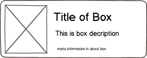
In an Android application, I have a "Grid Layout" with fixed size cells for describing Three-line items:

mockup

download bmml source – Wireframes created with Balsamiq Mockups

Number of columns and rows in Grid depend to the device dimensions. Also above items (boxes) will created by users and this may cause a problem:

What we have to do if a user enter a long title which exceeds bound of item? Of course we can do:

  1. ellipsis title
  2. limit input characters of title
  3. break long title text into two lines
  4. use "list" instead of grid; but it cause empty/blank spaces on "tablets" around items

What is the best choice?

1

2 Answers 2

1

Dealing with user inputs has always been a challenge, however we'll always fall back on the best worse of all scenarios possible.

  1. Ellipsis is a great indicator, it all depends on how its used and its position.
    • At the end it's not advisable as some important text maybe located there. i.e Long title ...
    • At the beginning is worst of all i.e ...Long title
    • At some where around the middle is a better position, that way, the viewer has an idea of the full text. i.e Long... title

However there has to be a way to view the said item in full details if this is going to be used e.g a click to view full details.

  1. You can limit the user input for the title, but until all your design constraints has been reached, however if the user input will be limited then, whatever they input must be fully displayed(Which you can't possibly fulfill in the massive number of device across the world), at such this is not really a good option to go for.

  2. Breaking the title to two line is a good thing to consider, just another addition to the whole deign thinking, reduce font size a bit and allow two line max.

  3. List are always better than grid as you have more to display at a glance, it's just a matter of usage across different screen sizes.

    Mobile Devices == 1 Column List
    Tabs == 2 Column List
    Huge Tabs == 3 Column list

SUMMARY
All the options are good, you just have to combine them in a way to create a universal design solution, here's an example to help you out.
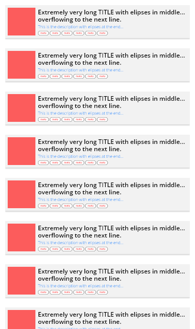
Mobile

enter image description here


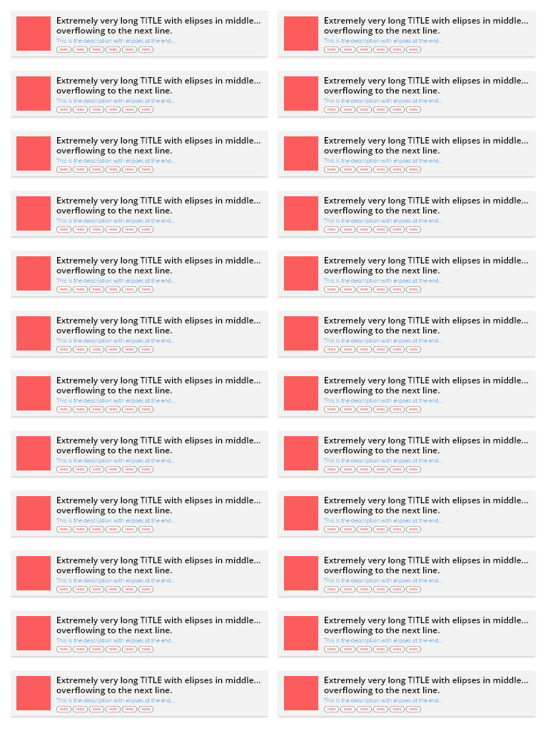
Tab

enter image description here

0

You must consider user's information requirements and it's priority.
Certainly, you have some good reasons to show each information to the user. But some informations has more priority according to your research.
These principles must be considered in designing UI process and final designed layout must be based on these.

I can understand that Image and Title are most important informations which you want to show to the end user. So you must pay the most attention to these in your layout. So you should make enough space for viewing common-length title. So in your case (base on your designed item layout) items should be wide (or change the layout).
You can/must determine the minimum width base on your User Research.
Also for wider screen size problem which you mentioned, @dbkonXepts suggestion is good in my opinion.

PLEASE NOTE that breaking UX principles for solving some UI minor problems is a bad practice. You must resolve it base on UX. (see my above early writing)

After that, you can use eliding for uncommon titles as final solution.

For option 2 of your list, this will depend on your research. For option 3, seems to be not a good approach (base on your item layout) since causes to bad reading (typography).
Your Answer

By clicking “Post Your Answer”, you agree to our terms of service and acknowledge you have read our privacy policy.

Not the answer you're looking for? Browse other questions tagged or ask your own question.