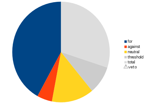
Suppose we have a vote widget. There are four possible options:
- Vote for the proposal
- Vote against the proposal
- Abstain (i.e. neither for nor against)
- Veto the proposal (i.e. very strongly against)
Every person who votes can pick one of those. We could also add an additional category of people who are required to vote, but haven't yet.
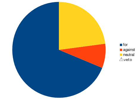
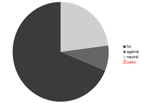
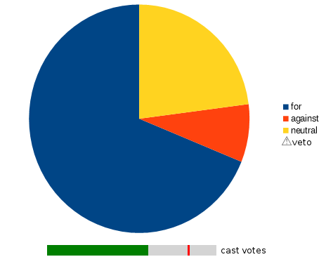
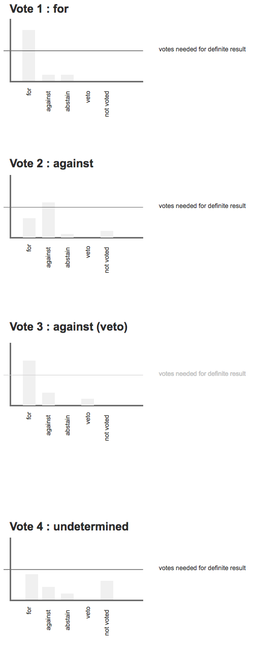
We might have four votes. For the purposes of the mechanic, "neutral" contains the sum of those who have abstained and anyone who's yet to vote. The results of which are below:
Vote 1: For - 80%, Against - 10%, Neutral - 10% (10% abstain), Veto - 0% : Result for
Vote 2: For - 30%, Against - 55%, Neutral - 15% (5% abstain, 10% not voted), Veto - 0% : Result against
Vote 3: For - 70%, Against - 20%, Neutral - 0%, Veto - 10% : Result against
Vote 4: For - 40%, Against - 20%, Neutral - 40% (10% abstain, 30% not voted), Veto - 0% : Result undetermined
The last result is undetermined as, if all neutral parties voted against it, it would not pass. In vote 2, even if all neutral members voted for it, the result would still be "against". In all cases, any veto automatically results in it the vote being against.
The person may view this graph before all votes have been cast. We want them to know:
- What proportion of the people are in favour / against
- How many people need to agree (or disagree) for a conclusive result
- If the vote has been decided, and if so what the result is
The question is, what's the best way to visualise those results so that the mechanic is clear? For bonus points, what if we required a certain threshold (for example, a minimum of 70% voting for an option).

