0

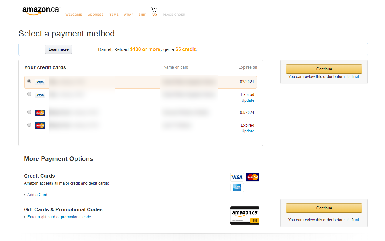
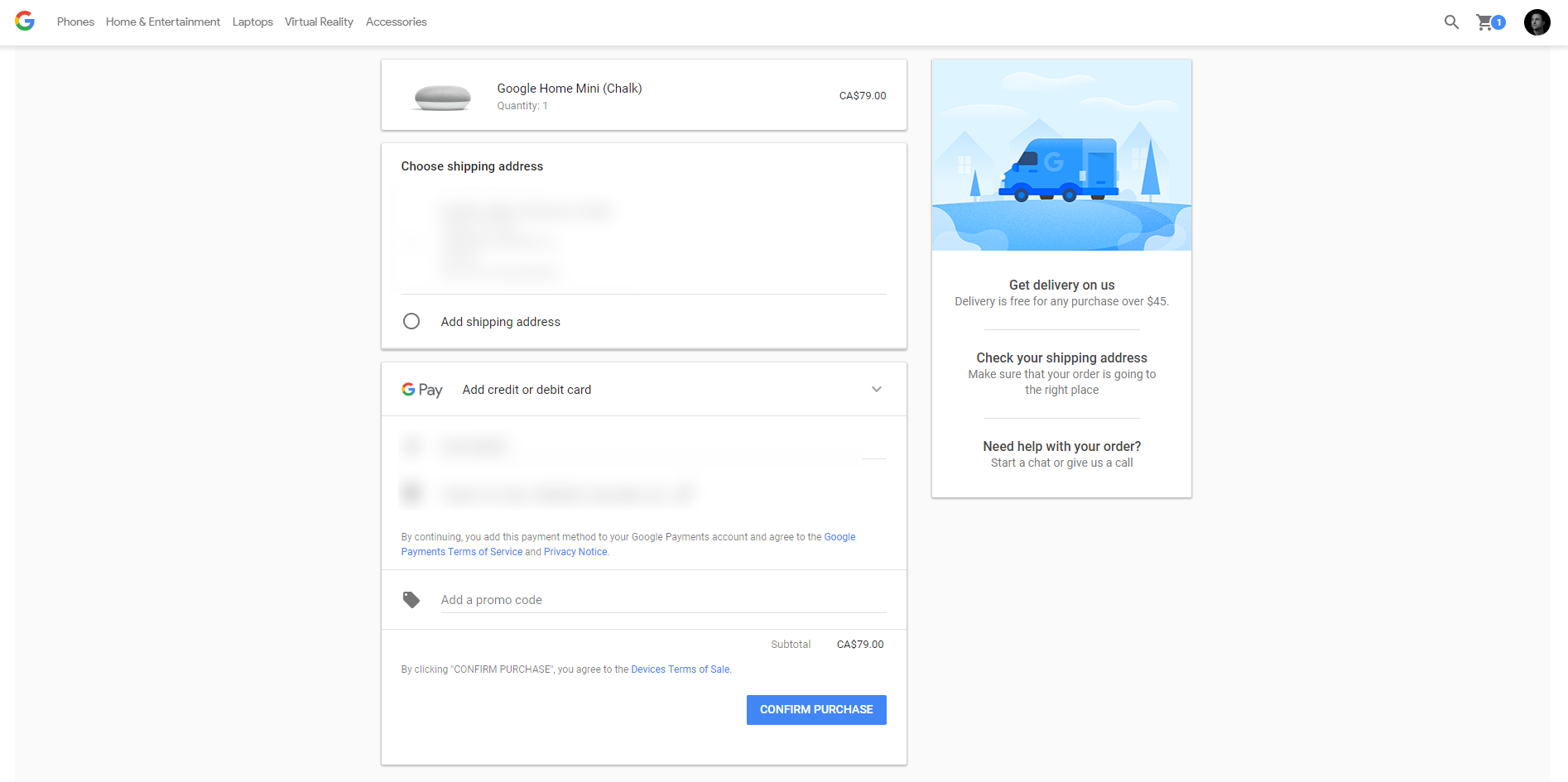
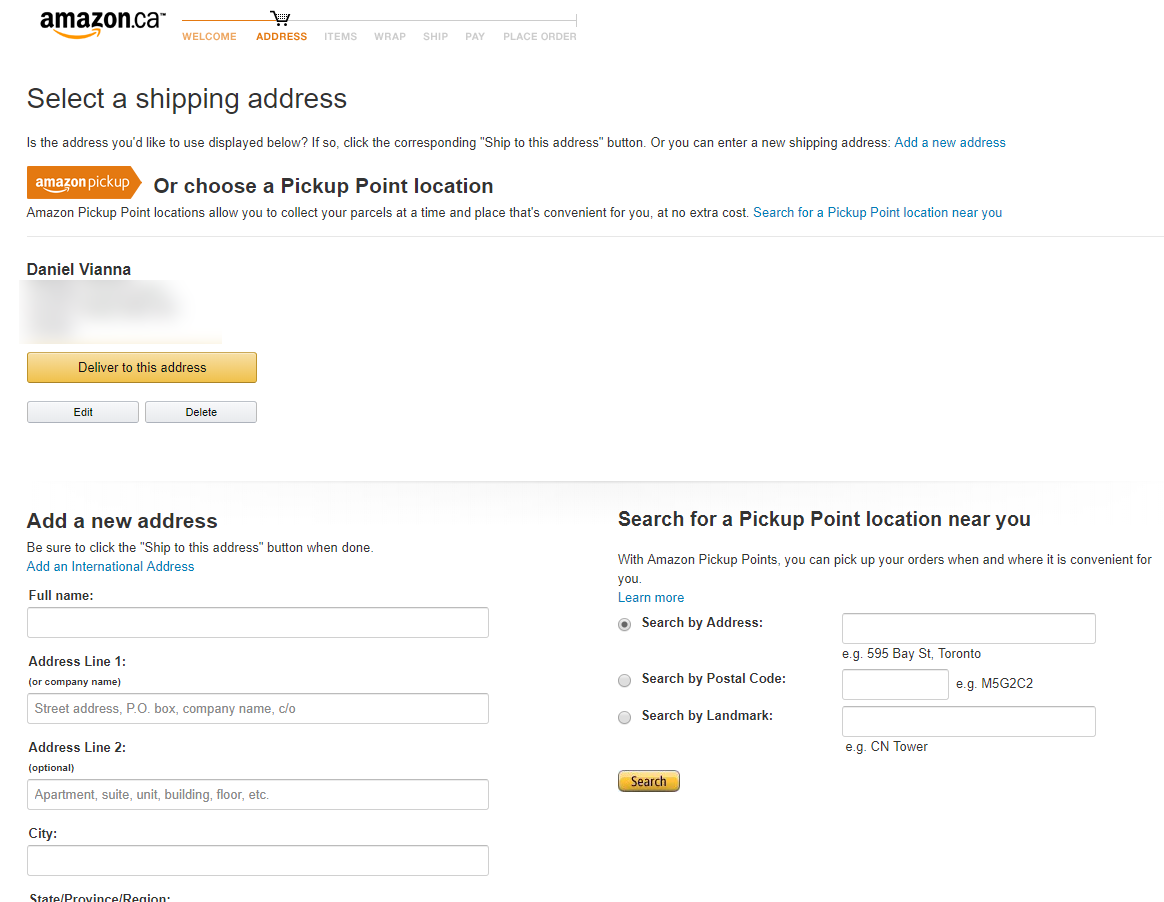
I'm checking Amazon's checkout and Google Store's checkout and it seems that Amazon has more pages per checkout step (1 for address, 1 for payment method, 1 for review order). While Google Store combined most of these steps into stacked UI cards with accordion collapse widget. I'm assuming both companies optimized a hell lot of both flows, but I don't know whether Amazon being targeted for a broader audience chose this, or Google is actually on leading the innovation by killing multiple pages and placing it into one. It looks like Shopify (without customization) follows a similar approach to Amazon. Is there any science-based evidence on which one of the flows generate better conversions?

enter image description here


enter image description here


enter image description here


enter image description here

3
  • Off the top of my head, amazon may be trying to subtly push people to use 1-click purchasing by making the checkout process a bit clunky. It sounds crazy, but they can afford it...
    – tobybot
    Commented May 2, 2018 at 23:05
  • I remember that when I use Amazon in the US at smile.amazon.com, the checkout page has accordions – one for address, one for payment, and one for shipping options. It is different from the multi-page interface in your screenshots. Maybe you are seeing an interface that guides you more because you have made fewer purchases on the site, or you have fewer addresses in your address book. Or maybe the design of Amazon.ca lags behind Amazon.com. Commented May 2, 2018 at 23:23
  • that's weird! I still see the same thing on the link you sent. I guess amazon is serving a layout based on IP or algorithm? Would you mind posting some screenshots? Commented May 3, 2018 at 2:37

3 Answers 3

1

The number of pages that your checkout uses is not the most important factor. What is important, is asking for just the right information, at the right time, in the right way. Just as important, you need to clearly provide the information that the customer needs to feel safe and comfortable purchasing from your online store. You can achieve those things on both a multi-page and 1-page checkout. Both 1-page and multi-page checkout have pros and cons. Baymard few years ago did a research in A/B testing for 1 page e multi page checkout and there weren't important differences between two tested pages.

Just make sure to ask and give right information at the right moment. In my experience I've seen that a multi page checkout were not perceived as long if in each page were asked few informations.

0

I trust Amazon has a more successful pattern. The steps are very clearly defined and it allows for easy navigation in smaller devices. I admit I use it regularly and that might influence how very clear it is in my head. Getting rid off previous entered information gives a sense of progress (whether that progress is saved or not), and perhaps removes a bit of the cluttering (this could also be provided in the multiple steps 1-pager by graying/blurring out future/previous steps). In the end there is not a great deal of difference between the two, Google's is in blocks that perhaps can be split into different screens when viewed in smaller a viewport. As long as the blocks / steps are clear, and particularly the final purchase button, then it should all be good.

0

I did not examined them in detail. One possible explanation could be the logical separation. The variety of products, countries and payment methods is higher at amazon. (and they have a lot of special cases - e.g. Hardware, dangerous goods etc)

The separation helps to handle those cases in a stable way and don't overload a single screen.

Your Answer

By clicking “Post Your Answer”, you agree to our terms of service and acknowledge you have read our privacy policy.

Not the answer you're looking for? Browse other questions tagged or ask your own question.