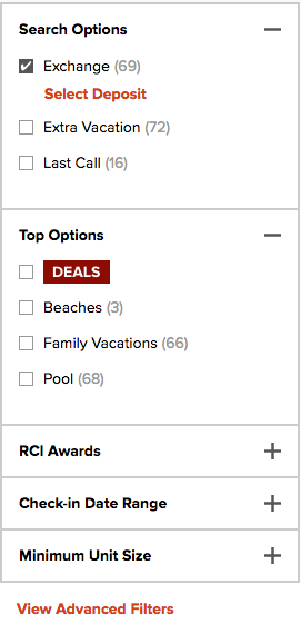
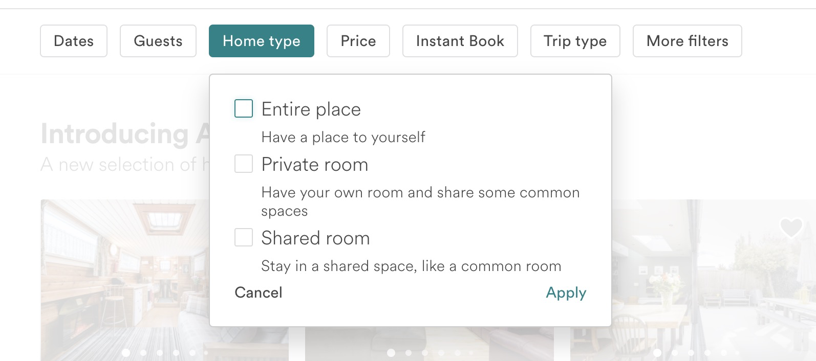
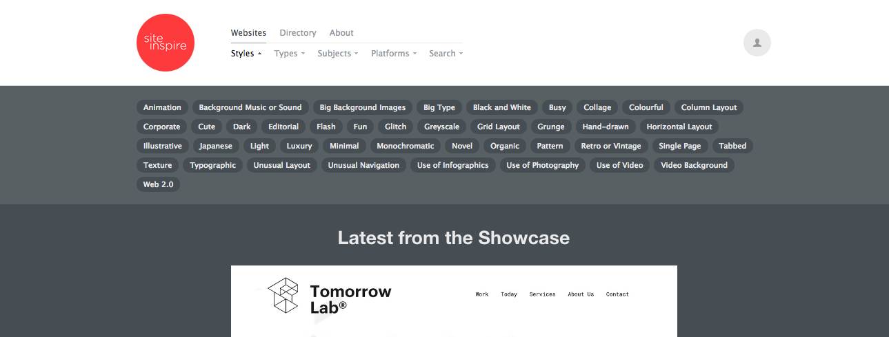
Horizontal checkboxes in my opinion is an anti-pattern for the below reasons
- They don’t easily translate into a responsive behavior
- The user has to work harder to navigate/select on larger screen devices such as tablets and desktops
There might be more but these come to mind straight away.
It is always recommended to have a consistent navigation scheme so that the user does not have to guess what changes happened in the navigation. It just adds another friction point for the users. In this case the facetted search should have a consistent behavior no matter how many facet groups have been returned as part of a particular search.
Recommendations
Below is what you can do to improve/optimize the facetted search experience for the users.
Always have a 2/3 most used facet groups open and the rest hidden under the more filters options. The challenge will be to determine which ones are the most used facet groups and is a good candidate for testing.
Another way to do the same thing is to group the top facets from various groups into another group called top filters and have that expanded all the time. We ended up implementing that on our site.

Let me know if you need further details.


