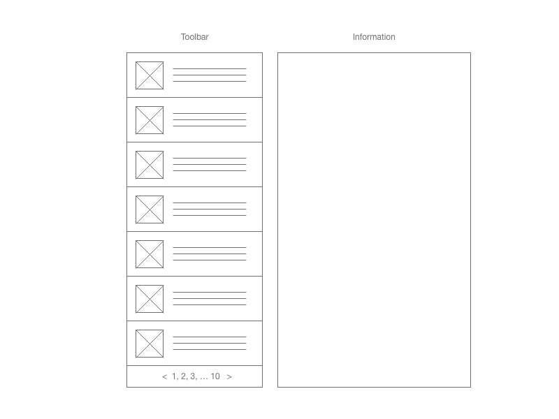
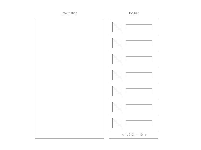
This is how the tool works. Users need to first interact with the toolbar to see the information on the information panel.
Currently we have two arguments regarding where should the toolbar and information panel be placed. Right or left.
A. Since people are reading from left to right. And users need to first interact with the toolbar then see result display on the information panel. Therefore, toolbar should be placed on the left side. This argument is emphasizing on interaction.
B. Since people are reading from left to right. Information panel should be placed on the left side and toolbar on the right. This argument is emphasizing on reading information.
I’ve been trying to search for some answer. I am just wondering is there any study out there talks about the optimal toolbar placement. And what’s your rationale?
The closest I can find is this A Study on Optimizing Toolbar Placement in Computer Graphical User Interfaces


