0

I have a modal/lightbox with the gallery on the mobile (it doesn’t have action buttons, so no chance for cancel button).

Considering latest research on thumb zones, does it make sense to move “close“ and/or other actions to the bottom center?

enter image description here

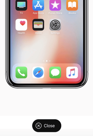
Apple seems to do it on the iPhone X landing:

enter image description here


Or does familiarity (top right corner) outweighs difficulty of reach?

(Personally I have troubles reaching top right corner with one hand on iPhone 7 Plus)

1 Answer 1

1

I think it would depend on other actions the use may want to take. Putting it at the bottom seems like a big call to action, and feels distracting unless it’s a modal or other very transient action.

Since this is a modal, I think closing is a primary action so a close button there feels reasonable. However, I would be careful in highlighting it if it’s a light box in order to avoid making I distracting.

Otherwise, if it’s reading an email or something else I would say top corners are fine and where the user expects it. Sometimes it’s good to make actions a bit harder to do.

Your Answer

By clicking “Post Your Answer”, you agree to our terms of service and acknowledge you have read our privacy policy.

Not the answer you're looking for? Browse other questions tagged or ask your own question.