0

In my web registration form I have signup/signin button options (CTAs).

I do not want to confuse the user with two bright and obvious CTA buttons, myself and my client would much rather have just one of the buttons have more focus.

But we do not know which would be best for our situation. Is there a general rule for this?

For example: Register as new user: enter image description here

Or

Sign in as existing:

enter image description here

As you can see the blue filled CTA is supposed to have more focus than the inverse.

Edit: the "new user registration" form is quite lengthy, it has a minimum of 6 fields there are more fields depending on how the user answers. So I would like to separate these two options onto one single page without the input fields.

1
  • This depends where the business focus is. If the focus is on retaining users with a strong and lasting relationship then the login button should probably have more importance. If, however, the business is focussed on a short term engagement with the user and signups are more important than a relationship (not necessarily a bad thing) then the Register button should probably be more visible to the user. Commented Feb 16, 2018 at 10:12

2 Answers 2

1

Do you want to generate more registrations? Great, put the "Register"-Button in Focus.

Do you want to limit registrations because your hosting your site on your smartphone? Okay better put less focus on registration.

Its that easy to be honest.

Make the Register button as prominent as possible without making the "login" button hard to find for existing users.

Protip: You can use a button for "Register" and a textlink for "Login" next to it.

There are so many options, it depends on what you want to achieve.

5
  • Is there a study that to support your statement? Commented Feb 19, 2018 at 9:01
  • A study about what? That people perceive big flashy buttons before they perceive less flashy buttons/texts? That study is called common sense and the only reason call to actions exist. Commented Feb 19, 2018 at 9:43
  • Yes, that study. Without research base evidence you words are just words and nothing else. Commented Feb 19, 2018 at 11:46
  • econsultancy.com/blog/… And literally every other study regarding eyetracking and/or user perception. Commented Feb 19, 2018 at 11:58
  • Good read on CTA, but I did not find any relation between the article and the question. How will highlighting the registration button on the sign in/sign up form will lead to more leads if users are visiting the page solely for the purpose of signing in or creating an account? Commented Feb 19, 2018 at 13:19
1

Neither really. You want to focus on the first input field if there is such present, but not the button. You can have button of two different colors as per your example, but only for the purpose of highlighting the difference.

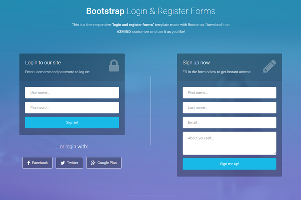
As per your comments, there is a solution to this (please see example #1), but if the sign up form is rather big, you want to ask yourself if you want to combine these two into one page.

Example #1

enter image description here

Hope this helps.

1
  • Thanks for the input Ivan. But the problem with that is that the "new user registration" form is quite lengthy so I would like to separate these two options onto one single page. Commented Feb 16, 2018 at 9:58

Your Answer

By clicking “Post Your Answer”, you agree to our terms of service and acknowledge you have read our privacy policy.

Not the answer you're looking for? Browse other questions tagged or ask your own question.