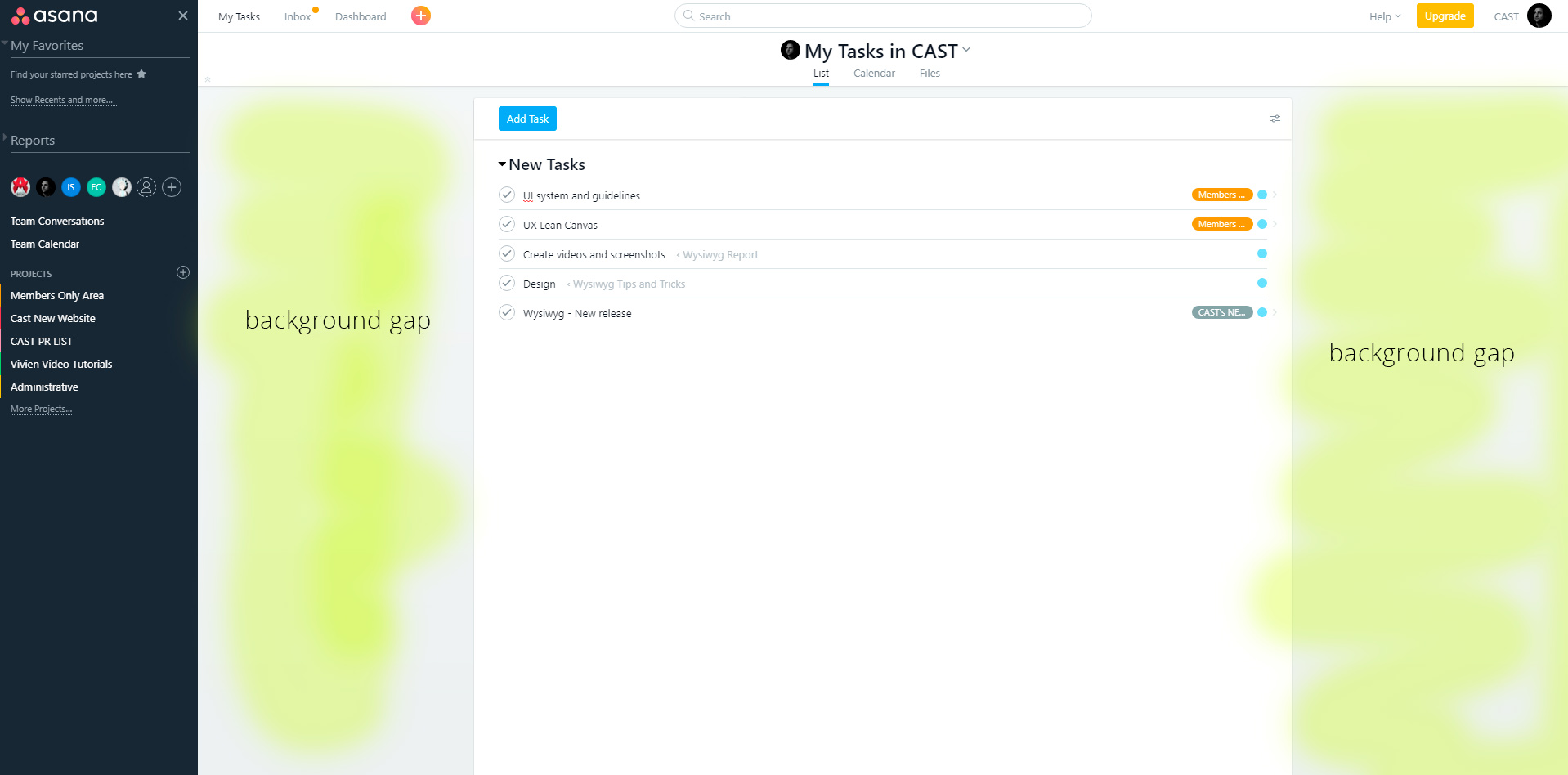
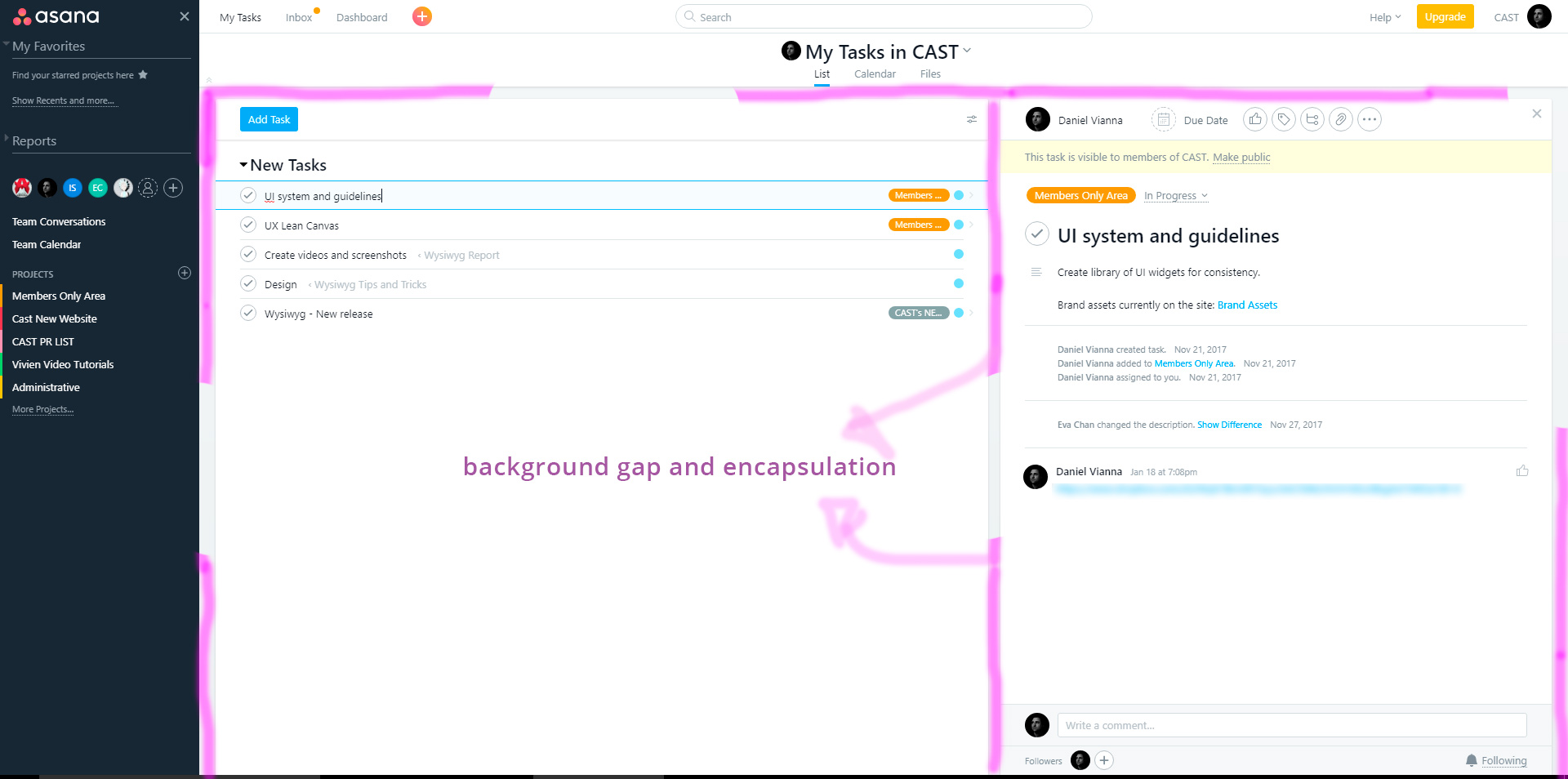
I'm designing my first single page application which is for users to manage their USB dongle for a desktop application and also to create teams and request tech support.
This is the wireframe of the application which will be half SPA and half page based:
Support page after alert is dismissed
Question: What is the best solution for positioning an alert in this case? considering headaches with responsive screens? in my example, I created the widget on top of the tech support widget with a permanent gap. But a better solution is to push the content down automatically when this alert box is summoned and after it's dismissed the widget returns to its original position. The context of this widget is to alert the user that his dongle license is expired which restricts him from requesting certain types of tech support.
Question2: should an alert box be inside the canvas as a widget that shows up and goes away or a modal box as an example of Asana? That would be a third approach for this situation which solves the spacing issue, but I don't know in terms of usability what is the best implementation of alert boxes.
Question3: How should I position my alert box considering different ways SPA layouts in terms of background spacing (encapsulation of widgets/screens) between widgets considering both design and front-end aspects? I've seen some with gaps such as Asana and others without such as Slack?


