0

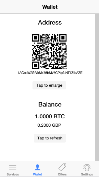
The screen below in my app displays wallet and current balance information.

I think it is very difficult at the moment to distinguish between the two.

How can I better display this information to the reader? What would be the best way of organising it?

Wallet is meant to give information on the user’s wallet address and provide them with a QR code that they can share with friends, when they need to transact (ie send/receive money).

Balance tells the user how much money is left in their account.

enter image description here

4
  • You haven't described two things. Wallet and Balance... What's the difference?
    – Confused
    Commented Dec 4, 2017 at 1:37
  • Can you please able to say why you add the QR code over here.... is it for adding balance to your wallet ? Commented Dec 4, 2017 at 6:41
  • I’ve updated the question with more detail. Yes, the QR code is meant for sharing with friends and businesses when needing to transact
    – methuselah
    Commented Dec 4, 2017 at 7:36
  • i will add the suggestion in answer section Commented Dec 4, 2017 at 7:55

1 Answer 1

1

Here have some key point to change:

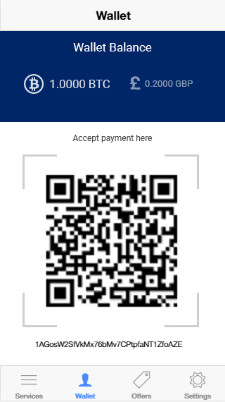
  • in this section the highlighted things should be the user's wallet balance. so keep the the balance at top. then put the balances (Bitcoin and GBP) then
  • add a title that should define why you are using the QR code
  • make the Qr code large and don't put the button to make it large
  • remove the refresh button and instead of that you can add scroll refresh system (having on the top screen scroll, just like facebook refresh )

make the thing to make it too minimal with user efficiency

here i added a image may be well define your problems :)

enter image description here

1

Your Answer

By clicking “Post Your Answer”, you agree to our terms of service and acknowledge you have read our privacy policy.

Not the answer you're looking for? Browse other questions tagged or ask your own question.