2

mockup

download bmml source – Wireframes created with Balsamiq Mockups

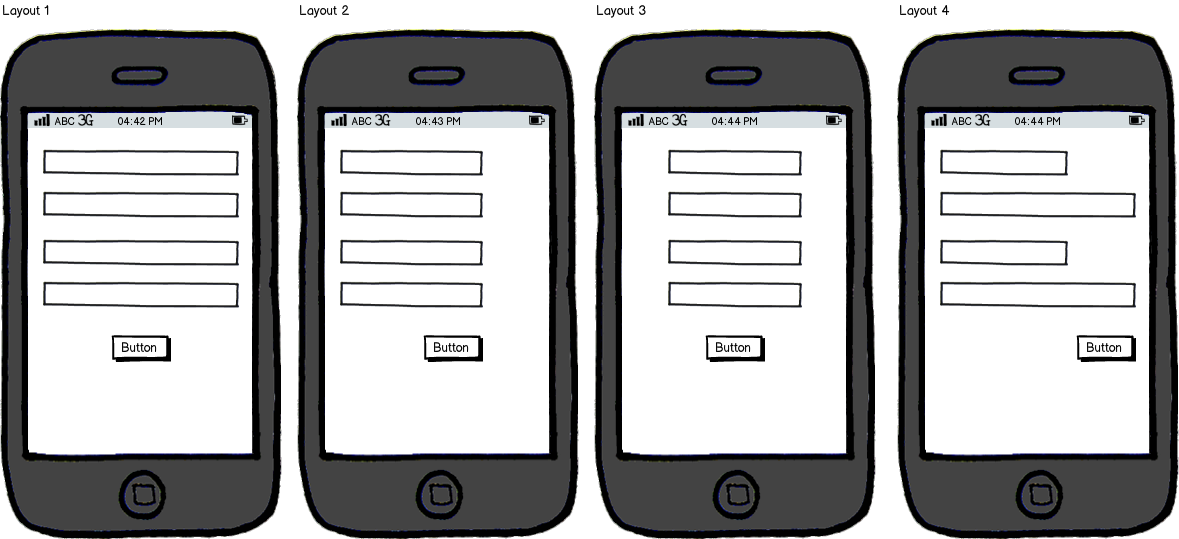
Layout 1 - Input fields stretched to fit the screen size and button(s) center-aligned

Layout 2 - This is a direct web-to-mobile translation where fields are of same size but are left-aligned with the button(s) right-aligned

Layout 3 - The fields aren't stretched to fit the screen and the whole form is center-aligned (card-like layout)

Layout 4 - Variable field sizes depending upon requirement with the longest (or biggest) field fitting the screen and the button(s) are right-aligned

I know that all the layouts I have mentioned below are usable and this might feel like an opinion-based question but I don't want to know which one is preferable.

My question is that which one would the best in terms of usability and ease-of-use?

1
  • I think the first one is best for the large input fields make it easy to tap, but i would just change the position of the button to the right side. I think that way would be best when using the device with one hand. Commented Nov 16, 2017 at 0:22

3 Answers 3

3

For me, option 4.

I use shorter input fields for fields that can only have a few characters worth of input. For anything else, I use full width fields. Reason being is that you can manage expectations better if the length of the input field matches its content. You don't want people to think they are doing something wrong because they're given much more space than they need. Think about test forms in school that give you a ton of space when your answer only needed one sentence to be coherent and insightful. You start to doubt yourself. We want users to be confident and assured while filling out a form.

Baymard institute usability study found that if a field is too long or too short, users start to wonder if they correctly understood the label. This was especially true for fields with uncommon data or a technical label like CVV (card verification code).

3
  • 1
    I think your answer makes a lot of sense if he where talking about a pc and not a mobile. Reducing the space of a field to 2 characters to insert your age for example will make it actually harder to interact with and not easier. I think anyway you are assuming some odd fields and not just a normal form (name, email, password, etc) where no explanation is needed. As the question asks about usability on a mobile, the correct answers will be the first one, although I will make the button full width to improve usability too. Commented Nov 17, 2017 at 11:16
  • Well when I mean shorten it, I don't mean so it can literally only hold 2 characters. I mean it should be visually shorter than the full width ones. On mobile, the field needs to be tall enough and wide enough to accommodate good tapping. This doesn't immediately mean every field (or button) has to be the whole width of the device. It would be interesting if there's research that measures where people tap: left, middle or right side of the input field. Commented Nov 17, 2017 at 11:29
  • 1
    That will be amazing. Although it will probably have to take a lot of things into consideration such as: device width, if the user is left or right handed, size and position of the target, where the text is aligned and of course multiple forms input sizes and positions. Sounds like fun to test! But at the end of the day and without an research, the full width (Option 1) covers many more user case scenarios. Simplifying the filling up experience to left and right hand users. Commented Nov 17, 2017 at 12:38
1

Go with the first, where the fields are stretched out over the whole width. For a mobile phone this makes sense:

  • The screen is smaller so field widths won't be out of proportion.
  • Left and right handed people can more easily reach the fields with the thumb.
  • All left aligned fields start at the same position from the left, while all right aligned fields (numbers) start at the same position on the right.

The symmetrical layout can also be more aesthetically appealing or easier on the eye.

While it's a good idea to hint about the requested input giving just enough space, it's better to focus on descriptive labels and instructions.

0

which one would the best in terms of usability and ease-of-use?

The first one since it makes it really easy for the user to tap in those fields.

I would make the button cover the whole width too, to increase tap area and make it visually more appealing with the form fields.

Your Answer

By clicking “Post Your Answer”, you agree to our terms of service and acknowledge you have read our privacy policy.

Not the answer you're looking for? Browse other questions tagged or ask your own question.