1

Colour is used in other UI elements to drive usability, such as green for "positive". However, it seems that color isn't used in check marks, check boxes, and radio buttons, possibly due to other factors such as: branding, surrounding UI, and click-ability issues.

How might color affect check marks, check boxes and radio buttons in UI/UX?

5
  • I think besides best practice, always the colours that are surrounding these web elements need to be considered too.. for the best look and feel.
    – A user
    Commented Oct 25, 2017 at 14:40
  • 3
    I can see why you'd think check marks by themselves may need to be green but I feel like checkboxes and radio buttons are rarely green and I don't particularly see why they would need to be?
    – DasBeasto
    Commented Oct 25, 2017 at 14:43
  • Hey Ting, welcome to UX.SE. By necessary, do you mean are there advantages to color in those UI elements?
    – Alan
    Commented Oct 25, 2017 at 16:22
  • yes, cause I see those are the positive colour system, and I always think it should be green, but after research, selection colour(checkbox & radio button) seems doesn't necessary to be green, it can follow by many facts like branding & surrounding UI & clickable issues.
    – Ting
    Commented Oct 25, 2017 at 16:34
  • Okay, I am going to attempt to edit your question. Please feel free to make edits after mine.
    – Alan
    Commented Oct 25, 2017 at 17:00

2 Answers 2

4

On one hand, you'll need to modify native behaviors, which takes more time and effort and you risk some usability issues.

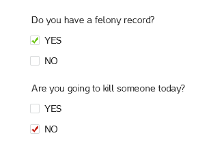
Second, unless the case is very specific and limited, you won't need any color reinforcement for positive or negative (because if you want to reinforce positive, you'll need to balance with negative as well). Consider the following:

enter image description here

This simple and blunt example shows how checking something that is bad positively reinforces something negative, and checking something that is good reinforces negativity by use of colors, creating a high cognitive load. Believe me: when I did it, I had to think twice if I was creating the example correctly.... and I was creating it! Just imagine this for a regular user.

This example also shows a problem: how do you know what is good and what is bad? How do you discriminate this on a broad basis? Answer is simple: it's close to impossible.

In short, to answer your specific question: color always have an influence. It might be bigger or smaller, but it always exists. In this particular case, I'd say it has a lot of issues and probably no benefits at all

A caveat

It's relatively common to see green checkmarks and reed crosses on marketing, specially when they're listing benefits (and lack of them, for example when comparing plans), but these are specifically created for this, so user doesn't have to interact with them, and they are not dynamic

0

How color affects checkboxes, checkmarks and radio buttons kinda depends on the job color needs to perform.

If color's job is to convey a specific quality independent of the selected/unselected status of the control, it's a messy variable to play with. The control's text label, the labels of associated controls (other choices within the same radio array for example), the section headings, the context of the form itself - all these things and more can reinforce or undermine whatever it is you're trying to accomplish with that extra "track" of information color is layering on top of a boolean control.

I can't find an example to share because, as @Devin pointed out, I think this is mostly done in marketing imagery and not for true/false state controls in UIs. My knee jerk reaction is that this feels like just one more chance for stakeholders to disagree.

On the other hand, if the job of color is simply to make the control more conspicuous to serve a design intent like reinforcing the difference between selected and unselected states, then color becomes a currency that you have to spend wisely. Anything else onscreen that uses color for distinction is competition, so rules have to be set up. The identity of that secondary or accent color varies greatly, but I would say this is very common use of color for these types of UI controls.

In the example below, notice that only the selected state uses color:
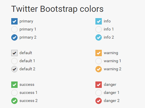
Bootstrap Control Colors

Another job of color in forms might be to reinforce a color theme. This can be done within the context described above, i.e. all the "selected" states are colored from a theme.

I don't actually see too many UIs that extend brand trade dress to cover UI controls. Personally, don't think it's worth the cognitive overhead of a single human noticing that the radio buttons' "selected" state matches the drapes and aren't just grayscale.

Your Answer

By clicking “Post Your Answer”, you agree to our terms of service and acknowledge you have read our privacy policy.

Not the answer you're looking for? Browse other questions tagged or ask your own question.