3

I am currently working on an enterprise website with loads of different views/content.

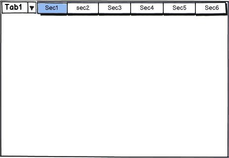
I have chosen tabs as a navigation and each tab has a new view in it .On top of this, i have grouped all these tabs into modules and chose module tabs for navigation.

Check the first image for reference

enter image description here

The problem that I am facing here is the arrows on top seems functional on secondary tabs but in primary when arrows are used user misses context as top-level tabs move away.

and another option I tried was putting more at the end of top-level tabs.

Check the first image for reference

enter image description here

but I am not sure of how this interaction would look

example - when the user selects tab 9 from the drop-down how will user go back to tab 1

enter image description here

So arrow is necessary here again and it is will be a mix of option 1 and 2 which seems wrong I think.

Let me know if this has any other solutions.

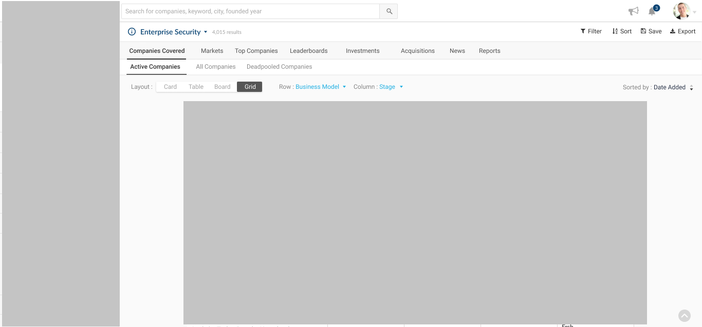
This is how it looks in site enter image description here

2
  • 2
    Tab overload! I would avoid those tab like buttons for the "Layout" section. Icons could easily work here and there are icons available for such options. Just a thought. Commented Jan 24, 2018 at 9:28
  • 1
    Can the subcategories be set in multiple rows instead? Or are there subcategories below those tabs as well? It feels like the core of the problem is bad categorization, really. Is there a way to break you navigation down into more digestible chunks? Even if this means adding more levels?
    – invot
    Commented Jan 25, 2018 at 18:04

5 Answers 5

3

mockup

download bmml source – Wireframes created with Balsamiq Mockups

The same question had been already raised earlier. What about handling primary modules as horizontal tabs and secondary modules as vertical tabs?

I have added a very rough mockup just to convey the idea. From your design, the user will have to click on a more button to view the remaining primary modules. So,if the user don't have to shift between primary modules very frequently, you could give the option for user to set an initial context for primary modules and allow the user to shift between the secondary modules.

NB: The way to select of primary module in the mockup may not be the correct option. I just put it up to convey the idea.

7
  • I would be happy to but as all the views take up a full page. I cannot afford to use vertical space. This platform I am working on is a data platform hence every pixel is important for me.
    – Harshith
    Commented Oct 23, 2017 at 8:04
  • 1
    Have you made a design for a concept with a sidebar? It might not be as unfeasible as you think, and if it is, you have solid evidence it cannot be done (for your stakeholders). Currently the navigation is heavily cluttered and confusing, so sacrificing some space for navigation seems like a priority. Commented Oct 23, 2017 at 8:10
  • Is it mandatory to show the primary module all the time? Will the user switch between the modules frequently? Commented Oct 23, 2017 at 8:31
  • Yes, all all the information is almost related and all modules are core features
    – Harshith
    Commented Oct 23, 2017 at 8:45
  • I was hoping if the shifting between the primary tabs is not often, you could limit the selection of primary modules to one at a time using a filter or a drop-down at the top and hence the secondary modules will behave as a context driven (based on the primary module selected) Commented Oct 23, 2017 at 11:00
1

Vertical Navigation

Vertical (a.k.a. “Sidebar”) navigation is a way of showing a persistent site or application structure along one side of the product.

Unlike tabs, vertical navigation is appropriate when the number of categories is not small, or is user-customizable (such as folders or tags in an email client). It is considered a “safe” navigation pattern because it is familiar, flexible, and doesn’t take up much space. It is often used when there is no other obvious choice.

In your case

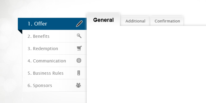
You could try using some of the vertical space with "Tabs" and Horizontal Space with "Sub Tabs". Much like the image attached below.vertical space with "Tabs" and Horizontal Space with "Sub Tabs"

1

I'm not sure why you're so adamant on tabs. When you have multiple layers of navigation tabs become confusing, frustrating and difficult to navigate.

I've recently been looking into navigation for mega sites and this nifty example of a top navigation bar came up in my research. https://www.fold3.com/image/10985207

It doesn't take much screen space when the user is browsing the selected page and neatly folds out when the user wants to navigate.

I know that maybe this isn't a direct answer to your problem but I hope it inspires a better solution.

1
  • Can you explain the down vote please? Commented Jan 26, 2018 at 7:32
0

You could minimize the tabs furthest from the selected tad.

initial

|*tab 1*|tab 2|tab 3|tab 4|tab 5|tab 6|t.|t.|t.|

tab 5 selected

|t.|t.|tab 3|tab 4|*tab 5*|tab 6|tab 9|tab 8|t.|
0

...Since I am also working on complex dashboards and have encountered the same issue several times, I turned up into turning tab elements into vertically collapsed nested dropdown elements.

edit: About your concern that you need to use every pixel available - when users need to navigate, they don't really care about what's on the current screen; they just want to get there easily. No-one is going to play with your menus (although many of us would like them to!), they just need of an intuitive way to navigate to the page their want. Nothing more straightforward that what they are already used to (and I proposed above).. nested dropdowns.

edit2: I well deserve the downvote, but I didn't get what you asked for before you asked again.

Check this out. If you remove the 'tab' style on the top menu, then, even scrolling out wouldn't keep you 'out of context', would make more sense that having a 'tab style' being out of view.

enter image description here

2
  • 1
    No idea why the downvote, all I suggested was to style the tabs as nested dropdowns in the mobile version...oh, well... I'll deal with it :) Commented Jan 26, 2018 at 13:37
  • I also didn't understand why the downvoting, so have one on the house. I think this problem would be avoided with proper page grouping and with prioritization sorted. Commented Jan 26, 2018 at 14:21

Your Answer

By clicking “Post Your Answer”, you agree to our terms of service and acknowledge you have read our privacy policy.

Not the answer you're looking for? Browse other questions tagged or ask your own question.