2

I am working on the display of survey results. Basically, our company sends chatbot-like surveys to employees. I am working on a better way to display the results at the end of these surveys, with the update of having nested questions (conditional question / piping / branching logic).

The questions can have various types:

  • Open questions, like "what is your name ?" Results are displayed as a list of answers, like comments on Facebook.
  • Single choice questions, where user can pick one answer amongst a set of answers, like "yes/no". Results are displayed in a pie chart.
  • Multiple choice questions, where user can pick one or several answers from a set of options, like "what do you like to eat? - pizza - pie - broccoli -cookies". Results are displayed in a bar chart. These multiple choice questions may or may not have an option "other" for the user to give his own answer. In that case, the "other" answers are displayed under the bar chart, like the open question results (as a list of verbatim like comments on Facebook).

The big update is we can now have nested questions. That means one question can come and depend on the answer of previous question, which itself can depend on the answer of a previous question, etc. The nesting should stay on only one level in most of the cases, however the interface should be ready to any case, even absurdly complex.

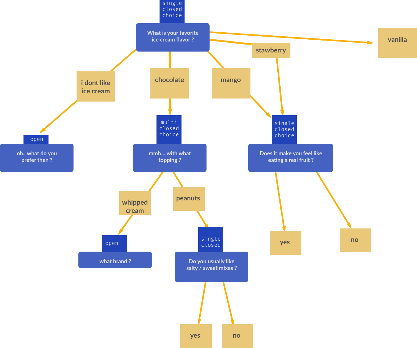
Here is an example of a survey I could need to display:

survey logic example

High quality version here

As you can see, the range is pretty wide but things were fine when questions were not nested. Each question was displayed in its own tab and that was it. Now it is getting complicated, with all this full customization of the survey that the user has.

I am looking for some tips of where to start, some leads, like examples of websites that display such data so I can have a look to find ideas?

I've looked at Google Forms, Survey Monkey and Qualtrics, but they don't visualize this logic (I think Qualtrics uses a manual filtering system).

2 Answers 2

1

Perhaps keep the result display as simple as possible -- horizontal bar charts to show quantity of each answer, followed by listings of answers grouped under each parent question.


1. What is your favorite ice cream flavor?

Chocolate ------- 5

Vanilla ----- 4

Strawberry ---2

Other -- 1

Other: Butter Pecan

Chocolate

What topping do you prefer?

Hot fudge --- 3

Whipped cream -- 2

Vanilla

What brand?

Dairy Queen -- 2

Dreyers -- 2


2. What kind of shoes do you wear?

Etc

Is there a reason why it might need to be more complex than this? A few headings, borders and white space treatments can help connote hierarchy.

0

First of all you have to understand what information you want to highlight/make more accessible.

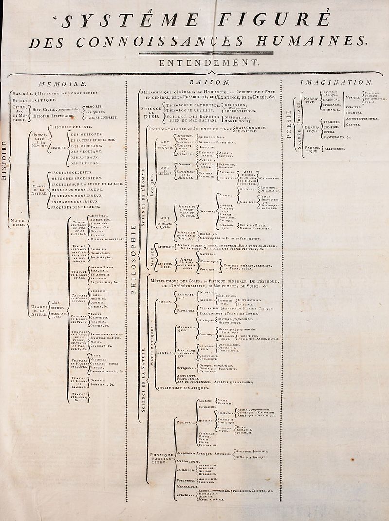
You can show the tree the same way you browse folders in your hard drive. Browsing does not need to provide results then it may be a simple tree view:

By See en:List of contributors to the Encyclopédie - http://ets.lib.uchicago.edu/ARTFL/OLDENCYC/images, Public Domain, https://commons.wikimedia.org/w/index.php?curid=66423

With this visualization each node is a question, you click on the node and you get the details.

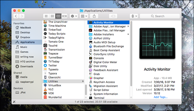
You may also use a different approach, instead of a traditional tree view you may opt for a a columns view (the one used in Mac Finder, for example):

https://www.howtogeek.com/howto/33414/how-to-make-the-mac-os-x-finder-suck-less/

Last column is for details, the others are to explore the tree. Same logic used in MacOS can be used here.


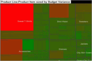
We're talking about data! We don't just have a scheme but also wonderful results we may want to highlight. What better than a good old tree heatmap?

http://infocenter.informationbuilders.com/wf80/index.jsp?topic=%2Fpubdocs%2Fvisdis_ae%2FVisualDiscovery_AE_User%2Fsource%2Ftopic20.htm

Where each block is a question and with color and/or size you quickly highlight the results. Note that you may keep size fixed and use only color. Also note that you may want to normalize results or not.

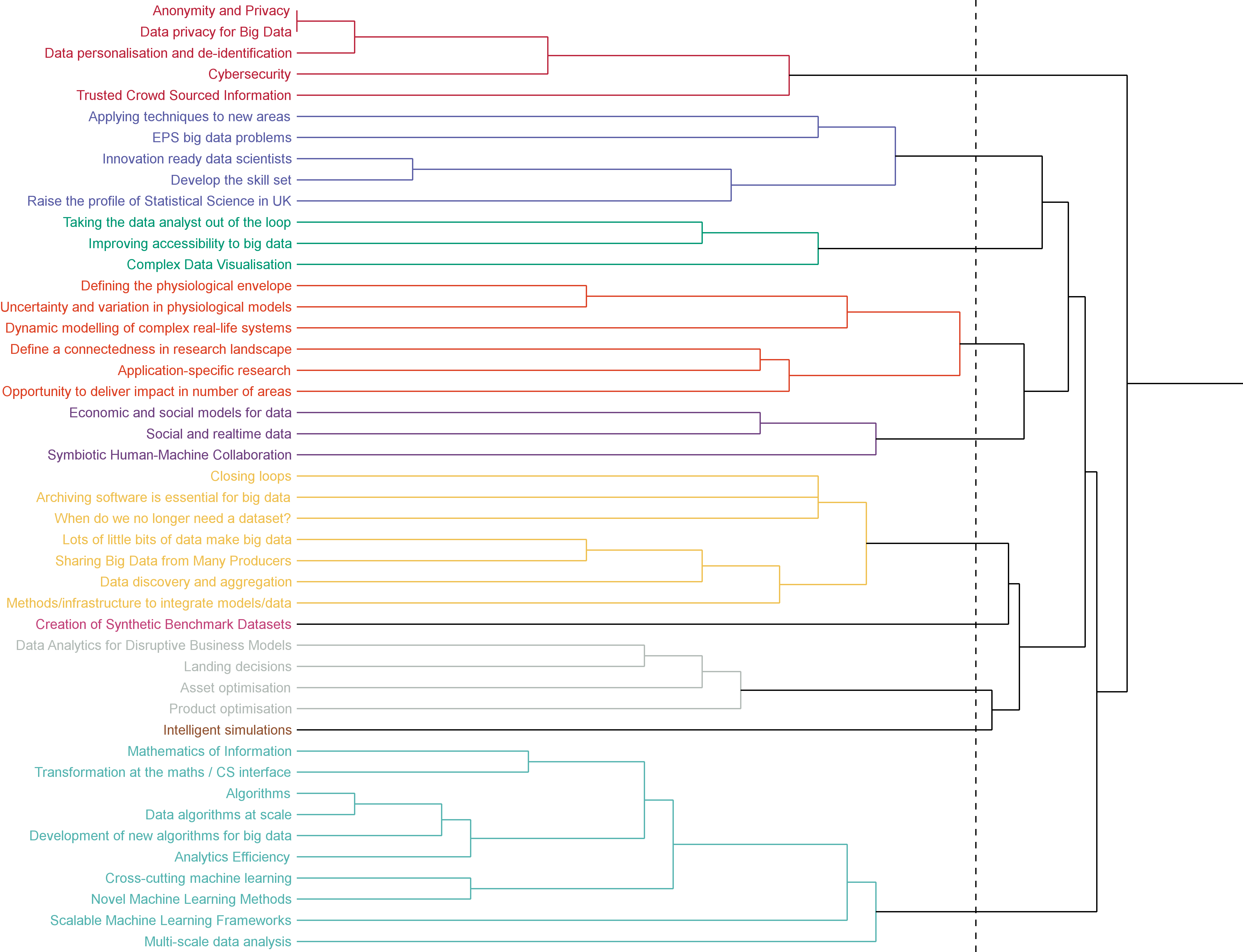
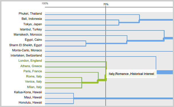
Anything else? Let's hack a traditional dendogram:

enter image description here

You should put text on each node (like a plain tree) and you can use line width to convey information:

https://support.optimalworkshop.com/hc/en-us/articles/201997650-Interpret-the-OptimalSort-Dendrograms-for-open-and-hybrid-card-sorts


All these said...why not something similar to your sketch? Drop those vibrant colors, reduce noise (single/multiple and open/close may be a small icon near the text) and use exactly that graphical representation. Click on a question to popup results. You may add colors to quickly highlight hot answers.


Just one small note, an area chart for yes/no? Why? A stacked bar or simply a bar chart is definitely better and easier to interpret.

Your Answer

By clicking “Post Your Answer”, you agree to our terms of service and acknowledge you have read our privacy policy.

Not the answer you're looking for? Browse other questions tagged or ask your own question.