1

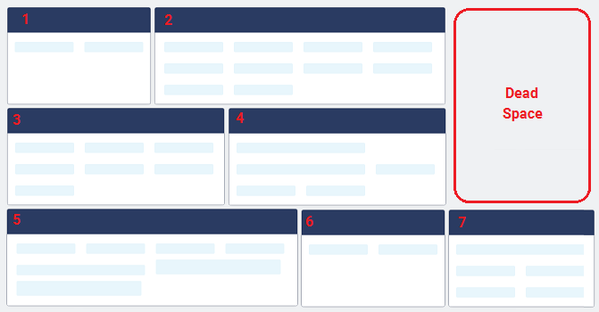
We have a screen which displays tiles and on each tile there is at least one field. Currently the tiles allow a maximum height of three rows of fields and an unlimited number of columns. The user is allowed to manually maintain the number of fields per tile which means that the width of the tiles can grow dynamically. The issue we are having is that it leaves some dead space on some of the tiles (see tiles 1 and 6 in Example 1 for extreme cases).

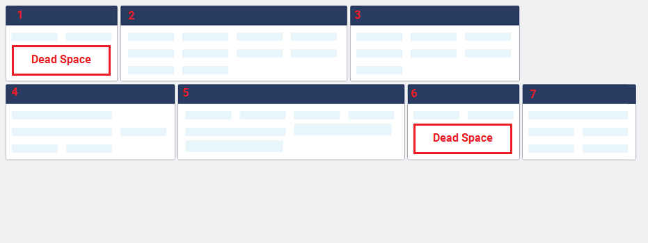
When the screen is resized, the order of the tiles is changed so that it wraps from left to right, top to bottom in the number indicated below in Example 2. However, when the wider tiles are re-ordered, there is obvious dead space remaining on the screen.

Is there a better way to have the tiles and fields work so that they not only reduce the amount of dead space but also allow for a intuitive reorder when the screen is resized?

Example 1: Example 1

Example 2: Example 2

2
  • I'll put this as a comment as I'm not sure I've grasped the problem, couldn't the tiles next to the dead space fill across? Or all tiles just expand on that row? Commented Aug 24, 2017 at 15:29
  • @UXfrom12, currently the tiles only grow wider based on the number of fields in the tile.
    – vbguyny
    Commented Aug 25, 2017 at 17:52

1 Answer 1

1

What is the user trying to do with this content?

Start with the users priorities, which often trumps aesthetics

One thing you might explore is the use of Flexbox (in context with bootstrap 4 here) for dynamic widths. Talk to your devs on this.

Here's MDN docs. Anything further than that is more suitable to Stack Overflow.

If the order of the tiles is important, personally speaking as a user, I don't mind dead space if the sequence is maintained for me. The same goes for if comparison across tiles is important as well.

Another approach (with caveats)

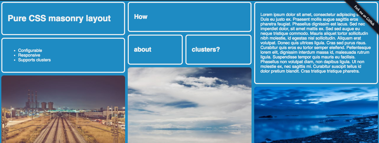
If it's a browsing/exploratory interface, in which the data itself is not ordered in any particular importance (the order doesn't matter), you can try a masonry UI.

enter image description here

enter image description here

Here's a demo:

Here's a more in-depth description:

There are some drawbacks to this, to name just one:

If you need your content to go from left to right in a date ordered style, pure CSS masonry might not be the right solution for you.

Pro

  • fills the space, and provides an immersive experience
  • encourages exploration, browsing, scrolling
  • works well for primarily visual content

Con

  • hard to search for relevant content if reading is a priority across tiles
  • is biased towards aesthetics and can reorder info.
  • comparison between tiles will be difficult due to alignment and shape change
4
  • very nice! I think it can be done with Bootstrap as well, but the explanation you gave on each of the possibilities is great as usual
    – Devin
    Commented Aug 24, 2017 at 16:34
  • thx. That first link describes it in context with bootstrap alpha 4. Just added that reference.
    – Mike M
    Commented Aug 24, 2017 at 16:39
  • Thanks, @MikeM, however I don't think you understand our use case. The tiles themselves will be containing fields for user input so they need to have a size which allows for the user to be able to do data entry. Also, the tiles need to wrap in an intuitive way so that the user doesn't have to search for the fields every time the screen is resized.
    – vbguyny
    Commented Aug 25, 2017 at 17:52
  • oh, thanks for clarity. so could you use than the first option (flexbox), so the tiles just expand horizontally, not vertically. You could use css to set a min height, so each tile lines up next to each other. Would that help?
    – Mike M
    Commented Aug 25, 2017 at 18:22

Your Answer

By clicking “Post Your Answer”, you agree to our terms of service and acknowledge you have read our privacy policy.

Not the answer you're looking for? Browse other questions tagged or ask your own question.