0

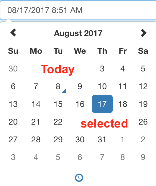
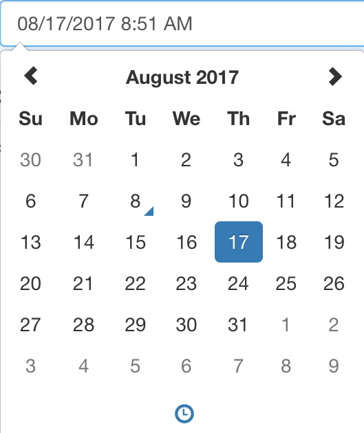
The typical component used to pick a date looks like this:

Date picker example

(from Bootstrap examples)

You'll notice it's not very clear at the first sight what is the current date and what is the selected date. Just to be clear, this is the "ground truth":

Date picker with Today and selected date annotated

Are there some best practices to indicate the selection and the current date, so that it's immediately obvious which is which?

4 Answers 4

2

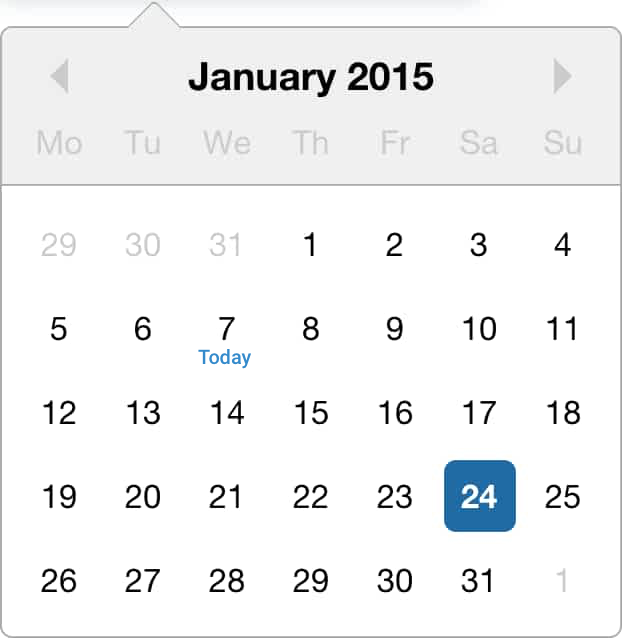
IMO, nothing is more clear than writing "Today".

enter image description here

1

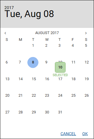
Seems a fairly simple issue, you could go with icons or text or both, as long as the meaning is clear.

Ignore the blue 'today' that's Balsamiq's and I'm not sure how to get rid of it.

Updated from original question due to comment

Simply make it clear, if the calendar is a date picker that closes, ensure you populate a label or textbox to show the selection.

Date Selected

3
  • Sorry if I did not make this clear enough - the selection in my case is just 1 day, not an interval.
    – vektor
    Commented Aug 8, 2017 at 8:12
  • 1
    Not sure why Balsamiq is shifting the calendar up or the elements down... Commented Aug 8, 2017 at 8:20
  • That's weird, @UXfrom12. We are having trouble reproducing the shifting bug internally. Would it be possible to send us the file to test? No pressure: [email protected] Commented Aug 14, 2017 at 13:59
1

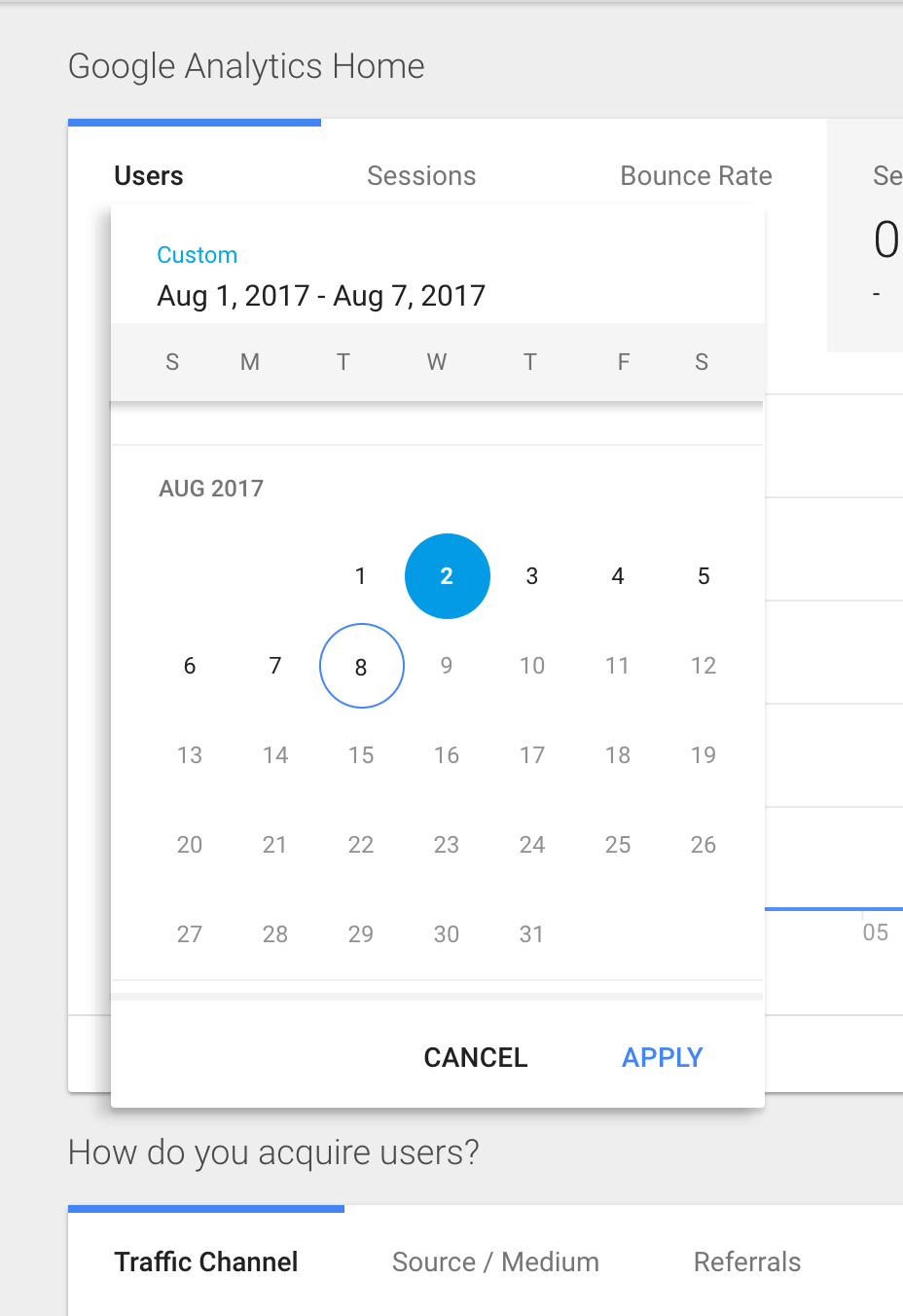
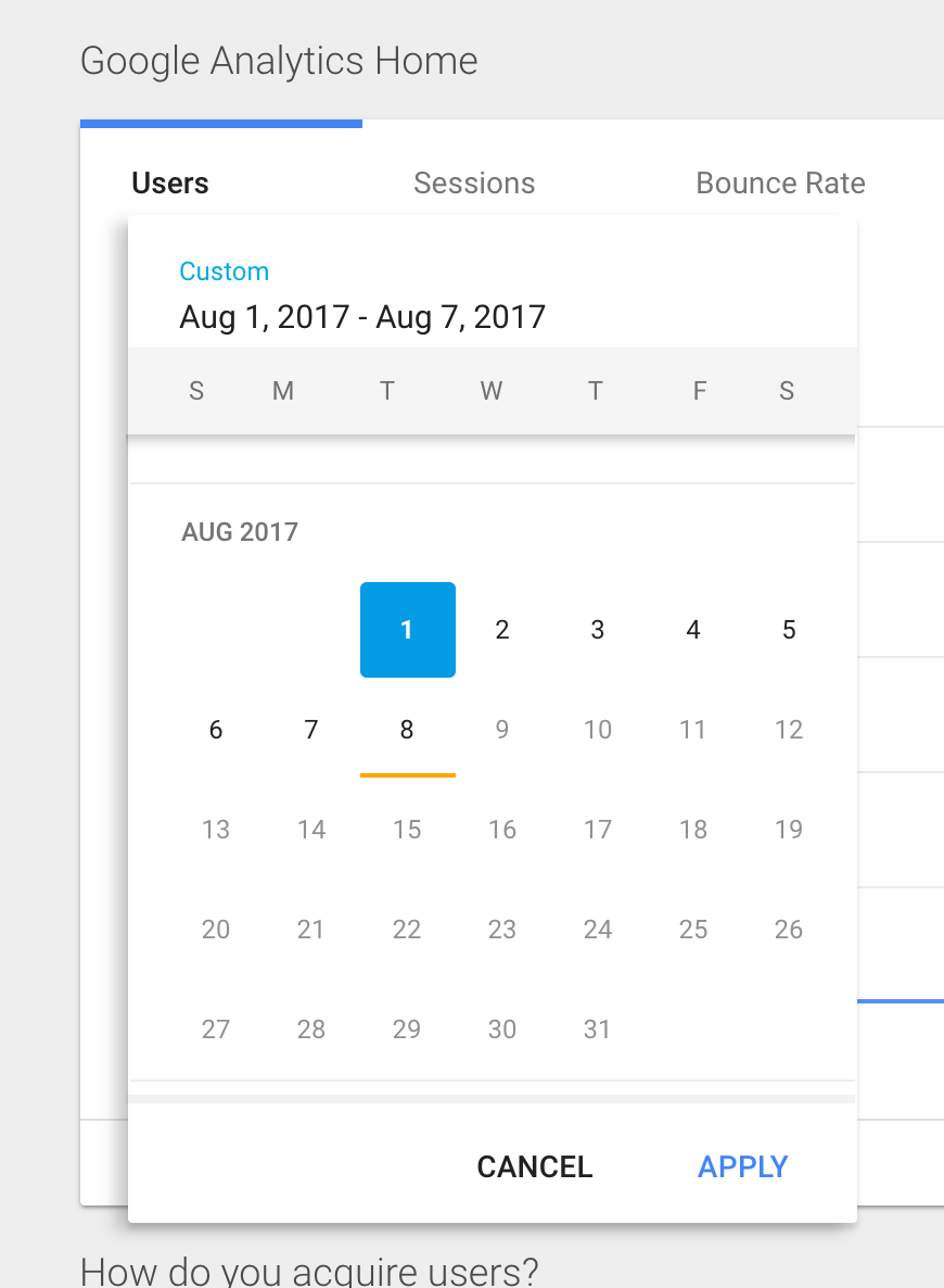
I don't have any hard research as to what works best, but Google Analytics uses the same shape, but gives an outline for today. You'll see clear contrast. Nevermind the date range label above: I just modified the calender itself.

enter image description here

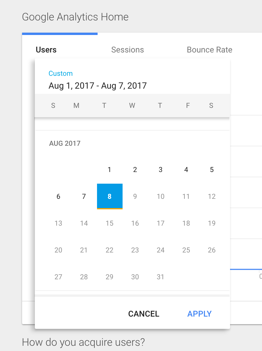
You'll also see some datepickers using a differing color underline to indicate today. This allows you show both the selection and today's date simultaneously. Here's a quick modification of the google AX date picker to demonstrate (the colors are just a start):

enter image description here

with both today underlined and today selected: enter image description here

Without seeing your current UI, and colors, fonts and interactions, these are some possible approaches to get the right amount of contrast and clarity.

0

There's no best practice for this scenario as such. Just keep in mind the following things and you should be fine:

  • Have the current date (the number or the box around the number) distinguishable from the rest. You can use anything right from your own example to different color box (Windows 10) or a circle around the number or the number in a different color.

  • Make sure that the selected date selection doesn't match the current date selection.

  • Although not necessary, show if the selected date is the current date with a new style.

Your Answer

By clicking “Post Your Answer”, you agree to our terms of service and acknowledge you have read our privacy policy.

Not the answer you're looking for? Browse other questions tagged or ask your own question.