2

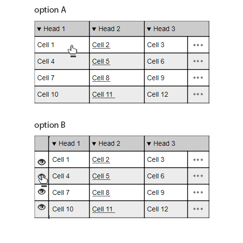
In a grid, that could contains several columns and some of the column contents are links that redirects to another pages. Do you thing that would be better to have a "view" icon that redirects to the item details page or the full row clickable, for instance, when the user mouse over the row.. I could change the mouse icon to the "hand" in order to show to the user that the row is clickable.

Also in the grid I could have another action buttons, such as "edit", "delete" and another specific actions regarding the functionality where the grid is placed.

These are the two examples:

enter image description here

What would be the best practice when redirecting the user to a "details" page?

5
  • Is the Details page, related to a single column of the row or the entire row?
    – uttham
    Commented Aug 1, 2017 at 3:41
  • It's related to the entire row Commented Aug 1, 2017 at 3:48
  • Then why did you give hyperlinks to a particular column?
    – uttham
    Commented Aug 1, 2017 at 3:49
  • Some of the columns could also have hyperlinks to another entities. Example: An appointments grid.. the details would redirect to the appointment details. But I also could have a hyperlink to the contact that is related to the appointment. Commented Aug 1, 2017 at 3:51
  • Too many action items will make it confusing. If there is no link on rows, make whole row clickable. Otherwise use link(cells) to direct to detail page along with other actions link (CRUD). Having an open/close eye put more burden on user's mind
    – UXbychoice
    Commented Aug 1, 2017 at 5:20

2 Answers 2

2

Option B is the way to go. It's very clear that the View icon is one hyperlink and the column Head 2 is the other.

Option A makes the situation confusing for 2 reasons:

  1. The users won't know exactly where to click for what as everything is clickable.
  2. You won't be able to indicate the difference in pointer.
2

It depend user to user, Option A

1: Different color treatment will work, as user remembers the link color (Blue for link widely use).

2: It will also reduce the extra element (Eye).

Option B

Eye Icon mostly used for Show/Hide, which might confuse user.

My Suggestion

According to me, Option A will have a good experience for user, as it will not have any extra element to remember for user.

1
  • "Eye Icon mostly used for Show/Hide" isn't an objection to the general idea of Option B, just the particular choice of icon. I think a magnifying glass is more typical.
    – nafg
    Commented Dec 23, 2018 at 23:19

Your Answer

By clicking “Post Your Answer”, you agree to our terms of service and acknowledge you have read our privacy policy.

Not the answer you're looking for? Browse other questions tagged or ask your own question.