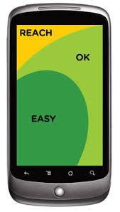
Taking into consideration the ease of access areas on a mobile device:
I am not sure how to determine/prioritize where to organize the main actions:
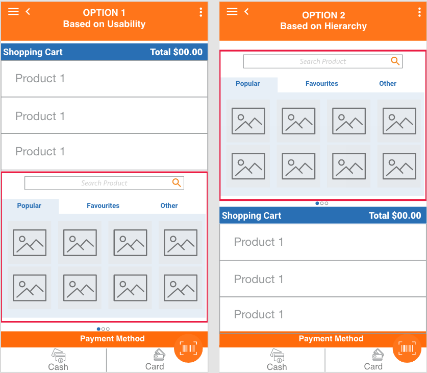
Hierarchy: Most important actions at the top
- Implications: might be on an area harder to reach
Usability: On the bottom 1/3 of the screen where the buttons are easier to reach.
- Implications: they loose importance on the overall layout.
For better understanding here is a mockup example of a Point of Sales app. The seller (user) will add products to the shopping list and then select the payment method. Here are the two approaches: (Actions inside the red rectangle are the main actions.)
Question Locate manin actions on a screen based on usability or hierarchy?
There might be other options/information that I might be missing so I would really appreciate other approaches, points of view based on experience or research.
ps: also appreciated Research regarding why search bars and other important actions are at the top of the screens regardless the ease to reach them, and if that has an impact on usability.
Thanks!


