4

Scenario

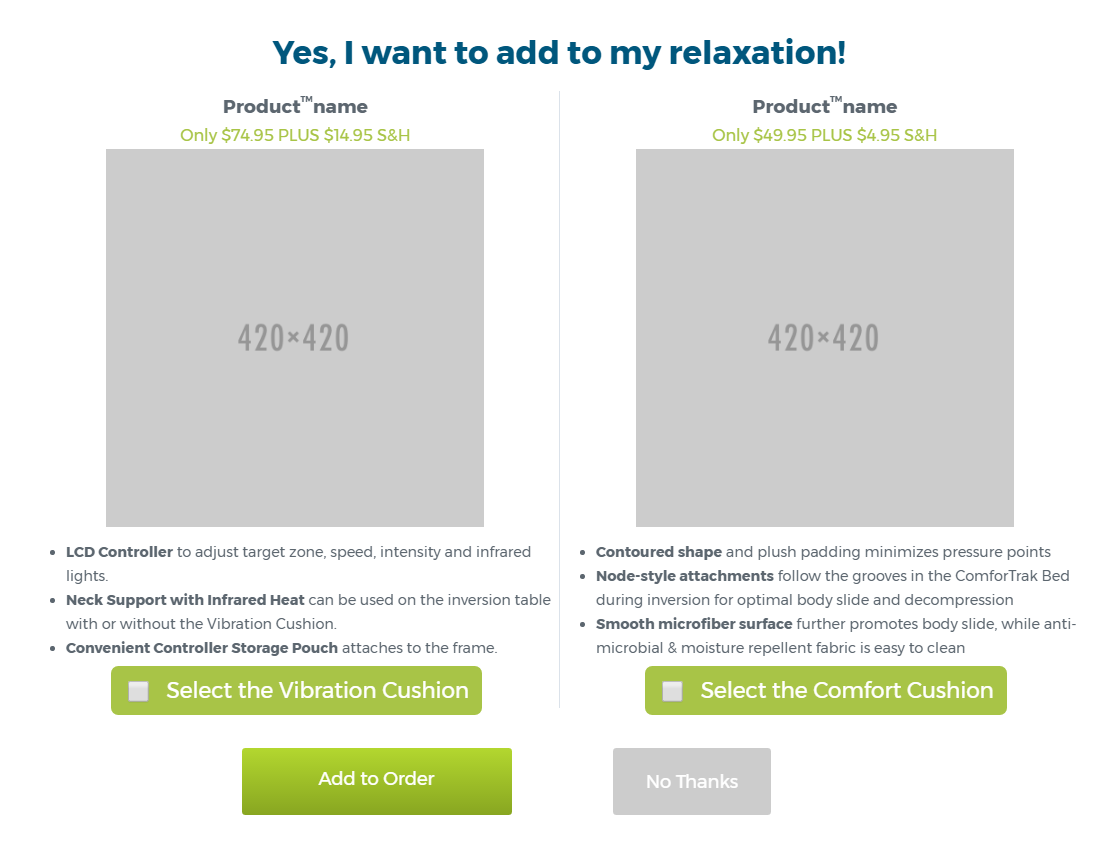
I'm working on a site with an upsell offer of two similar products that are presented upon entering the checkout flow. I need to let the user know they can add one or both upsells to their cart.

Current solution

Current design

In the current design, the user can:

  • Check one or both select buttons, then add to order
  • Hit no thanks to by pass the offer

Problem

If they press add to order with nothing selected, then nothing gets added to the cart and the window just closes and they are taken to the review order. I'd like to have feedback so add to order won’t submit anything until an option is selected. Unfortunately, I’m not sure I can program the plug in to do that.

I’m trying to think of another way to tell the user they should be selecting one or both of the products before pressing add to cart.

4
  • It is very hard to understand the problem without an image. Could you attach some wireframe or screenshot? Commented Apr 11, 2017 at 17:24
  • Sorry: imgur.com/a/ityDU
    – mpeterson
    Commented Apr 11, 2017 at 18:06
  • I believe the big product visuals are crucial in your case and as such it would be hard to put one product below another? Commented Apr 11, 2017 at 18:46
  • I could but it would make the user have to scroll down to see the other product. And it's mostly a comparison between similar products, but if they wanted to they could add both.
    – mpeterson
    Commented Apr 11, 2017 at 19:28

2 Answers 2

5

Less clicks, please 😬

The trouble here is that you're asking your customer to change how they think about adding to the cart.

Ask yourself a simple question when creating the control:

Is there anywhere else in the site that customers need to first select the product, then add it to the cart?

Hopefully the answer is a big "No!". If not, you probably have a site-wide conversion problem.

Use the site's common pattern

So just do what I'm guessing you do everywhere else: Give them an "add to cart" option.

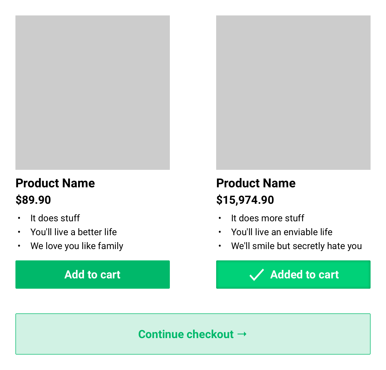
Simple add to cart button for each product

Profit through bad experience 😈

When you're pulling this kind of trickery on an e-comm site, it's usually to get the consumer to spend more than they intended. Your goal, for better or worse, is to create a wrinkle in the experience that causes them to regret not already having bought this additional thing(s).

Keep an eye on your stats

To achieve your evil end, you probably want to emphasize the "Add to cart" actions and slightly downplay the "Continue" action. Be careful though, you also don't want to see a spike in cart abandonment.

3
  • Thank for some feedback, I can apply some of this, but the way the checkout process is built, I'd like to show somehow that both can be added or not at all. Right now they have to click the check mark then continue on
    – mpeterson
    Commented Apr 11, 2017 at 19:47
  • 1
    The problem is that you're thinking about it as "selected". That's not how e-comm works in general use, and probably not how it works on the rest of your site. The "selected" state can happen invisibly for the user: "add to cart" selects, "continue" finishes the process, if you must. Commented Apr 11, 2017 at 19:54
  • "We love your family." Commented Apr 11, 2017 at 22:25
0

Is it possible to add both items to the cart, or is it one or the other?

If you can add both items, I would just change both buttons to whatever you use on your main call to action on your product page (e.g. Add to Cart). Provide visual feedback that the item has indeed been added, such as changing the the text to 'Added' or something similar. Finally, I would change the final call to action to 'Proceed to Checkout', indicating where the user will be taken to.

If it's one or the other, I would change the buttons to 'Add to Cart and Continue' or similar. This way, it skips them having to select the product, then hit the button to proceed to the next step.

In both cases, keep the 'No Thanks' option too.

Finally, it's worth considering the impact this could have on your conversion rate. Some users may not take kindly to having such a large, obtrusive element with lots of detailed information interrupting them, and may abandon altogether. This loss could exceed any gain you make from people engaging with the upsell.

For this reason, I would consider running an A/B test to see if there is indeed any impact. If this is not possible for whatever reason, I would launch your site without the popup for a few weeks or months, see if you can establish a baseline for your conversion rate, then switch the popup on for a week or two to see what impact it has.

3
  • ^ Ditto on the A/B test. That will give you a whole lot more insight than just watching non-comparative stats. Commented Apr 11, 2017 at 19:12
  • We've had upsells in our checkout process for awhile now. You are able to add both products to the cart and that's something I want to convey since it doesn't quite seem like that is getting across. I would put "proceed to checkout" as the button, but this isn't the only upsell in the path, so they would just continue on to the next one.
    – mpeterson
    Commented Apr 11, 2017 at 19:19
  • Fair enough. In that case, I think the visual example provided by @plainclothes sums up all the points within the thread. I would still strongly recommend an A/B test though.
    – Paj
    Commented Apr 11, 2017 at 19:48

Your Answer

By clicking “Post Your Answer”, you agree to our terms of service and acknowledge you have read our privacy policy.

Not the answer you're looking for? Browse other questions tagged or ask your own question.