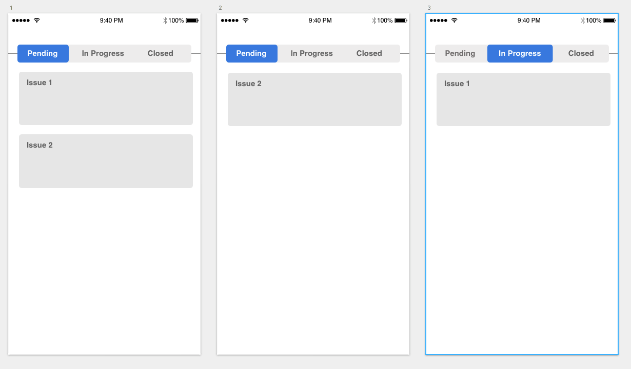
First of all, I think that, as a core of Kanban approach, this should not be an issue for the Users, as there is a natural connection between swiping an item right and the fact that it lands in the column on the right.
As such, supporting it with just an onboarding screen saying "As you swipe items they land in the tabs on left or right." would be just enough in this case, and even this would be something necessary for Users who are not familiar with Kanban.
However, I think that this app, Agile Tasks, has done it quite right. Upon moving a card to another stage, the counters change. This lets Users know how many items are in particular tabs, especially in the ones that are inactive at the moment.
If you are still not convinced, upon moving a card the target tab could blink for a while, or the counter could zoom in and blink etc. - but I believe that it is not necessary.
Edit
As there is, apparently, a need to reflect a situation when a change to the cards happens in the background, I believe that showing temporarily a "ghost" version of the card (greyed out, with a comment that this card has been moved to e.g. "Closed" could be a good idea. These "ghost cards" could be dismissed manually on a swipe down to refresh gesture.


