0

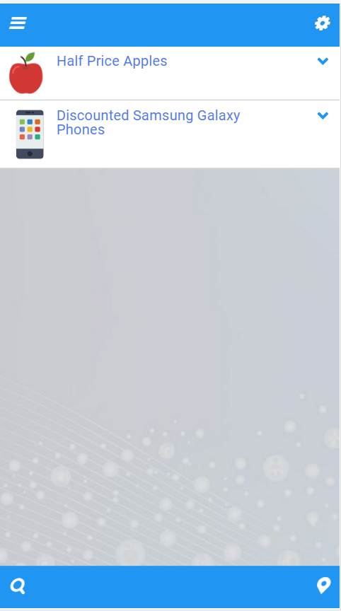
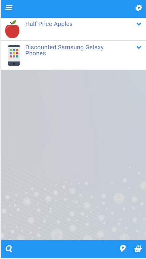
Consider the two screenshots shown below

2x2 icons (in "balance") 2 + 3 icons (not "balanced")

The context here is an "offers" mobile app with the icons serving the following functions

  • Drop down "refine" results list (top left)
  • Configure/Settings (top right)
  • Search (bottom left)
  • Offers on a map (bottom right)
  • Shopping Basket (bottom right x 2 - if/when used)

The intent behind that last one is to ensure that the "basket" is accessible from the "main page" of the app with a single tap.

My own experience with using apps and websites is this

  • I tend not to be attracted to apps that show too many header/footer icons (takes me too long to figure them out, to remember what they do
  • It "looks" unattractive
  • I make mistakes and tap on the wrong of 2 or more adjacent icons
  • I tend to ignore all but one icon that appears in a group

I would like to know what take others here have on this

  • Is this just a personal perception on my part?
  • If not, what can be done to remedy the situation?
5
  • It might be mostly you, but I don't like icons with non-obvious meanings either. The annoyance is mitigated, though, if they provide an explanatory hint when hovering.
    – MMacD
    Commented Mar 30, 2017 at 21:01
  • Hover hints are of no use with mobile devices
    – DroidOS
    Commented Mar 31, 2017 at 3:20
  • Why not? (I don't own one, so I don't know anything about them)
    – MMacD
    Commented Apr 1, 2017 at 13:24
  • With a touch screen device there is nothing that can "hover" - no mouse pointer in sight. So the only event that you can really hook into is the touch/tap event.
    – DroidOS
    Commented Apr 3, 2017 at 3:08
  • ah, okay, fairy nuff. So no mitigation for handhelds, then.
    – MMacD
    Commented Apr 4, 2017 at 12:43

1 Answer 1

2

I think there is a lot to solve with this design, even more than you refer to in your question.

I tend not to be attracted to apps that show too many header/footer icons (takes me too long to figure them out, to remember what they do

In general, you are right. Visual and functional overload is something that can affect usability a lot. Unfortunately, I think this is just the case here.

Not only the icons are spread around the interface, but they are also not hundred percent self-explanatory:

  • Search icon - I believe it should refer to the content as much as possible, right now I would rather think it leads to another screen.

  • Settings - why would I need to access it often? It is too exposed, and probably you will also need to put "About", and some other things somewhere as well, so I would suggest having a Menu icon.

  • The marker icon is not self-explanatory. I would not know what it does.

  • Shopping basket - it is not a good practice to hide an icon from the interface, instead I would add an "basket empty" state to it.

  • The Refine icon does not refer to the content and looks like menu icon - a filter icon would really be a better choice here.

  • Icons are placed a little bit too close to each other.

  • I cannot see the app purpose described anywhere.

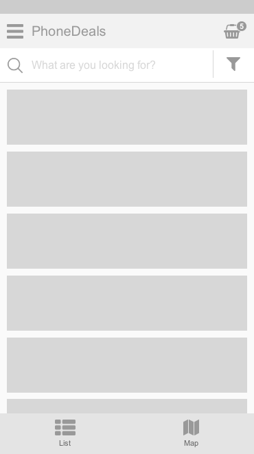
To make it more clear, I would do something like this:

enter image description here

This way:

  • you can clearly tell one view from another (map vs. list)
  • search and filtering use the recognisable icons and are directly related to the content
  • shopping basket is always visible and clearly communicates if there is something inside of it (0 or no badge if empty).
  • you have a menu where you can hide settings etc.
0

Your Answer

By clicking “Post Your Answer”, you agree to our terms of service and acknowledge you have read our privacy policy.

Not the answer you're looking for? Browse other questions tagged or ask your own question.